Download
1 / 42
420 likes | 615 Views
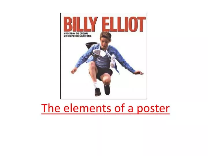
The elements of a poster. Visual Verbal. layout rhetorical questions balance pun colour vocabulary font dialect/jargon image emotive language allusion rhyme/rhythm alignment texture/pattern These features combine to deliver a message.

E N D
VisualVerbal layout rhetorical questions balance pun colour vocabulary font dialect/jargon image emotive language allusion rhyme/rhythm alignment texture/pattern These features combine to deliver a message
Balancing the layout – the large monster figure on the left is balanced by thewriting on the right
Colours – range from black to white, with mid-tones between - with calm blues which complement each other - yellow is a positive, high energy colour
-The girl is off-centre, but she is ‘looking’ towards the block of empty space on the left.-the colour purple tones with the pink of skin and T shirt-tones range from the black of lettering and dark eyes to white
Balance can be achieved through: • Symmetry of layout [ horizontal, vertical or diagonal] • colour – white through to dark with shades in between • Tying visual image with words/slogans • Don’t be afraid of using empty space to balance your poster
The girl’s injury is made to look like a dent in a car’s bodywork. This ties in directly with the poster’s message. It is startling enough to make you want to look twice at the image.
Visual messages • Your image must link to the verbal features you choose. They must complement each other. [ you may also attract viewer’s attention by having a clever, contradictory visual+verbal] • An image may speak for itself
A pun – the original would have been ‘crying over spilt milk’, ie don’t dwell on past defeats but suck it up
Yellow in lettering matches the Warriors’ singlet under the skin.White and blue lettering match colours in the image.
Notice too, that the lettering touches the player’s shoulder and the slant matches the angle of the rips in the man’s back. Unless you are going for something very symmetrical, having overlap is a good way of making the eye glide from one object to another.
This poster has limited colours. Why has the creator used red?
The creator has also used a visual image as an allusion. What is it?
Allusions and associations • Use the knowledge that people already have to make links and imply messages • Common symbols are – crowns dove heart roses barbed wire… • Use your viewers’ associations with colour to suggest ideas/moods… Blue = cold, water, pure Red = passion, anger love etc
‘The Mechanic’ is aligned exactly with the horizontal limits of the gun
By contrast, notice that the figure is cropped top and bottom, don’t be afraid to align your image to the edges of the page.
Alignment • Don’t take words too close to the edge, but you may crop images • Posters are tidier when words and images are aligned
Notice the font in this poster. It is rounded, complementing the curves of the stick man. Think carefully about your choice of font – don’t simply choose your favourite, select one that matches your message.
Look at each of these fonts. What kinds of messages would you associate with these fonts? …