Download
1 / 5
50 likes | 149 Views
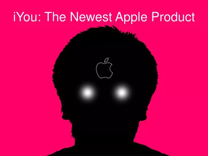
iYou: The Newest Apple Product. Environment/Expectations.

E N D
Environment/Expectations The Apple store experience is similar to most other electronics stores: high amounts of customer activity, a large number of customer service associates, and lots of constant advertisement. The crucial detail about this particular area is the type of customer that tends to browse Apple stores: people, usually younger types, that are looking for the newest and up-to-date gadgetry available to stay “plugged in” as it were. My project is something of a parody of this concept, specifically with Apple and their constant stacking of new features allowing people to stay online. With most of their customers already ingrained in their products, Apple takes the obvious next step: install devices directly into your skull so you’ll never have to be without them. Naturally this technology is still a few years away, but I believe that consumers that are surrounded by enough advertising data will believe it’s authenticity simply because it’s there.
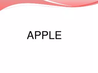
Ad Design The design theory for this particular project is easily explained: Apple ads have a very specific feel to them, shown on the next slide. With the proper observation of technique the look of my fake ad should match almost exactly the design choices made for nearly all Apple advertisements. The solid background colors are always something soft and light, for instance, and never a harsh dark tone. I pick a pink/red background for this particular ad to give it a sinister quality while still matching the look of Apple. The font, Myraid Pro, is one of only a few fonts that Apple uses. Another frequently used one is Helvetica Neue, which I might also use for subheading text not shown in my “sketch” on the first slide, which needs a little more finesse to make it appear 100% like the real thing. Pictured here is an example of a fake Apple ad which I found online and resembles what I imagine the fake flier for the iYou looking like.