Download
1 / 61
610 likes | 706 Views
Presenting. Fact Based Management Tools (R) Module: SPC / EPC / Six Sigma Version 7.2 for Windows XP and later editions. Computer Software for Statistical Process Control (SPC), Engineering Process Control (EPC), and, Six Sigma Process Improvement.

E N D
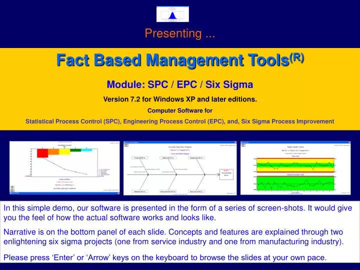
Presenting ... Fact Based Management Tools(R) Module: SPC / EPC / Six Sigma Version 7.2 for Windows XP and later editions. Computer Software for Statistical Process Control (SPC), Engineering Process Control (EPC), and, Six Sigma Process Improvement In this simple demo, our software is presented in the form of a series of screen-shots. It would give you the feel of how the actual software works and looks like. Narrative is on the bottom panel of each slide. Concepts and features are explained through two enlightening six sigma projects (one from service industry and one from manufacturing industry). Please press ‘Enter’ or ‘Arrow’ keys on the keyboard to browse the slides at your own pace.
Process Improvement using SPC / EPC / Six Sigma Tools There is a pressing need for the continual improvement of manufacturing and service processes in today’s competitive business environment. You may follow the time-tested Six Sigma DMAIC approach (Define, Measure, Analyse, Improve, and, Control) in any improvement initiative. For this, you need to … 1. Identify the areas for improvement 2. Identify the key input & output variables (KIVs & KOVs) that are critical to quality/schedule/cost 3. Collect the relevant data and analyse them using the SPC tools such as C&E Diagram, Pareto, Histogram, Scatter Plot, Control Chart, etc. 4. Take corrective and preventive actions to improve the process, and 5. Install an on-going control scheme (such as SPC or EPC chart) to sustain the improvement.
What is SPC ? Statistical Process control (SPC) is a scientific and inexpensive way to prevent defects. It is an effective check against assignable causes of process variation. You would require SPC tools for every Six Sigma project. When to use EPC ? Once a process is brought to stable condition using SPC charts, Engineering Process Control (EPC) helps in predicting the process performance and pro-active adjustments, thereby reducing process variability. It adds extra power to your process control schemes. Both SPC and EPC are very essential for achieving the PPM (parts per million) defect levels expected of your Six Sigma initiatives. In this context, it is very important to provide a statistical software to your personnel for error-free data analysis and charting on regular basis. Our FBM Tools – SPC/EPC/Six Sigma module is a Windows-based computer program designed specifically for improvement projects, by seasoned Engineer-Statistician experts (alumni of the Indian Statistical Institute). Before getting into the details of the software, let us look at one example project from service industry and one from manufacturing industry, to learn how to put SPC/EPC/Six Sigma tools to use. Please see the software screens and read the narrative at the bottom panel.
Example Project (Service Industry) In a certain company, there were chronic data entry problems in the Accounts Department. As part of its Six Sigma initiatives, the company’s management has decided to study the data entry errors by collecting the data for one month and analysing it. The company has designated its Manager, Mr. Stanley John as the Project Leader. Mr. John has created a project record by going to the menu item File Manage My Projects
Example Project (Service Industry) Then he created a new data file by going to the menu item File New Data File. After that, he entered the data collected in August 2011 and saved the file.
Example Project (Service Industry) Looking at the data, he decided to first carry out a Pareto Analysis. For this he went to the menu item File Manage My Workbooks / Start Data Analysis Pareto Analysis and created a workbook record.
Example Project (Service Industry) When he clicked on the ‘START ANALYSIS NOW’ button, the software has displayed the Pareto Diagram.
Example Project (Service Industry) And, when he clicked on the ‘View Table’ button, the Pareto Table was shown as above. He has decided to present this Pareto output along with a Cause & Effect Diagram to the concerned data entry operators for further brainstorming and improvement.
Example Project (Service Industry) He has also decided to group the errors under six categories (variation of Six M’s) such as People, Method, Equipment, Resources, Measurements, and, Materials. He went to the menu item File Manage My Workbooks / Start Data Analysis Cause and Effect Diagram and created a workbook record.
Example Project (Service Industry) When he clicked on the ‘START ANALYSIS NOW’ button, the software has displayed the Cause & Effect Diagram.
Example Project (Service Industry) Also, the project leader wanted to get an estimate of the current levels of Six Sigma Metrics of the data entry process. For this, he has decided to open a control chart workbook and use the u-chart. To setup u-chart, the project leader has gone to the menu item File Manage My Workbooks / Start Data Analysis Control Chart and Histogram and created a workbook record.
Example Project (Service Industry) When he clicked on the ‘START ANALYSIS NOW’ button, the software has displayed the above message. To view the control chart, he has gone to the menu item Graphics Control Charts and clicked open the menu.
Example Project (Service Industry) The following control chart (u-chart) was displayed. As the sample sizes were varying, the chart was drawn with varying control limits (not as straight lines). Areas within control limits shown in green colour, and areas outside limits in red colour.
Example Project (Service Industry) To view the Six Sigma metrics, he has gone to the menu item Reports Control Chart Data Summary and clicked open the menu as above. After checking the required sections in the report, he hit the ‘View/Print’ button to view the report.
Example Project (Service Industry) Having done the preliminary data analysis, it is now time for brainstorming and improvement.
Example Project (Service Industry) Brain Storming & Improvement: Looking at the Pareto Analysis, Cause & Effect Diagram, and the Control Chart, the data entry operators as well as the project leader agreed that the root causes of the problem were: 1. People (Human errors – spelling mistakes and wrong postings), and 2. Method (Procedural flaws in communicating cheque details) It was decided … - to impart training to all data entry operators on accounting concepts (correct posting) - to enable automatic spell-check facility of the accounting software, and also to keep dictionary CDs at data entry work stations - to re-write the integrated management system (IMS) work instructions in such a way that cheque details would never be lost in the communication process, and - to continue with the u-chart for monitoring the day-to-day error levels. Let’s see what was the result of implementing the corrective actions:
Example Project (Service Industry) See the freshly collected data for September 2011.
Example Project (Service Industry) See the (modified) workbook entries for u-chart.
Example Project (Service Industry) See the u-chart for September 2011.
Example Project (Service Industry) See the improved Six Sigma Metrics for September 2011. Prior to Six Sigma initiatives, these were: Defects per Million (DPM) : 8186.15 Sigma Quality Level : 3.90 Yield (%) : 99.18
Hope that you liked the sample project from service industry. Now, let’s see one example project from manufacturing industry.
Example Project (Manufacturing Industry) The following tools are covered in this example: - Control Chart (Variable Data) - Scatter Plot & Regression - Engineering Process Control (EPC) Project Description: In a certain pharmaceutical company that manufactures tablets, there was frequent rejection of final product due to off-the-spec tablet weight. As part of its Six Sigma initiatives, the company’s management decided to study the tablet weight variations by collecting some data from the plant and analysing it. The company has designated its Manager, Mr. Stanley John as the Project Leader and the Laboratory Technician Ms. Ratna Raj as team member. Now, let’s see how this very interesting project was executed.
Example Project (Manufacturing Industry) As the first step, the project leader has created a project record by going to the menu item File Manage My Project Records
Example Project (Manufacturing Industry) Then, he entered the team information by clicking on the ‘View / Edit the List of Team Members’ button.
Example Project (Manufacturing Industry) After that, he entered the key input and output variables by clicking on the ‘View / Edit the List of Key Input and Output Variables (KIV’s and KOV’s)’ button.
Example Project (Manufacturing Industry) Then he created a data file and entered the data that was collected with the help of team member.
Example Project (Manufacturing Industry) After that he has created a workbook record for control chart.
Example Project (Manufacturing Industry) He has then added details under ‘Specifications’ tab.
Example Project (Manufacturing Industry) He has then looked at ‘SPC Parameters’ tab and just made one entry (Target = 1.00) and kept all others at default values. As the basic chart selected was Xbar-S and chart type selected was ‘Conventional’, these parameters were not required. Regarding ‘EPC Parameters’ tab, he decided to enter the details at a later stage (after analysing the data using Scatter Plot and Regression tool).
Example Project (Manufacturing Industry) He then clicked on the ‘START ANALYSIS NOW’ button, and received the above message. Now, he decided to see the graphs first.
Example Project (Manufacturing Industry) Histogram, depicting the data distribution (spread) viz-a-viz tolerance band (technical specifications).
Example Project (Manufacturing Industry) Frequency Table (optional add-on to Histogram), showing data distribution in tabular form.
Example Project (Manufacturing Industry) Normal Probability Plot (NPP) is a very important visual aid for checking the normality of data (i.e., to examine whether the data comes from a population with Normal Distribution). If the data follows Normal Distribution, the plotted points would form a straight line.
Example Project (Manufacturing Industry) Run chart is a simple plot of sample averages, which gives a visual understanding of patterns and trends in control chart data.
Example Project (Manufacturing Industry) Traditional SPC charts are not effective when the data is highly auto-correlated (i.e., when consecutive data points are correlated. If the bars on the Auto-Correlation Chart are shorter, it indicates less amount of auto-correlation. In case the data is highly auto-correlated, use Un-weighted Batch Mean (UBM) chart.
Example Project (Manufacturing Industry) Control chart shows that the process is under statistical control. That means, there is no sporadic (assignable) cause present. The process is stable.
Example Project (Manufacturing Industry) Six Sigma Metrics & Probability Distribution (Normal) gives an idea about expected rejections. Though none of the data analysed were beyond specifications, the small red zone below the lower specification limit (LSL) indicates possibility of manufacturing out-of-spec products. Also, the process is barely capable (Cp < 1.33) and not centered (Cpk < 1).
Example Project (Manufacturing Industry) Now, the reports were looked at. First, the data summary.
Example Project (Manufacturing Industry) Data summary, continues.
Example Project (Manufacturing Industry) Data summary, report ends.
Example Project (Manufacturing Industry) Then he looked at the Control Chart Run Analysis, but couldn’t see any significant cyclic variations. Mr. John has concluded that the real problem is in process setting. From his technical knowledge, he knows that Tablet Weight can be adjusted by controlling the Feed Rate (input variable). But, he needed to establish the relation, i.e., Average Weight of Tablet (Y) Vs Feed Rate (X). For this, he decided to use scatter plot & linear regression.
Example Project (Manufacturing Industry) Then he created a Scatter Plot workbook.
Example Project (Manufacturing Industry) By clicking on the ‘START ANALYSIS NOW’ button, he could se the scatter plot & regression line. As a rule of thumb, R-square value must be at least 0.70 for the regression line to be considered as meaningful. Mr. John looked at the R-square value. It was 0.9951 (very close to the perfect value). So, he decided to use the equation.
Example Project (Manufacturing Industry) Setting up an Engineering Process Control (EPC) chart for the Tablet making process: It involved the following steps (and cues from the User Manual accompanying the SPC software): 1. Selection of feedback control model: Selected Integral model, for simplicity. 2. Setting the parameter (g) for the selected model: Overall Process Gain, g = 0.1092 3. Setting the Smoothing Constant () for EWMA predictor: = 0.15 (‘best fit’ from recent data) 4. Setting the Adjustment Boundary Value (L) for EWMA predictor: L = 0.0041 5. Re-setting the process average at the Target value (1.00 gram): Done by engineering means. 6. Installing an EPC chart and monitoring (and adjusting) the process: For this, he went back to the SPC software. Let’s see what he did there.
Example Project (Manufacturing Industry) Mr. John has edited the original control chart workbook (EPC Parameters tab), as above.
Example Project (Manufacturing Industry) After process re-set, fresh data were taken from 2.00 PM onwards and entered in the same data file as above.
Example Project (Manufacturing Industry) Then, the work book entries were modified (such as project phase changed to ‘Control’, etc) as above.
Example Project (Manufacturing Industry) Then hit the ‘START ANALYSIS NOW’ button, and checked the EPC chart (‘Graphics’ menu). The thin graph in black colour is the sample mean. The thick graph in blue colour is the EWMA predictor for process average. The next point prediction (predicted value for process average at 8.00 PM) was 1.0005 and the advice was to leave the Feed Rate (X) at its present level (i.e., 2.13).
We have discussed two practical projects so far. What are you thinking now ? Never thought that such things could be done in your organisation also ! As they say, it is better late than never. Our software could be a helpful companion in your improvement initiatives. This product is available in three editions (Academic / Lite / Standard). Each edition is designed to serve a particular user category. Let us now talk about the software features in detail.
This is the login screen. Select your User ID from the list, enter the password, and select a login option (User / Admin). Then press ‘OK’ to enter the software.