Download
1 / 15

E N D
Production of music magazine front cover Katie Lewis
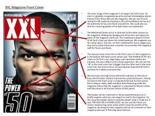
First I started by using a blank template on Photoshop. I changed the colour of my background by using the paint bucket tool. I decided to change it to the colour grey because I felt like it wasn’t too dark because I still wanted my text and image to be seen clearly.
Next I added in my title which I came up with the name of Rock Aside. I decided to use the colour black because I felt like it stands out well against the grey.
Once I had added in my title, I added in the image of my front cover artist. To just get the image of my artist without the background I used the magic wand tool. It took my a while to crop it all out but I took it slow to make it precise and real.
Once I had sorted out my image, I then added in my positioning statement. I decided to locate this just below my title so people look at my title and image first.
Next, I added in my cover lines. To do this I just added text but I made the artists name featured in the cover line bigger so it stands out more than the text beneath it. I decide to use black and white because I wanted them to stand out but not as much as my image and title.
In addition, I then added in my main title which is the name of the artist featured on my front cover. I decided to use the colour yellow because when I looked up rock magazines on the internet yellow was a popular colour that was used so I decided to try it out and I really liked the way it made it stand out.
Then I added in my main cover line. I decided to put this in white because I didn't want to take all the focus away from my main title. I decided to locate it below the title so people will look at the title first then carry on looking down to the cover line.
Next I added in my barcode. I decided to put it in the very right hand corner because generally that’s the main place where they are located. I decided to put it landscape so there is more room for something to go along the bottom.
Next, I added in a white box in the bottom left hand corner. I decided to put a white box there so it makes the word ‘PLUS!’ stand out more. I didn't want to put in any other colours to it because I didn't want it to stand out very much.
Additionally, then I added a black strap line box ready for my strap line text to go on top. I decided to add a box because otherwise it would be really hard to read therefore it will make the text clearer and easier to read.
Then I added the strap line text. I added this in white so it contrasts with the black. In between each artists name I added in a white dot which separates each artists name.
Furthermore, at the bottom of the front cover just above the barcode I added in the price of my magazine, the issue number and the month it was made.
Lastly, I added a puff which is located on the right hand side near the top. I decided to add this because it is a feature many magazines have and when customers see the word ‘free’ they generally tend to have a further look.
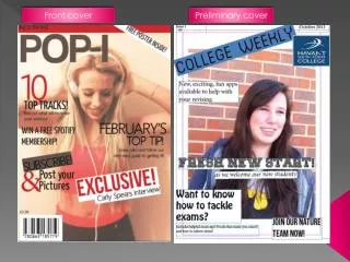
Here is my final front cover. I exported it in to a JPEG image so I can upload it on to my blog.