Download
1 / 26
260 likes | 265 Views
How to Create Bar and Line Graphs. Draw the Axes. Identify the Axes. Y- Axis. X- Axis. Identify the Axes. Y- Axis. Dependent Variable (what is observed and measured). X- Axis. Independent Variable (what is changed by the scientist). DRY MIX.

E N D
Identify the Axes Y- Axis X- Axis
Identify the Axes Y- Axis Dependent Variable (what is observed and measured) X- Axis Independent Variable (what is changed by the scientist)
DRY MIX One way to remember which data goes on which axis is the acronym DRY MIX. D.R.Y.M.I.X. D- Dependent M- Manipulated/known/controlled R- Responding/affected I- Independent Y- Y-axis X- X-axis
Scale • In order to emphasize comparisons/trends, decide on an appropriate scale for each axis. • We will begin each axis at zero and ALWAYS keep intervals equal It is highly recommended that intervals are a common number such as 2, 5, 10, 25, 100, etc. • The max numbers used for the scale should be 1-2 increments higher than the highest value.
DETERMINING Scale • EXAMPLE OF POORLY SCALED GRAPH :P • The Y-axis scale • is from 0-100 • The largest value • is only 35
DETERMINING Scale • EXAMPLE OF WELL-SCALED GRAPH :) • The Y-axis scale • is now from 0-40 • This does a better • job emphasizing • the comparison • between coins
DETERMINING Scale • Count graphing units & plan!!
Labels • Each axis needs a label so the reader knows exactly what the independent (IV) and dependent variables (DV) are. • The DV must be specific and include the units used to measure the data (such as “number of drops” or “mL”).
Labels DV label IV label
Title • At the top, write an appropriate title sentence. • The title should contain both the IV and DV.
TAILS An acronym to help you remember everything you need to create your graphs… T.A.I.L.S. Title Axis Interval Labels Scale
TAILS Title: Includes both variables Axis: IV on X-axis DV on Y-axis Interval: The interval (4) is appropriate for this scale Label: Both axes labeled Scale: Min and max values are appropriate
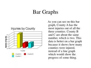
Bar Graphs • Bar graphs are used to compare discontinuous data, such as eye color or shoe size or population comparisons between countries • The X-axis for most bar graphs, will not have numerical values
Another example What 2 items from TAILS are missing?
Line Graphs • Line graphs show how/if the IV affects the DV • Many times, the IV plotted is time. • Used to show trends and make predictions.
Create-a-Graph Online! Click here to use the online tool!
Intervals The interval for the Y-axis is 20. The X-axis does not have numerical data and does not need an interval.