Download
1 / 38
380 likes | 482 Views
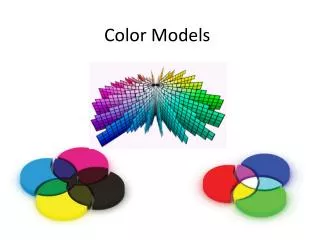
Part One Non-Circular Color Models. Isaac Newton. Triangles. Painter’s Triangle. Printer’s Triangle. The first to use a triangular model: Johann Wolfgang Von Goethe, author of Faust and other works.

E N D
Triangles Painter’s Triangle Printer’s Triangle
The first to use a triangular model: Johann Wolfgang Von Goethe, author of Faust and other works Johann Wolfgang Von Goethe was a German polymath (he did many things well) who lived from 1749-1832. He wrote novels and poems, studied plants, and, in 1810, wrote Theories of Color. While some of his color theories did not hold up to scientific testing, he was one of the first color theorists to look at the psychology of color. In addition, his view that darkness, as well as light, affected color also influenced numerous Painters including J.M.W. Turner
In Goethe's triangle the three primaries red, yellow, and blue are arranged at the vertices of the triangle. The other subdivisions of the triangle are grouped into secondary and tertiary triangles, where the secondary triangle colors represent the mix of the two primary triangles to either side of it, and the tertiary triangle colors represent the mix of the primary triangle adjacent to it and the secondary triangle directly across from it.
STOP! FIRST ASSIGNMENT • Using either the painter’s triangle or Goethe’s triangle, posit your three favorite colors on the points of the triangle as primaries. You may choose the three color aid papers that you chose at the start of the class as primaries or choose three new favorite primaries from your own Color Aid papers. • Use what you know about color mixing and overtones to try and make a close match to all three colors, using your paints. • Once you have created approximate primary matches, secondaries and tertiaries. Use Britstol board. **** If you would like to try this using Photoshop you may.
A brief explanation • http://dba.med.sc.edu/price/irf/Adobe_tg/models/munsell.html • http://www.colourlovers.com/blog/2008/12/29/color-basics-the-munsell-color-system
Meant as an educational tool, but, in truth, was not adopted by schools but by industry. • http://www.bostonglobe.com/ideas/2013/03/16/munsell-man-who-colored-america/KlfxVj45OxbaTlHZ8wmNeO/story.html
If you want to get a taste for Munsell’s original writing and the early 20th links between music, children’s education and color theory. I recommend going to this site: • http://books.google.com/books?id=PgcCAAAAYAAJ&printsec=frontcover&source=gbs_gesummary-r&cad=0 - v=onepage&q&f=false
Quote from Munsell’s treatise • Clear mental images make clear speech. Vague thoughts find vague utterance. • (4) The child gathers flowers, hoards colored beads, chases butterflies, and begs for the gaudiest painted toys. At first his strong color sensations are sufficiently described by the simple terms of red, yellow, green, blue and purple. But he soon sees that some are light, while others are dark, and later comes to perceive that each hue has many grayer degrees. Now, if he wants to describe a particular red, -such as that of his faded cap, -he is not content to merely call it red, since he is aware of other red objects which are very unlike it. So he gropes for means to define this particular red; and, having no standard of comparison, -no scale by which to estimate, -he hesitatingly says that it is a “sort of dull red.” • (5) Thus early is he cramped by the poverty of color language. He has never been given an appropriate word for this color quality, and has to borrow one signifying the opposite of sharp, which belongs to edge tools rather than to colors.
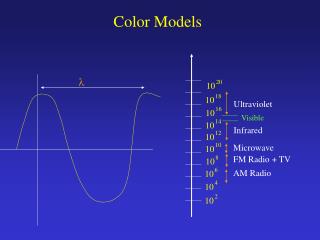
RGB Color Since colors are usually defined by three components, not only in the RGB model, but also in other color models such as CIELAB, then a three-dimensional volume is described by treating the component values as ordinary cartesian coordinates in a euclidean space. For the RGB model, this represented by a cube using non-negative values within a 0-1 range, assigning black to the origin at the vertex (0, 0, 0), and with increasing intensity values running along the three axes up to white at the vertex (1, 1, 1), diagonally opposite black. An RGB triplet (r,g,b) represents the three-dimensional coordinate of the point of the given color within the cube or its faces or along its edges. This approach allows computations of the color similarity of two given RGB colors by calculating the distance between them: the shorter the distance, the higher the similarity.
How colors are represented in graphic programs using RGB. Each slider ranges from 0 to 255. The byte (pron.: /ˈbaɪt/) is a unit of digital information in computing and telecommunications that most commonly consists of eight bits. Historically, a byte was the number of bits used to encode a single character of text in a computer and for this reason it is the basic addressable element in many computer architectures. The size of the byte has historically been hardware dependent and no definitive standards existed that mandated the size. The de facto standard of eight bits is a convenient power of two permitting the values 0 through 255 for one byte.
Photoshop and CIELAB • CIELAB is the second of two systems adopted by CIE in 1976 as models that better showed uniform color spacing in their values. CIELAB is an opponent color system based on the earlier (1942) system of Richard Hunter called L, a, b. • Color opposition correlates with discoveries in the mid-1960s that somewhere between the optical nerve and the brain, retinal color stimuli are translated into distinctions between light and dark, red and green, and blue and yellow. CIELAB indicates these values with three axes: L*, a*, and b*. (The full nomenclature is 1976 CIE L*a*b* Space.) • The central vertical axis represents lightness (signified as L*) whose values run from 0 (black) to 100 (white). This scale is closely related to Munsell’s value axis except that the value of each step is much greater. • The color axes are based on the fact that a color can't be both red and green, or both blue and yellow, because these colors oppose each other. On each axis the values run from positive to negative. On the a-a' axis, positive values indicate amounts of red while negative values indicate amounts of green. On the b-b' axis, yellow is positive and blue is negative. For both axes, zero is neutral gray.
When to use LAB color space • - Matching paint colors to printed media • - Matching fabric colors in a catalog or website • - Communicating your favorite Pantone color to another media form • LAB color space is the back-bone of all color management between devices in the color workflow • Lynda Tutorial on using Lab in Photoshop • http://www.youtube.com/watch?v=wa7QdgIXir0
Part Two: Color and Composition in 20th century painting class.Introducing Henri Matisse and Hans Hofmann…
Henri Matisse (1869-1954), was, alongside Picasso, one of the most influential of twentieth century artists. Many of his innovations were based in color theory. He was influenced by Chevereul, as well as by Pointillist painters such as Georges Seurat (who experimented with placing small dots of complementary colors next to one another to create color vibration) and Vincent Van Gogh (who explored the emotional aspect of complementary colors).
Paintings such as Woman with a Hat (San Francisco Museum of Modern Art), when exhibited at the 1905 Salon d'Automne in Paris, gave rise to the the first of the avant-garde movements (fall 1905–7), named “Fauvism” (from the French word fauves or “wild beasts”) by a contemporary art critic, referring to its use of bold combinations of bright colors and energetic brushwork. Below, “Madame Matisse” painted in 1907.
Matisse’s work was influenced by Picasso and Juan Gris’s cubism, as well as by Islamic art’s emphasis on pattern and decoration. These two works,Red Interior on Blue Table (1947) and Harmony in Red (1908) show a complex understanding of Warm and Cool Combination. In both, color, rather than value create a depth and movement which is emotional and physical rather than representational.
Henri Matisse FORTHIS WEEK’s HOMEWORK: I want you to watch http://www.youtube.com/watch?v=HWjhgnZ4nl4 TAKE NOTES AND MAKE COMMENTS AS YOU WATCH IN YOUR COLOR JOURNALS. Your homework also includes watching : http://www.radiolab.org/2012/may/21/
Hans Hoffman – Teacher and Artist1880-1966 • Synthetic cubism • Kandinsky • Fauves • Brought techniques to U.S. Psychology/Symbolic color and Analytic Analysis Color advancing or receding form. Form does not dictate color; color dictates form. Push/Pull
Synthetic Cubism, Juan Gris and Pablo Picasso Movement forward and sideways, multiple points of view, opposed to Renaissance
“Color provokes a psychic vibration. Color hides a power still unknown but real, which acts on every part of the human body.” Concerning the Spiritual in Art, Wassily Kandinsky.
Push and Pull Theory “In his 1948 book, The Search for the Real and Other Essays, Hoffman declared the long reign of perspective over. He felt that with this traditional approach, which dates back to the Renaissance, the space only goes in one direction: nothing comes back. He claimed that a visual system that relies on lines and points alone cannot sufficiently define pictorial space. Instead he argued that a combination of color, light, and shape could create ‘push and pull:’ the visual tension between forces and counter-forces that gives the viewer the experience of depth and motion on a flat surface.
More explanation • “With push and pull, shapes and colors interact to create not only the feeling of space, but of movement as well. Warm colors appear to advance; cool ones seem to recede. Light and dark values and overlapping shapes all help to create the illusion that the composition is in motion, or “breathing,” leading the eye to each part of the picture rather than letting it rest in one spot. In this way , the viewer becomes actively engaged with the picture – a goal Hofmann claimed all artists should strive for.” • -pbs.org
Hans Hofmann’s paintingsThe Golden Wall (left) and Fermented Soil (right)
Influenced many artists: Richard Diebenkorn and Louise Nevelson
Stop! Play at making your own Hans Hoffmann on this PBS site. • http://www.pbs.org/hanshofmann/push_and_pull.html
Now that you’ve had a chance to experiment– SECOND ASSIGNMENT • Using your bristol boardand paints, design an abstract or semi-abstract PUSH/PULL composition. Size 5”x7” • Consider the vibration of complementarycolors, the pushing forward quality of warm colors and the pulling (falling back) quality of cool colors, as well as how shape and pattern effect movement in a composition.
Homework • If you have not finished The Painter’s/Goethe’s Triangle and The Push/Pull Composition please do so. • After that, please watch the Matisse documentary, taking notes in your Color Journal. http://www.youtube.com/watch?v=HWjhgnZ4nl4 • And, again in the Color Journal, take notes on this Radio Lab broadcast: http://www.radiolab.org/2012/may/21/