Download

1 / 16
160 likes | 347 Views
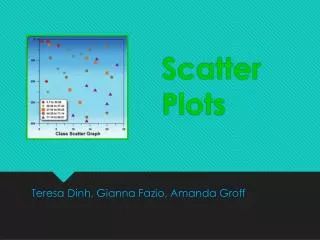
Scatter Plots. By Rach and Jess . Australian Curriculum. Use scatter plots to investigate and comment on relationships between two continuous variables. Using authentic data to construct scatter plots, make comparisons and draw conclusions. Declarative.

E N D
Scatter Plots By Rach and Jess
Australian Curriculum • Use scatter plots to investigate and comment on relationships between two continuous variables. • Using authentic data to construct scatter plots, make comparisons and draw conclusions.
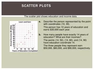
Declarative • A scatter plot is used to identify if there is a positive or negative relationship or no relation between a pair of variables. • Tables and graphs can be used to interpret bivariate data. • A line of best fit is used to identify if there is a positive or negative relationship between two variables.
Procedural • Gather and analyse data for a pair of variables i.e. hand span and foot length. • Record and plot data found on a graph (scatter plot). • Use a line of best fit to identify a positive or negative relationship between variables. • Manipulate and interpret bivariate data in tables and graphs.
What is a Scatter Plot? • Show how two variables relate • Strong relationship • Negative relationship • Unrelated
What do you need? • A data table with recorded variables
What do you need? • Appropriate table to fit-in data with labelled axis
What next? • Plot the points
Analysis the data • Is there a line of best fit (linear line)? • What is the relationship? • What is this data telling us?
Graphics Calculator Strengths Weaknesses Students do not have to set up the graph up or set the minimum or maximum for X and Y axes Line of best fit automatically calculated • Accurate scatter plot with data input • Accessible in classrooms • LM able to backtrack on calculator to see where students may have made mistakes • X and Y intercepts automatically calculated
Graphics Calculator Opportunities Threats Simple data error entry could hinder results and accuracy • To extend students abilities to use a graphics calculator • Time saving • Possible to implement in an exam
Quality Basics: The scatter plot Strengths Weaknesses Brief overview – possible for revision Does not give explanations of definitions of key mathematical terminology Does not provide teacher with formative feedback – students may guess answers until correct answer is reached • Positive, negative, curvilinear, no correlation • Independent and dependant variables explanations • Specific point locations • Prediction of particular points based on ‘linear line’ • Rules – When Y becomes larger X becomes _______
Quality Basics: The scatter plot Opportunities Threats Internet or server fail Students accessing other sites – off task behaviour • Use for introduction of scatter plots or use for revision
Build a scatter plot Strengths Weaknesses No formula provided for mean or standard deviation • Automatic calculation of means and standard deviations • Asks question – ‘are the two variables related’ • Ability to change number of cases and correlation coefficient (strength) • Linear relationships clearly seen by using line of best fit
Build a scatter plot Opportunities Threats Internet or server fail Students accessing other sites – off task behaviour • To extend student knowledge on standard deviation • Students to plot own points • Option to display gridlines, ticks for each variable and means for X and Y • Using ITC in the classroom
Yeah, we are finished now • John, do you have anything to add? • You may now applaud