Download
1 / 2
20 likes | 185 Views
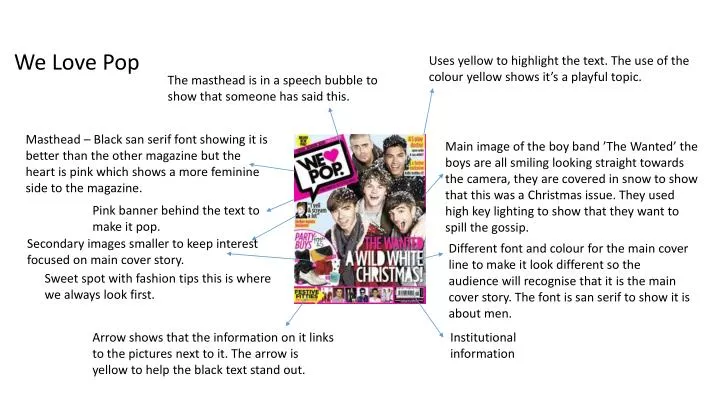
We Love Pop. Uses yellow to highlight the text. The use of the colour yellow shows it’s a playful topic. The masthead is in a speech bubble to show that someone has said this.

E N D
We Love Pop Uses yellow to highlight the text. The use of the colour yellow shows it’s a playful topic. The masthead is in a speech bubble to show that someone has said this. Masthead – Black san serif font showing it is better than the other magazine but the heart is pink which shows a more feminine side to the magazine. Main image of the boy band ’The Wanted’ the boys are all smiling looking straight towards the camera, they are covered in snow to show that this was a Christmas issue. They used high key lighting to show that they want to spill the gossip. Pink banner behind the text to make it pop. Secondary images smaller to keep interest focused on main cover story. Different font and colour for the main cover line to make it look different so the audience will recognise that it is the main cover story. The font is san serif to show it is about men. Sweet spot with fashion tips this is where we always look first. Arrow shows that the information on it links to the pictures next to it. The arrow is yellow to help the black text stand out. Institutional information
Top of the pops Has the BBC logo to show that they own the right s to this magazine. Masthead pink and white to show it is young and fresh. Link to social media which targets the audience. Main image of the boys from ‘The Vamps’ they are all looking to the camera. They have the casual look but are covered in kisses. Secondary cover lines with secondary images not as big and all in the same fonts so they don’t bring the attention away from their main story. Uses of the buzz word ‘EXCLUSIVE’ which means you have to read this magazine as it will be the inly one with this information. They use a serif font to show that this topic is very girly so it represents the whole branding of the magazine. They use the colours pink and yellow which connote a young summery feel these colours are also very bright so they can capture the readers attention. Graphic shape to separate this text from the rest it uses a mixture of the colours black and yellow to capture their attention. Institutional information Uses the buzz word ‘PLUS’ to make the readers think they are getting more than what they paid for.