Download
1 / 21
210 likes | 300 Views

E N D
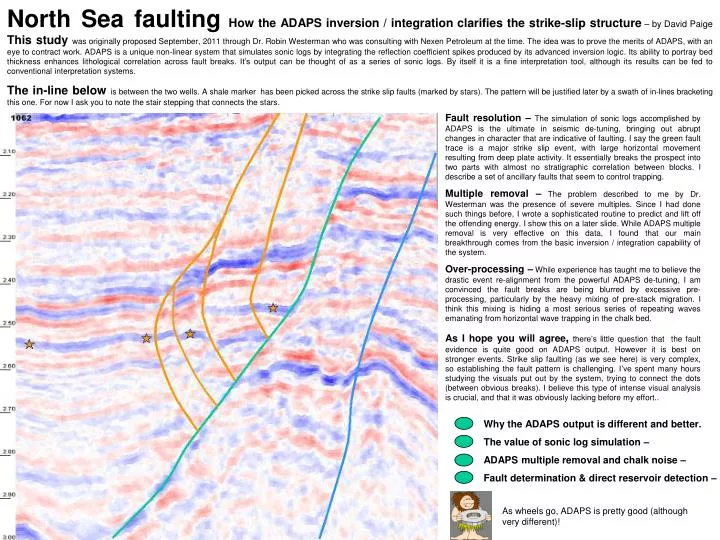
North Sea faultingHow the ADAPS inversion / integration clarifies the strike-slip structure – by David PaigeThis study was originally proposed September, 2011 through Dr. Robin Westerman who was consulting with Nexen Petroleum at the time. The idea was to prove the merits of ADAPS, with an eye to contract work. ADAPS is a unique non-linear system that simulates sonic logs by integrating the reflection coefficient spikes produced by its advanced inversion logic. Its ability to portray bed thickness enhances lithological correlation across fault breaks. It’s output can be thought of as a series of sonic logs. By itself it is a fine interpretation tool, although its results can be fed to conventional interpretation systems. The in-line below is between the two wells. A shale marker has been picked across the strike slip faults (marked by stars). The pattern will be justified later by a swath of in-lines bracketing this one. For now I ask you to note the stair stepping that connects the stars. Fault resolution –The simulation of sonic logs accomplished by ADAPS is the ultimate in seismic de-tuning, bringing out abrupt changes in character that are indicative of faulting. I say the green fault trace is a major strike slip event, with large horizontal movement resulting from deep plate activity. It essentially breaks the prospect into two parts with almost no stratigraphic correlation between blocks. I describe a set of ancillary faults that seem to control trapping. Multiple removal – The problem described to me by Dr. Westerman was the presence of severe multiples. Since I had done such things before, I wrote a sophisticated routine to predict and lift off the offending energy. I show this on a later slide. While ADAPS multiple removal is very effective on this data, I found that our main breakthrough comes from the basic inversion / integration capability of the system. Over-processing – While experience has taught me to believe the drastic event re-alignment from the powerful ADAPS de-tuning, I am convinced the fault breaks are being blurred by excessive pre-processing, particularly by the heavy mixing of pre-stack migration. I think this mixing is hiding a most serious series of repeating waves emanating from horizontal wave trapping in the chalk bed. As I hope you will agree,there’s little question that the fault evidence is quite good on ADAPS output. However it is best on stronger events. Strike slip faulting (as we see here) is very complex, so establishing the fault pattern is challenging. I’ve spent many hours studying the visuals put out by the system, trying to connect the dots (between obvious breaks). I believe this type of intense visual analysis is crucial, and that it was obviously lacking before my effort.. Why the ADAPS output is different and better. The value of sonic log simulation – ADAPS multiple removaland chalk noise – Fault determination & direct reservoir detection – As wheels go, ADAPS is pretty good (although very different)!
Vive la difference! Final ADAPS product Believe the ADAPS results or not, but rest assured they will be different. The horizon you mapped previously might not appear at all. ADAPS does a great job of de-tuning the seismic complex, and since reflections come from individual interfaces, the final composite events will almost never be the same. The general structure will look similar, but often the stratigraphic detail will differ drastically. To the right is an “after and before” from the In-Linewhere the well is. If you look closely you will see that the event structure has been completely altered by de-tuning. In particular you should see that the integration logic often combines interfaces to produce single events. In any case we say you are looking at true lithology. To understand the vital significance of this de-tuning requires some eye training. To help, we show an “after/before” strip example at the left, containing well matches. Remember that the input is to the right. At the very top you can see a good example of the event simplification mentioned above. The well match to the left illustrates the effects of ADAPS de-tuning. On the left strip (final) we see a single broad blue band lining up with a shale on the well image (we call this the target shale). On the right strip (straight stack) we see a negative (blue) and a positive (red) combination straddling the same node on the well log image, resulting in no mathematical correlation.The type of great well match contrast we see here is the heart of the ADAPS argument. The match was carefully timed, and it fits the ADAPS final product nicely. The fact that there are fewer nodes in the answer is a form of proof that the system is doing well. Taking this “simplification criterion” farther on these strips we can see several other excellent examples where nodes were removed. Then, moving back to the right we can better appreciate that there is a seismic beauty in event simplicity. Of course none of this surprised us, since we’ve made many great well matches (where we had much more log data to compare). Next we look at in-line/cross-line mergers to show the value of sonic log simulation (matching thicknesses). Straight stack Click arrow to return to series
Cross line / in-line merger #1 Discovery in-line Coming from a slant hole, we have to figure where the discovery sand lies in space. This picture shows the 3D intersection of the discovery in-line and our guess at the cross line. The excellent lithologic match confirms both the accuracy of our guess, and the value of the sonic log simulation. The circle is the target zone. To get from here to the producing well we have to cross at least two fairly distinct faults). It seems to us that the value of our improved fault picks should be self evident. Of course we are prejudiced. The ADAPS abilityto bring out fault breaks in the form of abrupt character changes is vital in this prospect. In strike slip areas there often is often no real correlation of events across the faults, and these breaks are all we have to work with. In the subject data, these character change signals are consistent between in-lines (most important in our own QC) The correlation seen between these two connecting lines shows this clearly. Connecting dots can still be interpretive. However the reality that our targets are separated by at least two faults is clear (even if one does not accept the detailed pattern).. Each time we improve resolutionthe interpretation becomes less subjective. We have noted that ADAPS is hurt by the excessive pre- whitening and asked for more pristine data. This seemed to have been a bigger problem than we thought, so we had to do with what we got. Pre-stack migration is probably the most serious problem in improving fault break resolution, since much migration improvement comes from heavy mixing. We plan to work on this problem. Probably the most important message this preliminary study emphasizes is the importance of human visualization - Just passing the computer output from these runs to current (automatic) interpretation and mapping systems seems a little pointless to me. It may well be that future routines will be smart enough to handle the subtlety, but they sure are not there yet. On the next slideI show another right angle intersection to again summarize the complexity of my fault interpretation. Of course once such a picture is accepted, drilling decisions can be made without the need for a final contoured map of the whole impossible structure. Naturally we would like better resolution, since we are probably missing smaller faults that could be important.
Bed thickness - Cross line The 27th In Line from an early set Here is another 90 degree intersection. It’s between the same cross line and the in-line intersecting one of the wells . Again, what makes it good is the bed thickness portrayal. ADAPS was able to model this lithology in spite of the pre-processing whitening that hurt its pattern recognition ability. Here we see ADAPS starting to approximate the wavelet with a natural assumption that some side-lobe energy will be present. However, as it proceeds with its iterations it finds that reducing those lobes improves the results in a very direct way. We have watched this iterative sequence hundreds of times and the best answer is invariably the last one as shown here. To ADAPS, “best” is when it has explained the most trace energy balanced with the lowest integration error. This final answer tellsus their logic was able to collapse the wave shape, while failing to reach full spiking. The fact that ADAPS can still produce superior results using such heavily modified data tells us the real work is being done with ADAPS ultimate non-linear spiking and integration. The world of seismic statistics is more complex than most researchers seem to realize.One factor normally ignored is stratigraphic cycles. There is often a pattern that imposes itself on the reflection info. Then we have the noise overlay of one form or another. In addition, there seems to be a strong tendency for wavelet analysis methods to exaggerate legginess. The major difference between our own ADAPS system and the version implemented earlier by Ikon took root when we began to insert both the energy explained and the integration error into our driving logic. The strip above shows this logic in action.The system can display intermediate results and we watch them closely. Routinely, each iteration produces a more precise answer. Now click elsewhere for multiple removal or on green arrow for router. ADAPS is different!
The multiple paradox: They are present in force. The adaps logic detects and removes them efficiently, but it makes little difference in the stack. The combo graphicat the left shows an input gather set before and after multiples removal.The red line shows the deep mute used for this run (all data below can be ignored). The same display moduleis called for both the raw input data (top) and for the treated results (bottom). The plot amplitude scale is set from first member of the gather, so relative amplitudes between plots should not be treated as relevant.Between individual membersthe differences are honest and this is where the AVO people should have to show meaningful variations. The last plot on the top halfis of the stack of the input data shown above. Because comparing the stacks is vital to this discussion, this stacked vector is saved by the logic to be repeated on the second display. This lower displayis called just before sending the stack to the inversion logic. On this pass, the treated set is displayed, followed by the saved input stack and the final “multiples removed” stack. The paradox – Considering the remarkable improvement in the event below 2.4 seconds, one would assume a commensurate difference in the stacks. The fact that we don’t see any obvious improvement is a testimonial to the innate power of the stack, i.e. its ability to look through the layers of noise that cover the events having the correct NMO. The next step – Because I am convinced the fault breaks are being muddled by heavy mixing associated with pre-stack migration, and because I am not happy the the deep results shown here, I asked to see some pre-migration gathers. The next two slides treat this subject. I see this as my next challenge.
Problems on pre-migration data -This is the major part of the first raw gather from a pre migration in-line. The major shallow event is undoubtedly the chalk. The oval shows where that event clones into a horizontally traveling wave guide. There is a preponderance of roughly 50cps energy going quite deep. There is little believable deep continuity, and no strong evidence of multiples. To understand what this view is telling us takes some effort. Since this subject is at the heart of the North Sea processing problem I ask that you spend whatever time it takes. Please toggle with the next slide where I lift off the 50 cycle stuff. I’vespent aton of time juststaring at this picture. Each time I come back Isee more crossing patterns. Forexample, look at the events that arecrossing the chalk at the top of the oval.Obviously these are not long multiples bouncing from that really strong interface, and neither are theysimple water bottoms. Going shallower, we see straight linerefractions (at least we can understand them). Now let’s consider the critical angle thing we are seeing inside the oval.Once it is hit, no more energy passes through the chalk, literally making the outside traces useless for deep energy. Furthermore this causes a void in the wave front. As we are taught, nature abhors such things and fills in with whatever it can dreamup. Our simple minded answer is that the energy that is trapped in the horizontal mode is reverberating, becoming a series of point sources. Whether you believe this theory or not, there is noarguing with what we can see physically. Notice that the deep patterns are higher in frequency than thethe believable strong shallow events. This implies they have not traveled very far and that is important.
Here are the results from the lift-off filter.Note once more the data within the matching oval. Note that the path beyond follows a straight line, showing the energy to be traveling horizontally (refraction). Note also the expanding refraction pattern following the cloning point. Because downward traveling energy has been interrupted at the critical angle, these events fill the gap. All of this is happening in the critical target zone. To use the outside traces here seems suicidal (you might review the deep mute on slide 5). Also note the improved detail within the red circle. . Click anywhere but on the green arrow to continue. Click there to return to the router The next slidestarts a timed series of In-Lines straddling the two well locations. While fault patterns might be questioned, pay attention to how constant the individual breaks are. Some potential reservoirs are also pointed to.
North sea fault study – To the left is the first inverted/integrated in-line of this series. Below are two before and after thumbnails, the upper is the (stacked) input & the lower the same output reduced in size. Watch this space for comments. On this slide I spell out our themes below. Themes – I say the green trace is a strike slip fault with major horizontal movement (no reasonable correlation between the blocks). Hopefully you will make several passes through the series. On the first I suggest you click rapidly through, noting this stratigraphic contrast. Please return (using the supplied link) to study the changing detail. The marker shale, and adjustment faulting – Note the 3 stars above. These point to the marker shale shown on slide 2. As we move through the series you will see faults developing that cut this bed. Correlation across these adjustment faults is often very good, indicating no problem with horizontal displacement. The fallacy of automated mapping – I’ve literally spent months establishing our overall correlations. To map prematurely is obviously dangerous. I comment on this as we go.
Note the stars are mostly in-line As we move through the series you will see them displaced by the faults that develop. Watch them closely, as this is most important to the fault interpretation! Two different worlds exist, separated by the green fault. Extensive horizontal movement is the reason.
And so the breakup starts. While the ancillary faulting picks may not be perfect, the faults certainly are there. The fact that the pattern fits over a wide spread is an important justification. The data to the rightof the main fault is still relatively unbroken.
Note the goodstratigraphic match Above the marker shale. This does not exist across the green (main) fault (even though it is tempting to cross over here. Later on this miss-match is more evident. While the ancillary fault pattern is getting quite complex, it holds steady till the end of the series. Unfortunately nothing is simple. Take time to note the before and after below;
Good correlation on marker but It’s time to remind you of what we said on slide 2 about de-tuning. The marker shale is located by arrows on the before & after displays below. On the input stack there is a pair of matched events showing the top and bottom. The ADAPS integration logic has combined the two into a thick shale which, as you saw, fits the well match.
Correlation still reasonable! We begin to see flexures on the right side. We assume this is where the lateral movement occurred, probably stemming from deep plate activity. While I fear the fault breaks are being heavily blurred by pre-stack migration, a combo of actual fractures and flexures seems reasonable.
Correlation still reasonable! The powerful ADAPS de-tuning brings out true event amplitudes. The arrow to the left points to what we consider a very promising new reservoir. I have seen a number in our data area. Unfortunately many are in small fault blocks. We begin to see blue fault breaks.
Correlation still reasonable! What is it about de-tuning that the industry doesn’t believe? The input below represents the best results at the time I came in. If one mapped the strong red event as a sand, ADAPS would say that was entirely wrong. I’ve made dozens of great well matches on proprietary data to prove it knows what it is talking about.
Correlation still reasonable! Pay attention now to the third star from the left. The target sand is just below the marker. One can see that the ancillary faulting is all-important here. You might toggle back and forth to watch the fault action.
Correlation still reasonable! So here we are. Go back to slide 2 to see the well match that started us on the marker shale tracking. Note the target sands looking better one star to the right. Click to go to 2. .
Correlation still reasonable! But this is a good place to discuss automatic interpretation software. Obviously it needs guiding here.
Correlation still reasonable! By this time in the series it should be clear that establishing the fault pattern is the first priority. Because the problem is so complex, this task requires retro fitting our interpretation mode. Human analysis of the kind of details ADAPS is showing us is the first step, automating what we learn comes later.
Yes the correlation is still good, at least to me. The burden on the viewer is that one cannot accept the presence of these trapping faults and still use today’s interpretation techniques. If we stay close to the major strike slip fault we’re looking at many small reservoirs that are tough to map. Of course we have direct reservoir clues, like the checked one here.
Click here to repeatseries Or on arrow to start over or on circle for router. Recap of important points - The strong de-tuning accomplished by the ADAPS integration logic completely changes the layering character of the output. The simulation of (well) sonic logs it achieves makes correlations in complexly faulted zones feasible. The presence of multiple faults breaks the reservoir matrix up into smaller parts. The key to interpretation is to first get the best idea possible of the fault pattern. This means that premature use of automatic interpretation software is doomed to failure. Visual studies of the fault evidence at least provide a hope of success. During this study I have come to some strong opinions on data problems that go beyond the scope of this report. The ADAPS pre-stack logic encourages detailed analysis of what goes into the stack. We have consistently seen evidence of a strong horizontal wave trap occurring in the chalk layer. This pulsating energy source sends repeated waves into the subsurface. We feel much of this noise was miss-interpreted as multiple energy. The industry response to this problem was to apply heavy mixing through pre-stack migration. The combination of this blurring with excessive pre-stack whitening has made the de-tuning task tough for ADAPS. ADAPS output is different Ancillary faulting Data problems Of course I would be pleased if you go back several times to review the series itself. I can be reached at dpaige1@sbcglobal.net