Download
1 / 45
450 likes | 613 Views
Using Archetype theory to outsell competitors Presentation for FDIN Packaging conference. 16 th June 2011. What is important in new product development?. Insight into a consumer need. A great idea that meets this need. Execution An effective way of communicating that links these. Idea.

E N D
Using Archetype theory to outsell competitorsPresentation for FDIN Packaging conference 16th June 2011
What is important in new product development? Insight into a consumer need A great idea that meets this need Execution An effective way of communicating that links these Idea Insight Packaging a key component here – should be central to execution not an after thought/ bolt-on, especially with FMCG brands
Why is packaging such a vital communication channel? • Immediate 2. Enduring 2. Enduring 3. Expressive 3. Expressive
1. Immediate • Packaging is highly visible. Other channels can engage but not everyone will see them • In addition, packaging is highly intuitive. In our time poor, info overload world we often have to make quick decisions about complicated things which means our subconscious brain processing plays a much more important role than our conscious decision making • Familiar sights and sounds - often expressed as on-pack symbols/signs - help this short circuiting process eg water/blue = cleansing eg white = purity eg green leaf = natural Image
2. Enduring • Packaging is ‘brand in the hand’ – real, tangible, permanent • Allows consumer time to absorb message – often handled/seen more than once • Design can be iconic (of a moment in culture) and enduring over time Image
3. Expressive • Packaging can deploy all the sensory expression elements that are powerful communicators of emotion – colour, texture, shape, sound (when opened), words • Good design can distil the essence of the idea/brand and express it in a way that connects emotionally with the target Image
So, how do you extract the maximum value from your packaging?
Need to ensure you have the right insight into the consumer need to feed into design development • The need may not be obvious or articulated • Have to go broader and deeper • Need to observe and listen for the subconscious needs • Listen to what people mean, not what they say • Need to look at what they do, as well as what they say they do • Look for the emotional need and the potential emotional benefit • Unique emotional benefits as powerful, if not more so, than functional benefits which in some sectors are easy for other brands to copy • Need to understand the context in which the brand operates • Meaning doesn’t come from brand alone but the bigger picture of underlying trends, competitive framework, expectations etc it works within Exploring the subconscious, emotional and wider context drives our approach to design development
Insight-fuelled design inputs 2 Category, channel and competitor context Sustainability demands and expectations TOOL Sustainability checklistUsed to create future-fit responsible design – structure, graphics, substrates, information TOOL In-situ auditUsed to understand the environment the pack must stand out and differentiate within CONTEXT BRAND How do consumers recognise the brand? What is the brand’s role in the world, what makes it tick? TOOL Archetype design wheelUsed to steer brand style and tone of voice TOOL Visual equity analysisUsed to discover key identifiers, signifiers and what can be changed CONSUMER What drives desire? How do people buy and use? TOOL Need state analysisUsed to decode the needs and wants pack must communicate TOOL Ethnographic studyUsed to understand decision hierarchies; how people buy and use TOOL Trends forecast and cultural insightUsed to ensure the brand communicates in a relevant way TOOL Semiotic analysisUsed to understand how to convey meaning implicitly; how to observe and break category conventions Leveraging societal trends and themes
What are Archetypes? If consumers assess packaging like this… • “The instantaneous assessment of your product upon the shelf is the product of highly complex perceptual processes that trace back to the roots of human consciousness itself” (Evenson Design Group, California) Then we need an insight tool that allows us to tap into these roots of human consciousness. This is Archetype theory…. • A set of universal images and ideas that have shaped our psychology • “There are forms and images that occur all over the earth as constituents of myths, and at the same time as individual products of unconscious origin. These are interpreted and hard wired by our psyches” (Jung)
How can they help? • Rich in meaning • Stem from neuropsychological drivers – the basic needs we have • Use stories rich in symbols and cues • Cross international borders • Express universal needs, not culturally specific (though may need culturally sensitive execution) • Easily accessible • We ‘get them’ easily because they work subconsciously/ instinctively and we are used to them (they repeat in all other cultural material eg films, books etc) Archetypes help build firm foundations for a strong brand because they connect with people in a meaningful, accessible and engaging way
Stability How Archetypes express our fundamental driving needs Belonging Independence and personal growth Mastery
Not a new idea but a useful tool • We already think of brands as distinctive personalities • Easier to develop a relationship with a person • Easier to be drawn to a brand with a strong, compelling purpose based on their character • Eg Disney, Nike, Apple • Archetypes can help with… • Identifying new opportunities - what archetypes are the existing brands? Any room for a new type? • Defining a differentiated personality for the brand (whether existing or new) • Connecting the identified consumer need with a clear brand story that addresses the need both functionally and emotionally • Guiding consistent brand behaviour and expression – how should the brand behave, look, talk? A robust framework to minimise risk and accelerate development
Tailoring Archetype theory specifically for design development • Most Archetype marketing theory so far has focused on helping brands define their brand and then guiding them on how best to express this through advertising • Easier to express archetype characters and their stories through a moving medium • There has been little, if any, written about how to express Archetype theory through the more static medium of design/packaging • Yet we know that packaging is a crucial avenue for brand expression • And that Archetype theory can help us here by: • Tapping into consumers’ subconscious memory structures by using the right subliminal design codes So, how did we set about developing our own Archetypal design rules?
01 02 03 04 05 UNDERSTANDING Revisited the psychology behind ANALYSIS Broken down archetypes into their constituent attributes EXTRACTION Extracted & built on design cues from archetype theory SYNTHESIS Overlaid these design cues onto the different attributes INSPIRATION Used enhanced attributes to extrapolate design directions most relevant to archetype A 5 stage approach
The Jester archetype Is fun Craves attention Likes pranks is one of the people Is life & soul of party Is a trickster Lets it rip Lives in the moment Makes mischief Makes you laugh Can defuse a situation Values enjoyment Is rebellious Pokes fun at the Establishment Is disruptive Is free wheeling
Breaking down The Jester archetype into its constituent pillars Overlaying design cues Translating these into design directions/strands THE JESTER ARCHETYPE Spontaneous Social Anarchic Transformative Mischievous & Humorous Egalitarian Turns situations upside down eg sad to happy Pokes fun at the Establishment Lets it rip – speaks mind without fear of reprisal Lives in moment Impulsive In touch with inner child Laughter, pranks & jokes Life & soul of party Needs an audience Not pompous Easy for all to grasp – across rank See effect in motion Trick of the eye/ optical effect Unsymmetrical Unruly Warm Engaging Unexpected Disruptive Common symbols Simple characters Fun Makes you smile POPULARIST UNSTRUCTURED & ENERGETIC RULE BREAKING PLAYFUL & CELEBRATORY TRANSFORM-ATIVE INVOLVING
McDonalds • Elementary - Bright, bold colours and basic shapes • Elementary- Iconic ‘Golden Arches’ work as branding shorthand • Child appeal - Happy meals utilise Disney characters and using McDonalds own clown, Ronald McDonald
Coke • (Hand) Crafted - Throughout its’ history the Coca Cola bottle has always been crafted with smooth, elegant, tactile contours and the use of glass helps to enforce the brand’s durability and quality • Gentle - Reflected in the both the easy-flowing, rounded, ‘script’ typography used for the logo and the fluid graphic device that sits alongside
Aveeno • Natural - Neutral colour palette with muted finish • Natural - Oat stalk visual reinforces this is a range based on a natural ingredient • Simple & consistent -Consideration has been given to the space around type and images which helps convey simplicity • Simple & consistent - Clear and consistent hierarchy, with the logo always followed by the ‘boxed’ product variant, helps conveys this is a straightforward brand
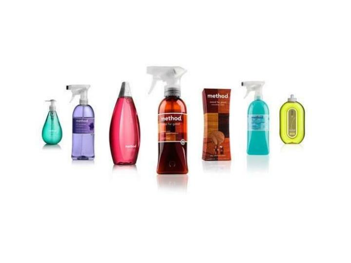
Pringles • Popularist – The man character • Unstructured and energetic – ‘Unruly’ product shot • Playful & celebratory –Harnessing special occasions eg ‘Merry Pringles’ special edition pack • Transformative – Strong colours, bold ‘X’ graphic and central taste explosion device all signal this is a range of big experiential flavour
Ben & Jerry’s • Rule breaking – Variant names (and non-food colours) that reference current/social affairs, often with tongue-in-cheek tone: would else but Ben & Jerry’s would bring politics into ice-cream?! • Involving – Conversational tone with back of pack competitions to encourage consumer generated flavours
Pepsi • Unstructured & energetic – Constantly evolving backgrounds keep design fresh and interesting • Playful & celebratory – Limited edition name for Halloween • Transformative– Often backgrounds have optical illusion effect
Red Bull • Powerful – Many cues which include: • - use of animal revered for its strength • - strong contrasting colours • - concentrated format • (implies powerful liquid within) • Ruthless – Bulls are shown in head-to-head combat • Sharp – Angular lines and constantly fighting bulls provide sense of restless energy, momentum and ‘edginess’ to design • Encouraging – Red Bull sponsored ‘extreme sports’ events enable consumers to live the competitive, ambitious, restless nature of the brand themselves
Tampax • Protective – Uppercase logo looks strong and reassuring • Protective – Delicate elements on the packaging (eg flowers, pearls etc) implicitly convey what the brand claims to protect – your femininity and freshness • Functional & resilient – Packaging also includes bold, functional claims on the effectiveness of the product
Nivea • Down to earth – Minimal design elements help position convey this as a beauty staple with no pretences • Reassuring – Old fashioned/classic crème formats eg tin/tubes – same as it’s always been • Friendly – Rounded script typography element and tin. Tin feels good in the hand and small version fits easily in handbag too
Carling • Popularist – Uses well-known English symbol of a lion, uniting its drinkers around a certain type of Englishness • Real – Use of black and white as key colour palette helps convey this is a straightforward brand that ‘tells it how it is’ • Inclusive – Product benefit conveyed as a taste all will enjoy
Perrier • Transformative – Clear bottle allows effervescence of product to shine through • Secondary pack elements (eg sleeve) give ‘watery’ optical effect • Energising – Bottle often looks cool to touch temping you with refreshing and uplifting product experience within • Other worldly – Perrier often ‘reinvents’ itself with special edition packs that are quite outlandish, celebratory and fun
Soap & Glory • Harmonious – Design unites seemingly disparate elements of 50s imagery, bold contemporary graphics and distinctive language to create coherent and consistent whole • Transformative – Shiny silver packs imply products’ ability to lift your complexion • Awe-inspiring – ‘Magic’ effects being claimed in old-style, sensational ‘headline’ manner • Intuitive – Language of claims and names demonstrate brand deeply understands feminine wiles and beauty needs
Emotion is all • Consumer + Brand • 20% Brain • 80% Heart
Emotion is all • Essential to connect quickly and intuitively with potential consumers • Emotion helps brands short-circuit more rational processing and cut through the clutter • Brands that offer compelling and differentiated emotional benefits are more powerful • Consumers think they will receive a bigger reward (eg not just a meal on the table but being recognised as a great mum) • Food and drink is probably one of the most emotional of categories as it touches the most basic human needs and drivers • Archetypes help to connect up psychology and neuroscience through the use of a profoundly emotional story • Helps us access our deepest emotional needs
Harnessing the emotional pulling power of packaging • Packaging is a key channel for emotive brand expression • Immediate • Enduring • Expressive So, when and how should you be looking at packaging? • When packaging functionality is a core part of the idea (which it often is) then it tends to be built in early • But very often it’s left until later – and the focus is on defining the need and generating ideas. But these won’t work without the great way of connecting them – and design is a good way of capturing this (rather than advertising line). Realistically, it’s more useful these days • Need to consider the communication/packaging aspect earlier. Need to ensure there is a clear integration into the whole process from the start – not added on later.
Making packaging work even harder for your brand – one final thought • 80% of Apple customers keep their packaging for 2 years or longer • Packaging is the most long lasting marketing tool. It goes on and on communicating the brand’s identity • How can one maximise the branding and marketing value of packaging – to make it more sustainable/ get more marketing impact from the same amount? • Not just about recycling etc but building in ongoing/ secondary usage • Eg recipe cards; storage containers; building blocks; entertainment; etc
Dorothy.mackenzie@dragonrouge.co.uk Telephone +44 (0)20 7262 4488 www.dragonrouge.com