Download
1 / 28
280 likes | 360 Views
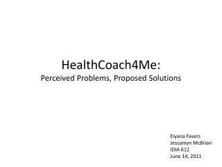
HealthCoach4Me Evaluation and Recommendations Esther Sheppard IDIA612. Home page:“Take Charge of Your Health” Activates users to take action. Patient Activation Measure. Goal: Visual simplification;. Visual Simplification. 1.

E N D
HealthCoach4Me Evaluation and Recommendations Esther Sheppard IDIA612
Home page:“Take Charge of Your Health” Activates users to take action Patient Activation Measure
Goal: Visual simplification; Visual Simplification 1 1. Three large boxes at bottom are more distinguishable then elements above.
Site has vibrant color; implies energy, success, and fun with lots of information. Users can identify with portraits. Homepage is visually too busy; hard to read/scan Healthcoach4Me.com Home page 1 2 1 1.Too much motion 2. Not enough negative (empty/quiet) space
By simplifying visual space user can find and read primary information easily Visual Simplification
Visual simplification 1 Visual Simplification 2 3 • Registration buttons have been consolidated to one prominent location. In interior pages it is a rectilinear button in similar location. • Animated squares were removed and replaced with two links to videos. “Why Register” was removed. • More negative space as well as appropriate space between lines of text makes reading and scanning easier to communicate important information.
Healthcoach4Me.com • Includes audience of older adults • Stress Management • COPD • Heart Disease • Diabetes • Medicine Audience
Goal: Navigation which is usable for all targeted age groups; Use proportional size to distance of targets 1 Navigation • The purple space between the main navigation and secondary navigation is too wide and isn’t utilized effectively. • The distance between links is too far and the targets are too small. • Result: Older adults will have a more difficult time using the site.
Navigation is usable for all targeted age groups; Proportional size to distance of targets Navigation 1 2 • Main navigation is grouped closely and larger in scale. Health Library opens to reveal Health Management and Medical Conditions categories. • My Coaching Plan slides down to accommodate two categories.
Goal: Enable users to skip repetitive navigation links Navigation
The previous animated program list opens to the same list which requires an added step to register or take a tour. Navigation
Process Flows:Animated Programs on left. Proposal on right. Home Home View all Programs Health Library Navigation Registration form Health Management Dashboard Medicine Health Library Medicine
The previous animated program list which constitutes the Health Library, has been reorganized into two categories which open to reveal linked text. Navigation 1 2 1. Icons have been removed. 2. Alternative, static, healthful happy person image Result: Navigation is in one place; links go directly to content.
Goal: Error Prevention 1 2 Error Prevention 3 1. Unnecessary space contributes to need to scroll (2).3. Text is too small and not spaced well. Result: Chunking would enable older users to register more easily
Provide clear feedback on actions; fix bug Problem with login 1 2 1. Email is already registered but doesn’t match records. 2. Password is correct 1
Registration Process 1 Error Prevention 1. Login and Register take user to one point of entry.
Login or register entry point Error Prevention User has single page to complete login process or initiate registration.
Text block is chunked to eliminate scrolling Error Prevention Separation of text block from form enables quick scanning.
Goal: Consistency and Anticipation 1 Error Prevention 2 • Registration steps let user know where they are in process • Input is in consistent location
Consistency of location of input Error Prevention 1 1. Next Step in same location.
“Start my Coaching Plan” finalizes process with “Submit” Error Prevention
“Explore” programs are redundant with health library but don’t have a clear purpose. Health Tools
Alternative proposal on home page: “Try a Health Tool” Health Tools
Health Tools: Three health tools for users to sample directly. Health Tools
Process Flows:Animated Programs on left. “Try a Health Tool” on right. Home Home View all Programs Try a Health Tool Health Tools Registration form Relaxation Activity Dashboard • Result: • Direct Access to tool • Less Frustration • Experiential information delivered • Provides broader understanding of resources on site • Interactive Health Library COPD
Recommendations: • Consider older users as guide for interface and interaction design • Simplify visual space • Simplify and reorganize navigation; utilize Fitts’ Law • Minimize vertical scrolling • Use familiar language • Organize registration for one point of entry; simplified visual field, consistency and anticipation • Reconsider goal of animated program list; use minimal selection to inform potential members of available tools with direct action and broaden their understanding of what the site offers. Additional recommendation: • Consider content inventory of all PDF’s and reorganize to inform categorizations and access.
References Athavale, A., V., (2010) Usability evaluation of two websites providing information on Diabetes. Journal of Health Informatics in Developing Countries. Vol.4 • No.2.P46. Retrieved June 1, 2011 from http://www.jhidc.org/index.php/jhidc/article/viewFile/48/82 Chisnell,D, E., Redish, J, C., Lee, A. (2006) New heuristics for understanding older adults as web users. Retrieved May 28,2011 from www.usabilityworks.net/resources/chisnell_redish_lee_heuristics.pdf De Jong, M., Van Der Geest, T., (2000) Characterizing web heuristics. TechnicalCommunication 47 pp 311-25. Retrieved May 28, 2011 from http://echo.iat.sfu.ca/library/jong_00_heuristics.pdf Hibbard, J. (2007) The elusive health care consumer: What will it take to activate patients? Retrieved May 28, 2011 from http://www.academyhealth.org/Publications/BriefList.cfm?navItemNumber=534 Koivunen, M-R., McCathieNevile, C. (2009) Accesible graphics and multimedia on the web. Retreived on May 31, 2011 from http://www.w3.org/2001/05/hfweb/heuristics.htm Nielsen, J. Ten usability heuristics. Retrieved on May 28, 2011. http://www.useit.com/papers/heuristic/heuristic_list.html Heuristics
References Paddison. C., Englefield, P., (2004) Applying heuristics to accessibility inspections. Interacting with Computers 16, pp. 507–521. Retrieved May 28,2011 from: http://www.elsevier.com/locate/intcom Randeree, E. and Rao, H.R. (2004) ‘E-health and assurance: curing hospital websites’, Int. J. Electronic Healthcare, Vol. 1, No. 1, pp.33–46. Research-based web design & usability guidelines. Retrieved June 1, 2011 from http://www.usability.gov/guidelines/ Section 508 standards guide Retrieved May 28, 2011 from http://www.section508.gov/index.cfm?fuseAction=stdsdoc#Web Tognazzini, B. First principles of interaction design Retrieved May 29, 2011 from http://www.asktog.com/basics/firstPrinciples.html Heuristics