Download
1 / 7
70 likes | 80 Views
Josephine Lester Broadstock is a data visualization expert, unleashing insights through compelling visual representations for businesses. Her expertise in data analysis and storytelling helps uncover key information quickly, enabling informed decision-making.

E N D
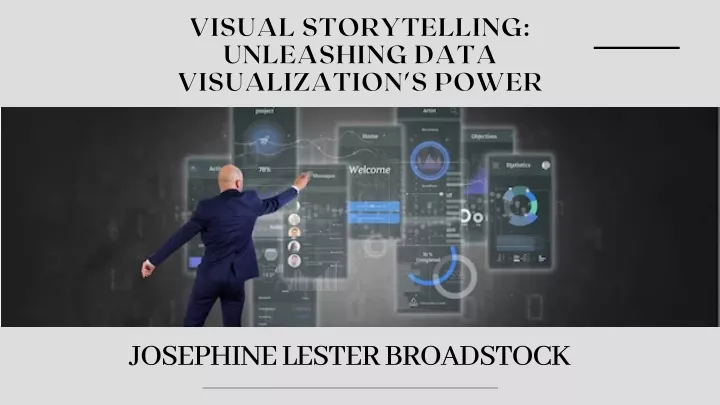
VISUAL STORYTELLING: UNLEASHING DATA VISUALIZATION'S POWER JOSEPHINE LESTER BROADSTOCK
Data visualization is essential for conveying complex information in data-driven decision-making. It combines aesthetics and cognitive principles, facilitating comprehension, pattern recognition, and knowledge extraction. Visual storytelling uncovers hidden patterns, relationships, and trends, engaging audiences and driving informed actions.
CHOOSING THE RIGHT VISUALIZATION TECHNIQUE: 1. Bar Charts and Pie Charts: Bar charts compare discrete categories, while pie charts display proportions and distribution of a whole. 2. Line Graphs: Line graphs track trends, visualizing stock market performance, weather patterns, and website traffic fluctuations. 3. Scatter Plots: Scatter plots reveal relationships and correlations between variables in scientific research. 4. Heat maps and Choropleth Maps: Heat maps display spatial patterns, while choropleth maps represent specific geographic regions. 5. Tree Maps: Treemaps visually represent hierarchical structures and proportions in data, aiding in understanding market share breakdowns.
DESIGN PRINCIPLES FOR EYE-CATCHING VISUALIZATIONS: SIMPLICITY: Maintain a clean, uncluttered design, removing unnecessary elements, and focusing on the key message. COLOR AND CONTRAST: Use strategically chosen colors to highlight information, create contrast, and ensure accessibility for individuals with visual impairments.
TYPOGRAPHY: Choose fonts that are easy to read and appropriate for the context. Use font sizes and styles that enhance legibility and maintain consistency throughout your visualization. DATA ACCURACY: Maintain transparency by accurately representing and labeling data, ensuring units of measurement, and including data sources to avoid confusion and misleading conclusions.
TOOLS AND TECHNOLOGIES FOR DATA VISUALIZATION: 1. TABLEAU: 2. D3.JS: 3. POWER BI: 4. PYTHON LIBRARIES: 5. POWER BI:
THANK YOU www.crunchbase.com/person/josephine-lester-broadstock