Download
1 / 30
300 likes | 305 Views
Statistics. Ungrouped Data. Measures of Central Tendency. Mode (MOD). The data value with the largest frequency (the one that appears the most often). A data distribution can have more than one mode, one mode, ore no mode.

E N D
Statistics Prepared by: C.Cichanowicz, March 2011
Ungrouped Data Measures of Central Tendency Prepared by: C.Cichanowicz, March 2011
Mode (MOD) • The data value with the largest frequency (the one that appears the most often). • A data distribution can have more than one mode, one mode, ore no mode. • The mode is representative of the data when there is a data value with a large frequency. Prepared by: C.Cichanowicz, March 2011
Median (MED) • The data value in the middle of the distribution. • Arrange the data in increasing order. • Odd # of data: the median is the value in the middle. • Even # of data: there will be 2 values in the middle, take their average. • The median is representative of the data when the data values are far from each other. Prepared by: C.Cichanowicz, March 2011
Mean • The average of the data. • Add all the data values together and divide the sum by the total number of values in the distribution. • The mean is representative when the data values are close together Prepared by: C.Cichanowicz, March 2011
Box-and-Whisker Plots Prepared by: C.Cichanowicz, March 2011
Box-and-Whisker Plots • A box-and-whisker plot is made up of 5 values. • The minimum • The maximum • 3 quartiles • Q2: median of the distribution • Q1 :median of the first half of the distribution • Q3 :median of the second half of the distribution Prepared by: C.Cichanowicz, March 2011
Box-and-Whisker Plots • Procedure • Arrange the data in increasing order. • Determine the median (Q2). • Determine the median of the first half of the data (Q1). • Determine the median of the second half of the data (Q3). • Draw a number line, with even spacing between numbers. Remember to consider the range of your data. • Mark with vertical lines the 5 values. (min, Q1, Q2, Q3, max) • Draw a box that connects Q1, Q2, and Q3. • Draw a line that connects min to Q1 and Q3 to max (these are the whiskers) Prepared by: C.Cichanowicz, March 2011
Box-and-Whisker Plots • Example: 40, 86, 32, 66, 87, 76, 32, 45 • 32, 32, 40, 45, 66, 76, 86, 87 Q2 Q1 Q3 Q1 Q2 Q3 min max Prepared by: C.Cichanowicz, March 2011
Box-and-Whisker Plots • The box-and-whisker plot separates the data into 4 equal parts (quartiles) ... There is 25% of the data in each part, even though it may not look like it 25% of data 25% of data 25% of data 25% of data Q1 Q2 Q3 min max Prepared by: C.Cichanowicz, March 2011
Measures of Dispersion • Range = max – min • Interquartile Range = Q3 – Q1 • Outliers: data values that are numerically distant from the others. • There is an outlier if a whisker is 1.5 times the length of a box (in the box-and-whisker plot). Prepared by: C.Cichanowicz, March 2011
Distribution Tables andHistograms Prepared by: C.Cichanowicz, March 2011
Distribution Tables • Vocabulary: • Range of a distribution = max value – min value • Frequency of a class = the number of data that belong to that class • Relative frequency = ratio of the frequency of a class to the total number of data (percentage) Prepared by: C.Cichanowicz, March 2011
Distribution Tables • To make a distribution table: • Determine the range of the data. • Divide the range into the desired number of classes (5-10, depending on the size of the data). • Each class must be the same size. • Classes must cover entire range without overlapping. • Fill in the table, with the classes in order, and determine the number of data in each class. Prepared by: C.Cichanowicz, March 2011
Histograms • Use the distribution table you make to prepare a histogram. 5 10 15 25 30 20 Prepared by: C.Cichanowicz, March 2011
Grouped Data Measures of Central Tendency Prepared by: C.Cichanowicz, March 2011
Modal Class • The modal class is the class with the largest frequency. • The mode is the middle value of the modal class. The class with the highest frequency or relative frequency is [70, 80[, so that is the modal class. The mode is 75. Prepared by: C.Cichanowicz, March 2011
Median • The median is in the class where 50% of the data falls. The median is the middle value of that class. • Add a separate column to the distribution table...the cumulative frequency. 50% of the data lies in the class [70, 80[, so the median is 75. Prepared by: C.Cichanowicz, March 2011
Mean • Determine the middle of each class. • Multiply the middle value of each class by the frequency of that class. • Calculate the sum. • Divide the sum by the total number of data values. • Determine the middle of each class. • Multiply the middle of each by the relative frequency (the percentage turned into a decimal). • Add up the values obtained, they will total the mean. Method 1 Using frequency Method 2 Using relative frequency Prepared by: C.Cichanowicz, March 2011
Mean Prepared by: C.Cichanowicz, March 2011
Samples and Sampling Methods Prepared by: C.Cichanowicz, March 2011
Choosing a representative Sample • Is the sample representative or not? • The sample must be representative of a target population. It must have as many characteristics as possible found in the target population. • Depends on the sample size and sampling method • Sources of bias • Sampling method used. • Sample not representative of the population. • A poorly formulated question. • Attitude of person conducting the survey. • Inadequate representation of the results. • Rejecting to large a portion of the sample. Prepared by: C.Cichanowicz, March 2011
Sampling Methods • Random Sampling • Each element is chosen at random. • Each element has an equal chance of being chosen. • Good when the population is homogeneous (elements have the same characteristics). Prepared by: C.Cichanowicz, March 2011
Sampling Methods • Systematic Sampling • Need a list of elements. • Each element is chosen at regular intervals Prepared by: C.Cichanowicz, March 2011
Sampling Methods • Stratified Sampling • Split population into subgroups (strata), made up of groups with the same characteristics. • Determine the percentage of the elements of each subgroup in relation to the total population (ex. 20% French, 75% English, 5% Spanish). • Elements are chosen at random from each subgroup, keeping in mind the percentages that were determined for each subgroup (ex. If a total of 20 people are to be chosen, take 4 French, 15 English, and 1 Spanish). Prepared by: C.Cichanowicz, March 2011
Sampling Methods • Cluster Sampling • It’s the subgroups of a population that are studied. • Subgroups are chosen at random (clusters). • All elements within the clusters make up the sample. Prepared by: C.Cichanowicz, March 2011
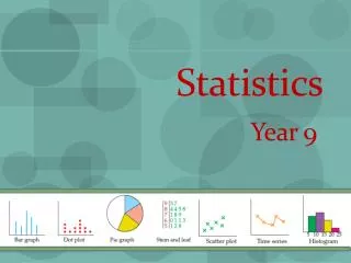
Statistical Graphs Prepared by: C.Cichanowicz, March 2011
Qualitative Data • Bar graph • Vertical or horizontal bars • Used to compare qualities • Circle Graph • Each sector represents a category • Displays percentages of a whole Prepared by: C.Cichanowicz, March 2011
Quantitative Data • Broken-line graph • Used to represent chronological data, data that changes over time. • Scatter plot • Used to see if there is a link between two aspects of a population. • Each point represents a element. Prepared by: C.Cichanowicz, March 2011
Quantitative Data • Histogram • Represents distributions of continuous data, grouped data. • Provides an overview of the distribution. • Box-and-whisker plot • Provides an overview of a distribution. • 4 groups with 25% of the data in each group. • We can see if data is symmetrical. Prepared by: C.Cichanowicz, March 2011