Download
1 / 30
300 likes | 489 Views
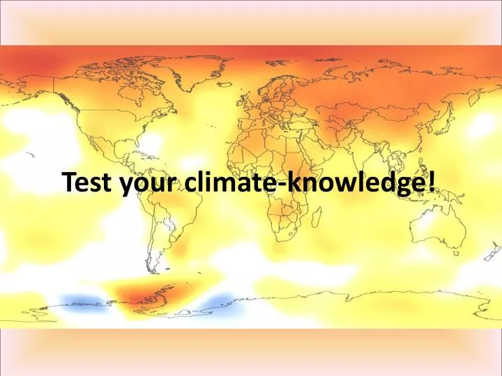
Test your climate-knowledge!. What does the coloring in the background-map show?. What does the coloring in the background-map show?.

E N D
What does the coloring in the background-map show? The colors show the changes in temperature of the past four decades in comparison to the mean temperature of 1951 to 1980. Warmer areas are shown in red, colder ones in blue. The Arctic and parts of Antarctica warmed the most. The first decade of the 21st century was warmer than the previous decade which was also warmer than the one before. Grafik: NASA-GISTEMP
Which percentage of active climate scientists say that global warming is a fact?
Which percentage of active climate scientists say that global warming is a fact?
What is the significance of the number 350? 350 ppm (parts per million) is – according to many scientists, climatologists and forward-thinking governments – the safe upper limit of CO2 in our atmosphere more information: http://www.350.org/
What types of effects are expected from a sea-level-rise of 50 cm? (more than one answer is correct!)
What types of effects are expected from a sea-level-rise of 50 cm? Many densely populated areas on Earth are found close to the coast. Infrastructure like harbors and airports will be jeopardized with just a small rise of sea-levels and adaptation measures are costly. Coastal areas will be hit harder from these climate change effects as storms and flooding can simultaneously have disastrous impacts as shown by hurricane Katrina in New Orleans in 2005. Source: Joint report from WWF and Allianz „Tipping points“ Nov. 2009http://www.wwf.de/fileadmin/fm-wwf/pdf_neu/Tipping_Points_WWF_Allianz_01.pdf
How much ice is lost on Greenland each year? From 2002 to 2003 the ice-loss on Greenland happened with a rate of 137 gigatonnes per year. Within a decade the rate of ice-loss has been more than doubled. From 2008 to 2009 286 gigatonnes were lost. source: http://www.skepticalscience.com/Visual-depiction-how-much-ice-Greenland-is-losing.html
Why is ocean acidification dangerous? (more than one correct answer!)
Why is ocean acidification dangerous? As surface waters become more acidic, it becomes more difficult for marine life like corals and shellfish to form the hard shells necessary for their survival, and coral reefs provide a home for more than 25% of all oceanic species. Tiny creatures called pteropods located at the base of many oceanic food chains can also be seriously impacted. The degradation of these species at the foundation of marine ecosystems could lead to the collapse of these environments with devastating implications to millions of people in the human populations that rely on them. The IAP also stated that, if atmospheric CO2 were to reach 550 parts per million (ppm) along its current rapid ascent from its pre-industrial level of 280 ppm, coral reefs around the globe could be dissolving. (Quelle: Skeptical Science – Ocean Acidification: Global warmings evil twin http://www.skepticalscience.com/ocean-acidification-global-warming.htm
How can “climate“ be defined best? “Climate trains the boxer but weather throws the punches.“ (Source: http://www.climatewatch.noaa.gov/2010/videos/soc2009) “Climate is what you expect, weather is what you get.“
Why is this chart titled “incomplete picture of the carbon cycle“?
Why is this chart titled “incomplete picture of the carbon cycle“? This is the complete picture: Natural land and ocean carbon remains roughly in balance and have done so for a long time. Although our output of 29 gigatons of CO2 is tiny compared to the 750 gigatons moving through the carbon cycle each year, it adds up because the land and ocean cannot absorb all of the extra CO2. About 40% of this additional CO2 is absorbed. The rest remains in the atmosphere. (source: http://www.skepticalscience.com/human-co2-smaller-than-natural-emissions.htm)
How much more CO2 is due to human activity than volcanoes? source: http://www.skepticalscience.com/volcanoes-and-global-warming.htm
What are you looking at? The graphic was first created by Tom Yulsman who publishes the blog cejournal.net. He stitched the three NASA/GISS produced panels together into one continuous horizontal graphic. Each column represents one year and each row one month. The base-period is 1951 to 1980, blue boxes represent colder temperatures, red boxes warmer temperatures than the base period‘s mean surface temperature. (Sources: http://www.cejournal.net/?p=4525 and http://data.giss.nasa.gov/gistemp/graphs/Tvs.year+month.pdf)
Thirsty for more information?Then check out this website: http://skepticalscience.com