Download
1 / 8
80 likes | 102 Views
MAKING MISTAKES IN POWERPOINT. (Never write titles in capitals only since it’s harder to read). Dont use script fonts either. (because they are very hard to read from a distance). C h o o s e y o u r co l o u r s wisely…. The default colours are the best

E N D
MAKING MISTAKES IN POWERPOINT (Never write titles in capitals only since it’s harder to read)
Dont use script fonts either... • (because they are very hard to read from a distance)
Chooseyourcolours wisely… • The default colours are the best • Too many colours look un-professional • Some colours can be very hard to read against some backgrounds • Text is even harder to read against a graduated background
Don’t add too much text… The maximum number of words you add to a slide should be 50. If you add more then the text will be too small for the people at the back to read. As a result they will give up and chat or doodle or whatever. Remember the purpose of the presentation is to act as a focus for your talk. It should be a set of subheadings to draw people’s attention to what you are saying. If you really need to give them a lot of information then put it on a printed sheet and give it as handouts. This bit is 50 words. That’s enough!
Don’t add too many bullet points • Bullet points or numbered items are good! • They keep you focused on the item. • You can change the shape of the bullet and the number style. • You can use images as the bullet. • You can make the bullets appear one at a time. • You can animate the bullet point. • You can add far too many bullet points. • Seven bullets is too many. • The more you add the smaller the text gets. • Eventually the people at the back will not be able to read the text because it will be too small. • It looks cramped with this many bullet points. • Even if you can read this from the back of the room, remember that not everyone may have such good eyesight
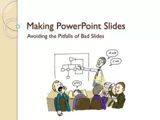
Pointless images • There’s no point in adding images just because you like the picture. • Pictures add interest but are a distraction if they are not related to the text. Animated pictures are particularly bad at this.
Don’t add too many pictures… • In general a single picture is good. It helps you get a point across. • It can be ok to add a second picture • Add many more and you lose the effect
Avoid silly animation • This one takes forever to complete and bores the viewers • Its not easy to read text which spins • …or swivels • Bouncing text gets irritating