Download
1 / 20
200 likes | 209 Views
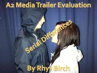
A2 Media Coursework Evaluation. Millie Harrington. IN WHAT WAYS DOES YOUR MEDIA PRODUCT USE, DEVELOP OR CHALLENGE FORMS AND CONVENTIONS OF REAL MEDIA PRODUCTS?. Main Task. Front Cover :. My magazine front cover adopts all the typical codes and conventions of a typical regional magazine.

E N D
A2 Media CourseworkEvaluation Millie Harrington
IN WHAT WAYS DOES YOUR MEDIA PRODUCT USE, DEVELOP OR CHALLENGE FORMS AND CONVENTIONS OF REAL MEDIA PRODUCTS?
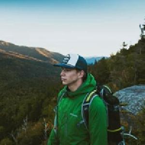
Main Task Front Cover: My magazine front cover adopts all the typical codes and conventions of a typical regional magazine. I have used an image of the location for the central image as it’s a better reflection of the region of the magazine I’m focusing on, as opposed to a person. Cover lines are very important for regional magazines to make clear to the reader with what the main article is about. I have developed this convention by increasing the font size and using circler shapes to separate the words within the cover line to draw much more attention to the main feature of the magazine –showing what is happening within the magazine. The image I used was tricky to figure out the colour scheme however to bring the image together I tried matching the colour of some of the buildings to the masthead which made it conventional. As shown in some regional magazine like my example this is a typical convention as it’ shows the cover lines and flowers are white which link to the masthead, giving it the centre of attention. In my magazine I’ve decided to have a pastel colour to point out the accent words within the cover stories. Adding a plug helps keeps the magazine conventional – so I did this by making it eye catching and bold for the reader to remember.
Main Task Contents Page: Looking at other content pages I’ve adapted to a similar layout of a regional fashion/social magazine. Columns are a typical feature in a contents page of a magazine. I’ve decided to not split these columns into categories as not all regional magazine are split into categories and by doing this will also keep the reader attention and on edge. Again to keep it conventional it’s very important to include the name of the magazine to the contents page and throughout the magazine as its shown as brand identity and it reminds the target audience of what they are reading. Its very common to place the title in one the top corners as its where the initial attention is lead when the target audience turn the page. I’ve also added the issue to keep brand recognition. Similar to the example layout I've made the page numbers big which links to the page numbers within the columns to help the audience get a better understanding of where it is and to inform them which page the main articles are on. I’ve linked the colour scheme together throughout the magazine to keep it attractive and I’ve included the issue to also keep brand identity.
Main Task Advert: My advert page has a common feature of regional magazine adverts in that the image covers the whole page, which shows off the product that is being advertised. In my case I’ve displayed a costa drink that is popular and sold regularly. The company is also based in Frome so having an advert for Costa will show brand recognition and get people interested in going. A common convention of an advert page in regional magazines is to display the logo for the brand in one of the top hand corners. However some adverts don’t apply logos but for the brand I’m doing (Costa) has its own logo so I didn’t need to create my own, so this promotes another way of brand identity. By creating an advert a typical convention is to keep it simple and not over crowd it with lots of information. Similar to other adverts, I’ve only added the businesses information like address and phone number to keep it eye catching and easy for the reader to remember. Like other advert they include a slogan of some sort – I’ve added costa slogans and by changing the ‘feel good’ to a different type of font making it fit with the words, to attract the target audience and to make them have that ‘feel good’ feeling.
Main Task Article Page: A common feature within many regional magazines including Bath Life magazines, is to have a whole page dedicated to an image relating to the article. I have decided not to apply this convention as my target audience want to see lots of image throughout my magazine, so to keep it eye catching I’ve added multiple images relating to the article. Therefore I also made the images colourful and made sure it all links to the colour scheme. Keeping the images linked I had taken images of equipment hairdressers use and image of the person doing hair and a hair design to keep the audiences attention and making sure they fixated on the article. I have added many conventions to this magazine and article. Such as pull quotes as they are commonly used in not just regional magazine's but magazine’s in general. This is a form of attracting the reader attention and keep eye catching so the reader remembers it.
HOW EFFECTIVE IS THE COMBINATION OF YOUR MAIN PRODUCT AND ANCILLARY TEXTS?
First Webpage: Homepage I’ve added my masthead to my webpage to keep a brand identity. I’ve used a formal and clear font to keep it sophisticated and easy to read which therefore appeals to my target audience. The research I collected from the questionnaire gave me the type of features my target audience would like to see on a website. As my research informed me that my target audience are interested in socialising and shopping therefore I’ve advertised a drink from one of the most popular coffee shops and images of clothes shops on CathrineHill. Images was one of the things that appealed to my target audience the most, therefore for including a gallery or a collection of images to keep it eye catching. The latest issue is advertised on the home page as it’s the main feature , there in order to promote the magazine itself I wanted a digital format that will target a different variety of people as more people are advanced into digital technology. Making it look like a realistic website I’ve added a direction bar which will take you to different types of pages on the website like how to contact us and what’s on etc. I’ve also added small slide shows and animations that feature an editors note and a feedback part. I’ve also included small circle tabs that include reviews and updates of What’s happening in Frome.
Second Webpage: Contact Page I’ve included a suggestion box so the reader can ask about the next issue and what will be included, this creates synergy between website and magazine. I want the reader to feel like they have participated in what they are reading, which will hopefully encourage them to buy the next issue. By including a view of the magazine on devices shows that its quick and easy to view and read the magazine wherever and whenever they like. Throughout my research and construction planning I discovered that it is important to keep the audience engaged and involved with the product they are buying. Therefore as the producer of my production it is important to include a section of information telling them of different ways to contact the magazine producers. For each page my masthead is shown to show brand identity – a constant relation to the magazine itself. As I found through my questionnaire that my target audience are keen users of digital technology, I’ve clearly shown how the magazine is easily accessible through digital technology.
Billboard On both my billboard and website I’ve used the masthead that features on my magazine – therefore helps maintain a brand identity. After reviewing the responses to the questionnaires, one of the main features that stood out were that the majority of my target audience use social media. This was important as a producer to keep the audience updated via social media as well as the print magazine. I’ve clearly added the popular social media websites to show as a producer that every aspect of my product will appeal to my target audience. By making it bold and clear shows that it will attract an audience instantly – by adding accent colours show that they wont forget what magazine. I have used the same image on my billboard as the one featured on the contact page on my website as this show synergy between the two ancillaries. As well as showing the products you can see the magazine on, it showing one the main articles that feature in my magazine, therefore promoting the magazine itself and the website. I wanted to make sure it all linked together as I want the audience to understand and how to engage between the two ancillaries that link to the main product.
Constructive Criticism – Main task As well as this, my teacher suggested I should change the original layout of my contents page to create a more regional look alike magazine. By adding multiple images, large text numbers and columns which involve what happens in the magazine which intrigue an audience into reading it. I took this criticism on board and my peers loved it as they enjoyed the clear and bright images that shown them which page to go to clearly. Although I was pleased with the positive feedback I received, I also received constructive criticism. This has enabled me to develop the magazine after getting a second opinion on it. Originally on my double page spread I made the main image cover half the page but a suggestion was made from my peers and teacher to change it. An idea was put forward that I should crop the image to just show the shop door which would be the main focal point.
Positive Feedback – Main Task Audience feedback is very important for the magazine industry as the audience are the deciding factor as to whether the product becomes popular or not. My main aim as the editor/producer was to appeal to my target audience, one of the ways I used audience feedback is through a questionnaire as this helped me get clear ideas of what my target audience would be attracted to. For my main task I got a lot of positive feedback especially from my teachers and peers. My teachers stated I made many links throughout my magazine through the colour scheme , showing slight light pastel colours like blues and greens. Pastel colours was an important feedback from my peers so I wanted to show I've taken it on board and learnt the importance of flow within a magazine – making each page connect.
Constructive criticism – Ancillaries Another piece of constructive criticism I received was regards to the lack of images and information on my website. Originally I didn’t have a header of my magazine name and no images on my website. I was advised mainly from my teachers that I needed to ad more information and images to bring it to life. Therefore I decided to add an introduction to my website showing what its all about and what the magazine includes every month and in the latest issue. I’ve also added images of the newest issue, shops and other social events and places. According to my research questionnaire my target audience are attracted to more Images than information. Originally my billboard had an unusual layout, as the devices were a messy layout and there was too much information clumped together. However my teachers and peers suggested to get a layout of devices already made which I found on a website called graphic burger and making sure my billboard is showing ‘less is more’. By adding less text and only the information that would stand out to my target audience meant it was more eye catching an again I added an accent colour that is show within my magazine and the colour that links with my article - now much happier with the end result.
Positive Feedback - Ancillaries Another positive comment I got back from my peers and teachers were the layout and the colour scheme and how my peers enjoy how the magazine all links together. Therefore I have learnt the importance of synergising the ancillaries with the main product. A few positive comments were made about my ancillaries. My peers who live in Frome appreciated the fact I included a positive view upon Frome by calling the magazine Frome’s ‘Finest’ – this suggest that my target audience positive and passionate about the town they live in. This shows I have truly focused and researched into what my target audience are passionate and attracted to. Overall, I carefully collected research, planned and constructed a magazine that would appeal to my target audience without letting personal opinions affect my overall production. Therefore hearing such positive feedback was very appeasing and I have learnt to trust my knowledge on codes and conventions of regional magazines.
HOW DID YOU USE MEDIA TECHNOLOGIES IN THE CONSTRUCTION, RESEARCH, PLANNING AND EVALUATION STAGES?
Research The all round main browser I used was google – before starting the main production I was not 100% clear on codes and conventions of regional magazines so google helped me with collect information to put together on my blog from codes and conventions, history of regional magazines, what content to include and who the typical target audience would be. Part of my research was looking into the institutions that publish regional magazines - I looked into MediaClash and RMC Media. They both publish regional magazines, MediaClash publish magazines like ‘Bath Life’ and ‘Bristol Life’ which are fairly local areas which I thought would be more relevant than RMC Media . I looked into their digital magazine and to take in inspiration for my own product. Another way to collect research and by using digital technology I used google forms which meant I could create digital questionnaires , which includes various answer methods like multiple choice, closed and open questions. Due to the questionnaire being online this helped me to easily distribute it directly to the people who fitted my target audience though email or shown on any device.
Planning I recorded the majority of the process and planning on my WordPress blog. Best thing about having a blog meant I could upload each part of my production to it and keeping up to date with what I was uploading and to keep a record of my progression – such as a check list and highlighting what I’ve completed. WordPress also lets you update and edit post when needed, allowing constant progress and easy to keep myself updated if any changes needed to be made to make my blog and overall production better. Allows you to see what pages and blogs you have updated and what you haven't saved or what you haven't published.
Construction I used a Sony camera to take my images, not only for my magazine but for my ancillaries too. Having my own camera than a school one meant I’d capture high quality images and a flexibility in terms of location of when to take the images. Another benefit of using my own camera meant I was familiar with the settings, knew how to capture the best lighting and effects. The editing and creating, such as cropping, brightening certain colours, and images or manipulating the shape of the photos , also create columns with different width sizes which was ideal for making the layout look as I professional as I could was done with Adobe Photoshop. I decided to use this software because I became familiar with it whilst constructing my AS product so I was able to use the skills I had learnt and develop them in my advanced production. One new software I used was wix.com which is a website software. I used this to create the two web pages for my ancillaries (Home page and Contact Page) as it was quick and easy to use, allowing me to add my own images and providing various layouts. This allowed me to advertise My production and making it look professional.
Evaluation I have chosen PowerPoint format for my evaluation as I could easily separate the questions into different slides and answer them in as much detail as possible. PowerPoint made it simple and easy for my to highlight and pick out what part of the production I am writing about, including images of my production, arrows and animations to make my evaluation clear and understandable. I used this software for my AS production, therefore another reason why I chose this software was to see my progression and to document the new skills I’ve learnt and developed. A2 Production AS Production