Download
1 / 51
510 likes | 717 Views
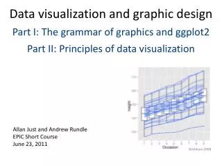
Data visualization and graphic design Part I: Principles of data visualization Part II: Advanced graphs with ggplot2. Allan Just and Andrew Rundle EPIC Short Course June 23, 2011. Wickham 2008. From your feedback:. Quick review Help with scales – practice using scales

E N D
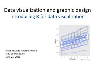
Data visualization and graphic design Part I: Principles of data visualization Part II: Advanced graphs with ggplot2 Allan Just and Andrew Rundle EPIC Short Course June 23, 2011 Wickham 2008
From your feedback: • Quick review • Help with scales – practice using scales • More practice exercises! Export for powerpoint • Bar charts • Working with dates
Building a plot in ggplot2 data to visualize (a data frame) map variables to aesthetic attributes geometric objects – what you see (points, bars, etc) statistical transformations – summarize data scales map values from data to aesthetic space faceting subsets the data to show multiple plots coordinate systems put data on plane of graphic Wickham 2009
Deducer: mapping versus setting Column of buttons switch between states These two are being mapped Remainder are set (using default settings)
Transforming in scale vscoordstat shown is Bootstrap 95% CI for mean Rescaled to log then stat was computed Stat on raw values transformed in coord Perfume use over 48 hours and urinary monoethyl phthalate (ng/ml)
I like to leave space to do my title in powerpoint Saving your output To control the size of the output Use the ggsave() function: ggsave(file, fig, height = 6.5, width = 10) defaults to 300 dpi A default powerpoint slide is 7.5" high and 10" wide Save a .ggp file to bring back into plot builder
Getting help! In R: in the JGR console → Help ?ggsave In the Plot Builder: Right-click on any tile in the top portion of the Plot Builder to get option to open the relevant ggplot2 help webpage Click on button in lower left for Deducer help page
Longitudinal data: the Oxboys dataset data(Oxboys) #anthropometrics str(Oxboys) Can we make a graph that shows individual height trajectories across visits (occasions)? How about also overlaying an overall trend smoother?
With your neighbor: Can you use Deducer to remake this plot as a 6.5" high and 6" wide file for a PowerPoint slide? The line color can be specified as (R: 51, G: 102, B: 255) ggplot() + geom_boxplot(aes(y = height,x = Occasion),data=Oxboys) + geom_line(aes(x = Occasion,y = height,group = Subject), data=Oxboys,colour = '#3366ff') ggsave("Oxboys_redrawn.png", height = 6.5, width = 6) getwd() #saves to working directory by default
Bar charts – the bad kind data(airquality) # open the plot builder and add geom_bar By default – ggplot2 expects to compute a summary for use with geom_bar. What is the default statistic used with geom_bar()? If you already have tabulated your summary you would need to switch to stat = "identity" to map to a precomputed y value. Let's say we wanted to only show the mean…
Working with dates / time series Bring in dates to R: str(as.Date("2011-06-23")) # also see ?strptime data(economics) head(economics) economics.mt <- melt(economics, id.vars = "date") head(economics.mt) Now we are going to plot: Use economics.mt as our data, use lines, x = date, y = value, Handy function from Hadley Wickham's reshape package
When we plot the new melted data frame with lines we get this – why?
By default, R will group by discrete aesthetics like color But our data can't really be shown on the same axis – what to do?
After we facet on rows (in the column box) we can open the widget for more options
Then I checked off y-axis free ; corresponds to scale = "free_y"
Sweet – stacked time series data on US economic health But the legend is redundant with the facet labels…
Here is my call. I can't do it in Deducer but in R code, I can turn off a legend, by setting legend=FALSE in the corresponding scale…
By adding, scale_color_hue(legend = F), we remove the color legend
Polishing your plots Detailed options for "the look" of a plot We already covered theme_bw(base_size = 12) The best source online for custom options: http://github.com/hadley/ggplot2/wiki/+opts()-List This was in your handout and emailed on Tuesday
In the ggplot2 book, Hadley extracts just the unemployment data. He adds presidential party using geom_rect()and labels the start of each term using geom_text()
Part I: Principles of data visualization Objectives • Why should you use a particular type of graph? • Graphs versus tables • How can theories of visual perception help you improve your graphs?
Why make a graph? Communication Tell the story of your data Discovery Your data might not show what you expected
If you paid for the top floor.... www.flickr.com/photos/sincretic/803004418/
Enjoy the view.... www.flickr.com/photos/zachvs/981254718/
John Tukey The greatest value of a picture is when it forces us to notice what we never expected to see. — John W. Tukey Exploratory Data Analysis. 1977
What is your question? Hint: usually this will be a comparison
Selecting a type of plot Replication of standard forms Outcome Predictor
Graphs versus Tables "[getting information from a table] is like extracting sunbeams from cucumbers.” Farquhar and Farquhar. Economic and industrial delusions. 1891
Semi-graphic display Brenner et al. The Lancet, 2002 edwardtufte.com
How can theories of visual perception help you improve your graphs?
How do you compare two measures? 100 samples of PM2.5 from two locations A square plot creates an expectation of comparison of equivalent measures
Let's make a square plot! data(mpg) str(mpg) How can we show whether city and highway mileage are comparable for these cars?
Some big hints… ggplot() + geom_point(aes(x = cty,y = hwy), data=mpg, alpha = 0.3, position = position_jitter()) + geom_abline(data=mpg, slope = 1.0, linetype = 3) + geom_smooth(aes(x = cty, y = hwy), data=mpg, method = 'lm', se = FALSE) + coord_equal() + scale_x_continuous(name = 'City miles per gallon', limits = c(0,45)) + scale_y_continuous(name = 'Highway miles per gallon', limits = c(0,45)) + theme_bw(base_size = 24.0)
Cleveland’s hierarchy of perceptual scales • Position along a common scale • Position along nonaligned scales • Length; Direction; Angle • Area • Volume; Curvature • Shading; Color saturation is A larger than B? Angle Area Arc length Position Length Area Cleveland and McGill. JASA 1984 .
Switching to using position as our scaleTukey's hanging rootogram Tukey, J. Statistical Papers in Honor of George W. Snedecor. T.A. Bancroft, ed. 1972
It’s all about your reference: The black outlines provide a reference to measure length/position of the blue bars or the white negative space Application of Weber's law (1860): probability of human detecting difference between two lines related to ratio of the two line lengths
What is the story of this table? Hubinger and Havery. J Cosmetic Sci. 2006
Cleveland’s Dotplot horizontal labels reordered categories use position to show <LOD Just et al. JESEE 2010 Hubinger and Havery. J Cosmetic Sci. 2006
Perception of angles:best at variation from 45˚ Cleveland. J Comp Graph Stats. 1993.
Why compare results across data subsets? Cleveland’s analysis from the Barley dataset
Picking scales: when to use a log scale Levine et al. J ClinEpi. 2010
Avoid distraction forgo "Chartjunk" – Edward Tufte Maximize the data/ink ratio
Avoid unnecessary dimensions Remember - we use depth cues to estimate real world dimensions stat.auckland.ac.nz/~ihaka/120/
Legend • Make it easy to lookup values – match the order on graph • Label your data directly when you can • geom_text() • directlabels is a package that does wonders with ggplot2 learnr.wordpress.com Made in SAS Redone in R
Explain your story in words as well "A picture plus 1000 words is better than two pictures or 2000 words" -Andrew Gelman
Recap: Designing a good scientific figure Answer a question – usually a comparison Use an appropriate design (emphasize comparisons of position before length, angle, area or color) Make it self-sufficient (annotation & figure legend) Show your data – tell its story