Download
1 / 71
710 likes | 916 Views
Lecture Unit 2 Graphical and Numerical Summaries of Data. UNIT OBJECTIVES At the conclusion of this unit you should be able to: 1) Construct graphs that appropriately describe data 2) Calculate and interpret numerical summaries of a data set.

E N D
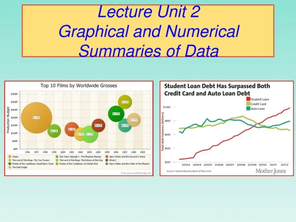
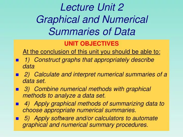
Lecture Unit 2Graphical and Numerical Summaries of Data UNIT OBJECTIVES At the conclusion of this unit you should be able to: • 1) Construct graphs that appropriately describe data • 2) Calculate and interpret numerical summaries of a data set. • 3) Combine numerical methods with graphical methods to analyze a data set. • 4) Apply graphical methods of summarizing data to choose appropriate numerical summaries. • 5) Apply software and/or calculators to automate graphical and numerical summary procedures.
Displaying Qualitative Data Section 2.1 “Sometimes you can see a lot just by looking.” Yogi Berra Hall of Fame Catcher, NY Yankees
The three rules of data analysis won’t be difficult to remember • 1. Make a picture—reveals aspects not obvious in the raw data; enables you to think clearly about the patterns and relationships that may be hiding in your data. • 2. Make a picture —to show important features of and patterns in the data. You may also see things that you did not expect: the extraordinary (possibly wrong) data values or unexpected patterns • 3. Make a picture —the best way to tellothers about your data is with a well-chosen picture.
Bar Charts: show counts or relative frequency for each category • Example: Titanic passenger/crew distribution
Pie Charts: shows proportions of the whole in each category • Example: Titanic passenger/crew distribution
Example: Top 10 causes of death in the United States 2001 For each individual who died in the United States in 2001, we record what was the cause of death. The table above is a summary of that information.
The number of individuals who died of an accident in 2001 is approximately 100,000. Top 10 causes of death: bar graph Each category is represented by one bar. The bar’s height shows the count (or sometimes the percentage) for that particular category. Top 10 causes of deaths in the United States 2001
Top 10 causes of deaths in the United States 2001 Bar graph sorted by rank Easy to analyze Sorted alphabetically Much less useful
Computer Hardware Sales 2009 ($billion) Software Sales 2009 ($billions) 1. United States $1582. China $64.43. Japan $544. Germany $24.45. Britain $23.56. France $19.37. Brazil $14.28. Italy $13.19. Australia $12.810. India $11.9 1. United States $137.92. Japan $23.43. Germany $204. Britain $16.85. France $12.66. Canada $7.37. Italy $6.38. China $5.4 9. Netherlands $5.410. Australia $4.8 NY Times
Top 10 causes of death: pie chart Each slice represents a piece of one whole. The size of a slice depends on what percent of the whole this category represents. Percent of people dying from top 10 causes of death in the United States in 2001
Make sure your labels match the data. Make sure all percents add up to 100. Percent of deaths from top 10 causes Percent of deaths from all causes
Child poverty before and after government intervention—UNICEF, 1996 • What does this chart tell you? • The United States has the highest rate of child poverty among developed nations (22% of under 18). • Its government does almost the least—through taxes and subsidies—to remedy the problem (size of orange bars and percent difference between orange/blue bars). • Could you transform this bar graph to fit in 1 pie chart? In two pie charts? Why? The poverty line is defined as 50% of national median income.
marg. dist. of survival 710/2201 32.3% 1491/2201 67.7% 885/2201 40.2% 325/2201 14.8% 285/2201 12.9% 706/2201 32.1% marg. dist. of class Contingency Tables: Categories for Two Variables • Example: Survival and class on the Titanic Marginal distributions
Contingency Tables: Categories for Two Variables (cont.) • Conditional distributions. Given the class of a passenger, what is the chance the passenger survived?
Contingency Tables: Categories for Two Variables (cont.) Questions: • What fraction of survivors were in first class? • What fraction of passengers were in first class and survivors ? • What fraction of the first class passengers survived? 202/710 202/2201 202/325
TV viewers during the Super Bowl in 2007. What is the marginal distribution of those who watched the commercials only? • 8.0% • 23.5% • 58.2% • 27.7% 10
TV viewers during the Super Bowl in 2007. What percentage watched the game and were female? • 41.8% • 38.8% • 51.2% • 19.8% 10
TV viewers during the Super Bowl in 2007. Given that a viewer did not watch the Super Bowl, what percentage were male? • 45.2% • 48.8% • 26.8% • 27.7% 10
3-Way Tables • Example: Georgia death-sentence data
Simpson’s Paradox • The reversal of the direction of a comparison or association when data from several groups are combined to form a single group.
Section 2.2Displaying Quantitative Data Histograms Stem and Leaf Displays
Relative Frequency Histogram of Exam Grades .30 .25 .20 Relative frequency .15 .10 .05 0 40 50 60 70 80 90 100 Grade
Frequency Histograms A histogram shows three general types of information: • It provides visual indication of where the approximate center of the data is. • We can gain an understanding of the degree of spread, or variation, in the data. • We can observe the shape of the distribution.
Frequency and Relative Frequency Histograms • identify smallest and largest values in data set • divide interval between largest and smallest values into between 5 and 20 subintervals called classes * each data value in one and only one class * no data value is on a boundary
Histogram Construction (cont.) * compute frequency or relative frequency of observations in each class * x-axis: class boundaries; y-axis: frequency or relative frequency scale * over each class draw a rectangle with height corresponding to the frequency or relative frequency in that class
Example. Number of daily employee absences from work • 106 obs; approx. no of classes= {2(106)}1/3 = {212}1/3 = 5.69 1+ log(106)/log(2) = 1 + 6.73 = 7.73 • There is no single “correct” answer for the number of classes • For example, you can choose 6, 7, 8, or 9 classes; don’t choose 15 classes
Absences from Work (cont.) • 6 classes • class width: (158-121)/6=37/6=6.17 7 • 6 classes, each of width 7; classes span 6(7)=42 units • data spans 158-121=37 units • classes overlap the span of the actual data values by 42-37=5 • lower boundary of 1st class: (1/2)(5) units below 121 = 121-2.5 = 118.5
Grades on a statistics exam Data: 75 66 77 66 64 73 91 65 59 86 61 86 61 58 70 77 80 58 94 78 62 79 83 54 52 45 82 48 67 55
Frequency Distribution of Grades Class Limits Frequency 40 up to 50 50 up to 60 60 up to 70 70 up to 80 80 up to 90 90 up to 100 Total 2 6 8 7 5 2 30
Relative Frequency Distribution of Grades Class Limits Relative Frequency 40 up to 50 50 up to 60 60 up to 70 70 up to 80 80 up to 90 90 up to 100 2/30 = .067 6/30 = .200 8/30 = .267 7/30 = .233 5/30 = .167 2/30 = .067
Relative Frequency Histogram of Grades .30 .25 .20 Relative frequency .15 .10 .05 0 40 50 60 70 80 90 100 Grade
Based on the histo-gram, about what percent of the values are between 47.5 and 52.5? • 50% • 5% • 17% • 30% 10