Download
1 / 70
700 likes | 801 Views
Looking Good in Print. Linda Rhodes Virginia Conference Director of Communications. Print what?. Newsletters Worship bulletins Brochures Advertising Direct Mail Flyers. Why do it?. Develop Mission Statement . Mission Statement Goals and objectives Target audiences. Key elements:

E N D
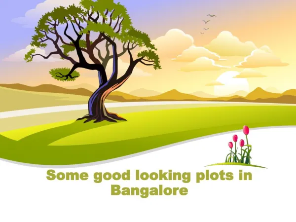
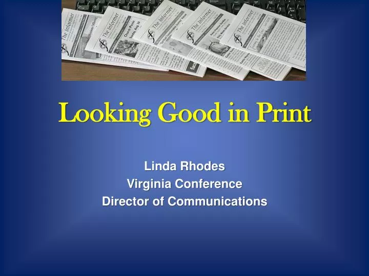
Looking Good in Print Linda Rhodes Virginia Conference Director of Communications
NewslettersWorship bulletinsBrochuresAdvertisingDirect MailFlyers
Develop Mission Statement Mission Statement Goals and objectives Target audiences
Key elements: Content Appearance Production Distribution
1. Content: a. Hard news
1. Content: a. Hard news b. Features
1. Content: a. Hard news b. Features c. Editorial/Opinions
1. Content: a. Hard news b. Features c. Editorial/Opinions d. Columns
1. Content: a. Hard news b. Features c. Editorial/Opinions d. Columns e. Events/Calendar
1. Content: a. Hard news b. Features c. Editorial/Opinions d. Columns e. Events/Calendar f. Fillers
Writing Style: Conversational
Writing Style: Conversational Simple, direct sentences
Writing Style: Conversational Simple, direct sentences 5 Ws + H
Writing Style: Conversational Simple, direct sentences 5 Ws + H Active voice
Writing Style: Conversational Simple, direct sentences 5 Ws + H Active voice Inverted pyramid
Writing Style: Conversational Simple, direct sentences 5 Ws + H Active voice Inverted pyramid Uniform style
Writing Style: Conversational Simple, direct sentences 5 Ws + H Active voice Inverted pyramid Uniform style Define acronyms
Writing Style: Conversational Simple, direct sentences 5 Ws + H Active voice Inverted pyramid Uniform style Define acronyms Inclusive language
2. Appearance: • a. Page size
2. Appearance: • a. Page size • b. Number of pages
2. Appearance: • a. Page size • b. Number of pages • c. Paper
2. Appearance: • a. Page size • b. Number of pages • c. Paper • d. Name/Flag
2. Appearance: • a. Page size • b. Number of pages • c. Paper • d. Name/Flag • e. Regular items
2. Appearance: • a. Page size • b. Number of pages • c. Paper • d. Name/Flag • e. Regular items • f. Folios
2. Appearance: • a. Page size • b. Number of pages • c. Paper • d. Name/Flag • e. Regular items • f. Folios • g. Table of contents
2. Appearance: • a. Page size • b. Number of pages • c. Paper • d. Name/Flag • e. Regular items • f. Folios • g. Table of contents • h. Typeface
Objective is to make iteasy to read. Help directthe reader
Principles of Layout/Design: Contrast
Principles of Layout/Design: Contrast Repetition
Principles of Layout/Design: Contrast Repetition Alignment
Principles of Layout/Design: Contrast Repetition Alignment Proximity
Layout: Simple, not boring
Layout: Simple, not boring Same thing in same place
Layout: Simple, not boring Same thing in same place Column width
Layout: Simple, not boring Same thing in same place Column width Type faces
Layout: Simple, not boring Same thing in same place Column width Type faces Photos/art
Layout: Simple, not boring Same thing in same place Column width Type faces Photos/art Contrast
Layout: Simple, not boring Same thing in same place Column width Type faces Photos/art Contrast Consistency
Newsletter No-No’s 1.Never underline typeset text
Newsletter No-No’s 2. AVOID ALL CAPITAL BODY TEXT. IT IS VERY DIFFICULT TO READ. EVEN ALL CAP HEADLINES ARE TOUGH.
Newsletter No-No’s 3. Don’t put two spaces after a period.
Newsletter No-No’s Don’t useso many differenttype faces in ONE newsletter that it looks like a cut-and-paste ransom note! Stick to one or two type faces. Get variety with bold, condensed and italic versions of the same type face.
Newsletter No-No’s 5. NEVER print body copy in color. (Limit printing headlines in color.) Better use of color is for rules, bullets, line art, masthead, logo, etc.