Download
1 / 31
310 likes | 425 Views
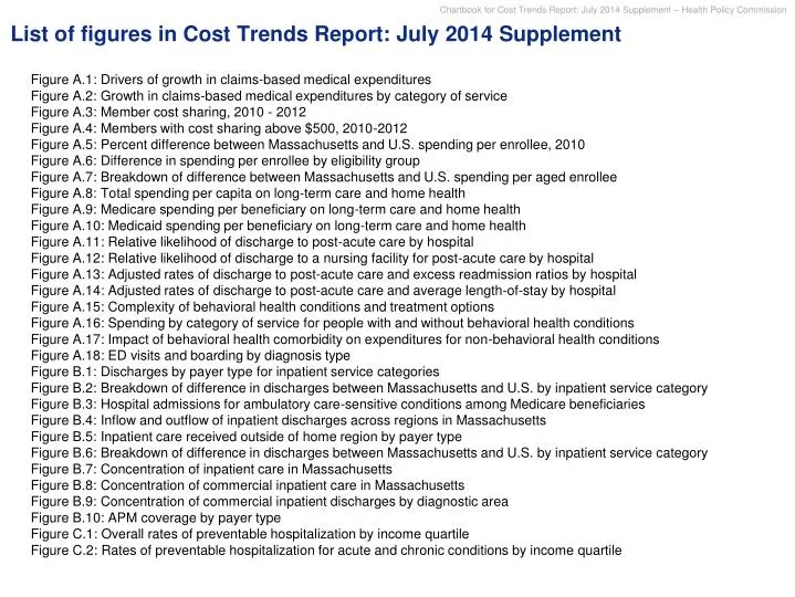
List of figures in Cost Trends Report: July 2014 Supplement. Figure A.1: Drivers of growth in claims-based medical expenditures Figure A.2: Growth in claims-based medical expenditures by category of service Figure A.3: Member cost sharing, 2010 - 2012

E N D
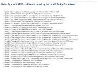
List of figures in Cost Trends Report: July 2014 Supplement • Figure A.1: Drivers of growth in claims-based medical expenditures • Figure A.2: Growth in claims-based medical expenditures by category of service • Figure A.3: Member cost sharing, 2010 - 2012 • Figure A.4: Members with cost sharing above $500, 2010-2012 • Figure A.5: Percent difference between Massachusetts and U.S. spending per enrollee, 2010 • Figure A.6: Difference in spending per enrollee by eligibility group • Figure A.7: Breakdown of difference between Massachusetts and U.S. spending per aged enrollee • Figure A.8: Total spending per capita on long-term care and home health • Figure A.9: Medicare spending per beneficiary on long-term care and home health • Figure A.10: Medicaid spending per beneficiary on long-term care and home health • Figure A.11: Relative likelihood of discharge to post-acute care by hospital • Figure A.12: Relative likelihood of discharge to a nursing facility for post-acute care by hospital • Figure A.13: Adjusted rates of discharge to post-acute care and excess readmission ratios by hospital • Figure A.14: Adjusted rates of discharge to post-acute care and average length-of-stay by hospital • Figure A.15: Complexity of behavioral health conditions and treatment options • Figure A.16: Spending by category of service for people with and without behavioral health conditions • Figure A.17: Impact of behavioral health comorbidity on expenditures for non-behavioral health conditions • Figure A.18: ED visits and boarding by diagnosis type • Figure B.1: Discharges by payer type for inpatient service categories • Figure B.2: Breakdown of difference in discharges between Massachusetts and U.S. by inpatient service category • Figure B.3: Hospital admissions for ambulatory care-sensitive conditions among Medicare beneficiaries • Figure B.4: Inflow and outflow of inpatient discharges across regions in Massachusetts • Figure B.5: Inpatient care received outside of home region by payer type • Figure B.6: Breakdown of difference in discharges between Massachusetts and U.S. by inpatient service category • Figure B.7: Concentration of inpatient care in Massachusetts • Figure B.8: Concentration of commercial inpatient care in Massachusetts • Figure B.9: Concentration of commercial inpatient discharges by diagnostic area • Figure B.10: APM coverage by payer type • Figure C.1: Overall rates of preventable hospitalization by income quartile • Figure C.2: Rates of preventable hospitalization for acute and chronic conditions by income quartile
Figure A.1: Drivers of growth in claims-based medical expenditures in Massachusetts Percent annual growth in claims-based medical expenditures*, 2010-2012 Changes in health status Overall spending growth Changes in price index Changes in utilization Increase in prices paid (may reflect unit prices and changes in provider mix) Decrease in spending at standardized prices No notable change in average risk scores from 2010 to 2012 Increase in per member per month claims-based medical expenditures +5.2% -2.1% ~0% +2.9% * Analysis is based on a sample that consists of claims submitted by the three largest commercial payers – Blue Cross Blue Shield of Massachusetts (BCBS), Harvard Pilgrim Health Care (HPHC), and Tufts Health Plan (THP) – representing 66 percent of commercially insured lives. Claims-based medical expenditure measure excludes pharmacy spending and payments made outside the claims system (such as shared savings, pay-for-performance, and capitation payments). SOURCE: HPC analysis of the All-Payer Claims Database
Figure A.2: Growth in claims-based medical expenditures by category of service Percent annual growth rate and percent of total growth in claims-based medical expenditures*, 2010-2012 • $350 • $330 • $5 • $5 2010 2012 * Analysis is based on a sample that consists of claims submitted by the three largest commercial payers – Blue Cross Blue Shield of Massachusetts (BCBS), Harvard Pilgrim Health Care (HPHC), and Tufts Health Plan (THP) – representing 66 percent of commercially insured lives. Claims-based medical expenditure measure excludes pharmacy spending and payments made outside the claims system (such as shared savings, pay-for-performance, and capitation payments). † For detailed definitions of categories of service, see CHIA and HPC publication “Massachusetts Commercial Medical Care Spending: Findings from the All-Payer Claims Database.” Lab/x-ray category includes professional services associated with laboratory and imaging. SOURCE:All-Payers Claims Database; HPC and CHIA analysis
Figure A.3: Member cost sharing, 2010-2012 Out-of-pocket spending on cost sharing*as percent of total claims-based medical expenditures† Includes co-pay, co-insurance, and deductible • 2010 • 2011 • 2012 * Out-of-pocket spending includes cost-sharing (co-payments, co-insurance, and deductibles) for medical services covered by by commercial insurance. Pharmacy spending and services paid for outside of the insurance claims system are not included. † Analysis is based on a sample that consists of claims submitted by the three largest commercial payers – Blue Cross Blue Shield of Massachusetts (BCBS), Harvard Pilgrim Health Care (HPHC), and Tufts Health Plan (THP) – representing 66 percent of commercially insured lives. Claims-based medical expenditure measure excludes pharmacy spending and payments made outside the claims system (such as shared savings, pay-for-performance, and capitation payments). SOURCE: All-Payers Claims Database; HPC and CHIA analysis
Figure A.4: Members with cost sharing above $500, 2010-2012 Percent of total members with cost sharing above $500, $1000, and $2000 thresholds* • 16.4% • 14.6% • 13.4% • ≥$2,000 • $1,000 – • $1,999 • $500 – • $999 • 2010 • 2011 • 2012 * Out-of-pocket spending includes cost-sharing (co-payments, co-insurance, and deductibles) for medical services covered by by commercial insurance. Pharmacy spending and services paid for outside of the insurance claims system are not included. NOTE: Analysis is based on a sample that consists of claims submitted by the three largest commercial payers – Blue Cross Blue Shield of Massachusetts (BCBS), Harvard Pilgrim Health Care (HPHC), and Tufts Health Plan (THP) – representing 66 percent of commercially insured lives. Claims-based medical expenditure measure excludes pharmacy spending and payments made outside the claims system (such as shared savings, pay-for-performance, and capitation payments). SOURCE: All-Payers Claims Database; HPC and CHIA analysis
Figure A.5: Percent difference between Massachusetts and U.S. Medicaid spending per enrollee, 2010 31% • Massachusetts has a higher proportion of aged and blind/disabled enrollees than average Medicaid program • Average spending per enrollee in these complex needs groups is 2.4-3.0x overall average spending per enrollee • Difference attributable to enrollment mix • Massachusetts has higher spending per enrollee than US average within each eligibility group: • Aged: +31% • Disabled: +4% • Adults: +13% • Children: +59% • Difference in spending per enrollee at comparable mix 2010 spending per MassHealth enrollee SOURCE: Centers for Medicare & Medicaid Services; HPC analysis
Figure A.6: Difference in spending per Medicaid enrollee by eligibility group Dollars per enrollee, 2010 • MA +31% • US +4% +31% +13% +59% Aged Blind/Disabled • Adults Children Total SOURCE: Centers for Medicare & Medicaid Services; HPC analysis
Figure A.7: Breakdown of difference between Massachusetts and U.S. spending per aged enrollee Dollars per enrollee, FFY 2010 • 0% • 0% • 3% • -2% • -1% • 100% • ($4,812) • -19% Institutional long-term care and home health services account for 73 percent of the higher spending per capita for the aged population • Institutional LTC • Home Health Services • Capitated • Other • Professional Services • Inpatient Hospital • Outpatient Hospital • Pharmacy • Mental Health Services • Personal Support Services • Total difference SOURCE: Centers for Medicare & Medicaid Services; HPC analysis
Figure A.8: Total spending per capita on long-term care and home health • Dollars per capita, 2009 Total long-term care and home health Nursing home +74% +72% Home health +77% Other health, residential, personal +67% US MA SOURCE: Centers for Medicare & Medicaid Services; HPC analysis
Figure A.9: Medicare spending per beneficiary on long-term care and home health • Dollars per beneficiary, 2009 Total long-term care and home health Nursing home +63% +35% • $1,005 Home health +4% Other health, residential, personal +69% US MA SOURCE: Centers for Medicare & Medicaid Services; HPC analysis
Figure A.10: Medicaid spending per beneficiary on long-term care and home health • Dollars per beneficiary, 2009 Total long-term care and home health Nursing home +29% +40% • $1,147 Home health +86% Other health, residential, personal +31% • $1,662 • $1,272 US MA SOURCE: Centers for Medicare & Medicaid Services; HPC analysis
Figure A.11: Relative likelihood of discharge to post-acute care by hospital Adjusted rate of discharge to nursing facilities and home health*, 2012 • Major teaching hospitals • Community hospitals • State • average * Rates for each hospital were estimated using a logistic regression model that adjusted for the following: age, sex, payer group, income, admit source of the patient, length of stay, and DRG. Our sample included patients who were at least 18 years of age and had a routine discharge, a discharge to a skilled nursing facility, or a discharge to a home healthcare provider. Specialty hospitals are excluded from figure and from displayed state average. Rates are normalized with the statewide average equal to 1.0. SOURCE: Center for Health Information and Analysis; HPC analysis
Figure A.12: Relative likelihood of discharge to a nursing facility for post-acute care by hospital Adjusted rate of selecting nursing facility as setting for post-acute care*,†, 2012 • Major teaching hospitals • Community hospitals • State • average * Rates for each hospital were estimated using a logistic regression model that adjusted for the following: age, sex, payer group, income, admit source of the patient, length of stay, and DRG. Our sample included patients who were at least 18 years of age and had a routine discharge, a discharge to a skilled nursing facility, or a discharge to a home healthcare provider. Specialty hospitals are excluded from figure and from displayed state average. Rates are normalized with the statewide average equal to 1.0. † Discharge to nursing facility as a proportion of total discharges to either nursing facility or home health. SOURCE: Center for Health Information and Analysis; HPC analysis
Figure A.13: Adjusted rates of discharge* to post-acute care and excess readmission ratios† by hospital Adjusted rate of discharge to post-acute care* r2: 0.03 Excess readmission ratio† • 0.00 • 0.92 • 0.94 • 0.96 • 0.98 • 1.00 • 1.02 • 1.04 • 1.06 • 1.08 • 1.10 • 1.12 • 1.14 * Rates for each hospital were estimated using a logistic regression model that adjusted for the following: age, sex, payer group, income, admit source of the patient, length of stay, and DRG. Our sample included patients who were at least 18 years of age and had a routine discharge, a discharge to a skilled nursing facility, or a discharge to a home healthcare provider. Specialty hospitals are excluded from figure and from displayed state average. Rates are normalized with the statewide average equal to 1.0 † Composite of risk-standardized 30-day Medicare excess readmission ratios for acute mycardial infarction, heart failure, and pneumonia (2009-2011). The composite rate is a weighted average of the three condition-specific rates. 1.0 represents national average. SOURCE: Center for Health Information and Analysis; Centers for Medicare & Medicaid Services; HPC analysis
Figure A.14: Adjusted rates of discharge* to post-acute care and average length-of-stay by hospital Adjusted rate of discharge to post-acute care* r2 < 0.01 Average length of stay * Rates for each hospital were estimated using a logistic regression model that adjusted for the following: age, sex, payer group, income, admit source of the patient, length of stay, and DRG. Our sample included patients who were at least 18 years of age and had a routine discharge, a discharge to a skilled nursing facility, or a discharge to a home healthcare provider. Specialty hospitals are excluded from figure and from displayed state average. Rates are normalized with the statewide average equal to 1.0 SOURCE: Center for Health Information and Analysis; Centers for Medicare & Medicaid Services; HPC analysis
Complex continuum of care that varies for each type of condition and according to condition severity Diverse set of conditions each with different set of risk factors and disease trajectory Figure A.15: Complexity of behavioral health conditions and treatment options Intensity of treatment High rate of comorbidity (medical and other BH) can complicate treatment of BH conditions Low intensity High intensity Examples focus on treatment for adults Mental illness Mood disorders Example of a continuum of care for schizophrenia Options may be limited by insurance coverage, capacity of facilities, patient preference Personality disorders Psycho-therapeutic Outpatient clinic Intensive outpatient Crisis/family stabilization Partial hospitalization Residential care Inpatient care Emergency department Psychosis/ schizophrenia Care management and coordination link care All 3 types can be part of treatment plan Anxiety disorders Psychosocial Supported employment Supported housing Club houses Recovery learning centers Family support Peer support Eating disorders Pharmacological • Thorazine • Haldol • Trilafon • Clorazil • Zyprexa • Abilify • Geodon • Invega List changes as new evidence emerges about currently used and novel compounds Conduct disorders Substance use disorder Alcohol Example of a continuum of care for alcohol dependence Options may be limited by insurance coverage, capacity of facilities, patient preference Psycho-therapeutic Outpatient counseling Intensive outpatient Partial hospitalization TSS/CSS Inpatient/ detoxification Emergency department Opioid Care management and coordination link care All 3 types can be part of treatment plan Cocaine Psychosocial Supported employment Supported housing Club houses Family support Alcoholics Anonymous Pharmacological • Naltrexone • Acamprosate • Disufiram • Topiramate List changes as new evidence emerges about currently used and novel compounds Other drug
Figure A.16: Spending by category of service for people with and with-out behavioral health conditions Claims-based medical expenditures*by category of service†, for people with and without behavioral health (BH) conditions‡, 2011 • With at least 1 BH condition • $7,313 • $19,609 • Total • $3,622 • $7,931 • No BH conditions +140% +220% • $419 • ED • $131 +125% +202% • $2,245 • $8,496 • Inpatient • $1,000 • $2,810 +80% +51% • $1,635 • Outpatient • $1,086 +279% +296% • Long-Term Care • and Home Health • $4,715 • $1,191 +49% +24% • $828 • Lab and X-ray • $668 • $3,003 • $3,516 +108% +72% • Professional1 • $1,444 • $2,045 * Analysis is based on a sample that consists of claims submitted by the three largest commercial payers – Blue Cross Blue Shield of Massachusetts (BCBS), Harvard Pilgrim Health Care (HPHC), and Tufts Health Plan (THP) – representing 66 percent of commercially insured lives. Claims-based medical expenditure measure excludes pharmacy spending and payments made outside the claims system (such as shared savings, pay-for-performance, and capitation payments). † For detailed definitions of categories of service, see CHIA and HPC publication, “Massachusetts Commercial Medical Care Spending: Findings from the All-Payer Claims Database.” Lab/x-ray category includes professional services associated with laboratory and imaging. ‡ Presence of behavioral health condition identified based on diagnostic codes in claims using Optum ERG software SOURCE: HPC analysis of the All-Payer Claims Database
Figure A.17: Impact of behavioral health comorbidity on expenditures for non-behavioral conditions Per person claims-based medical expenditures* on non-behavioral health conditions based on presence of behavioral health (BH) comorbidity†, 2012 (Commercial) and 2011 (Medicare) No chronic medical conditions 1.3x 1.1x 2.6x • With any BH condition • +$804 • +$205 • +$4,744 1.7x 1.5x 3.1x • With both MH and SUD • +$1,722 • +$1,297 • +$6,290 One or more chronic medical conditions 2.9x 1.4x 1.8x • With any BH condition • +$4,792 • +$3,907 • +$15,575 1.7x 2.7x 3.7x • With both MH and SUD • +$10,143 • +$6,183 • +$22,002 * Analysis is based on a sample that consists of claims submitted by the three largest commercial payers – Blue Cross Blue Shield of Massachusetts (BCBS), Harvard Pilgrim Health Care (HPHC), and Tufts Health Plan (THP) – representing 66 percent of commercially insured lives. Claims-based medical expenditure measure excludes pharmacy spending and payments made outside the claims system (such as shared savings, pay-for-performance, and capitation payments). † Presence of behavioral health condition identified based on diagnostic codes in claims using Optum ERG software. Expenditures for non-behavioral health conditions were identified using Optum ETG episode grouper. Additional detail is available in a technical appendix. SOURCE: HPC analysis of the All-Payer Claims Database
Figure A.18: ED visits and boarding by diagnosis type Percent of visits, 2012 • 100% • 6% • Behavioral health related diagnoses • All other diagnoses • All ED visits • Visits resulting in "ED boarding" SOURCE: Center for Health Information and Analysis; Department of Public Health; HPC Analysis
Figure B.1: Discharges by payer type for inpatient service categories • Percent of discharges in each service category, 2012 Commercial MassHealth Medicare 100% 1% Deliveries(17% of inpatient discharges) Medical(52% of inpatient discharges) Mental Health* (7% of inpatient discharges) Surgical (23% of inpatient discharges) * Discharges in general acute care hospitals. Excludes discharges in psychiatric, specialty non-acute, and chronic care hospitals. † Payer mix for discharges in general acute hospitals. Psychiatric hospitals do not report number of discharges by payer type, although in 2012 their mix of charges (gross patient service revenue) was 39 percent commercial, 30 percent MassHealth, and 32 percent Medicare. SOURCE: Massachusetts Health Data Consortium; HPC analysis
Figure B.2: Breakdown of difference in inpatient discharges between Massachusetts and U.S. by inpatient service category • Inpatient discharges* per 1,000 persons, 2011 Massachusetts residents use more inpatient care for ambulatory care-sensitive conditions than the national average • +3 • +15 • +4 • -1 • +9 • Medical • Surgical • Deliveries • Mental Health • Total * Discharges in general acute care hospitals. Excludes discharges in psychiatric, specialty non-acute, and chronic care hospitals. SOURCE: Healthcare Cost and Utilization Project, Kaiser Family Foundation, HPC analysis
Figure B.3: Hospital admissions for ambulatory care-sensitive conditions among Medicare beneficiaries, age 65-74 • Admissions per 1,000 persons • MA • Median state • 2008 • 2012 MA state rank: 37 MA state rank: 34 SOURCE: Commonwealth Fund Health System Data Center
Figure B.4: Inflow and outflow of inpatient discharges across regions in Massachusetts Number of inpatient discharges for non-transfer, non-emergency volume, 2012 -6K -1K East Merrimack Upper North Shore -9K -5K +68K Lower North Shore West Merrimack / Middlesex -1K -4K -1K Metro Boston -9K Pioneer Valley /Franklin Central Massachusetts Berkshires -7K Metro West -12K South Shore Metro South Legend -5K -2K 100K -1K Inflow* Norwood / Attleboro New Bedford -5K Fall River Outflow† 50K Cape and Islands 10K *Discharges at hospitals in region for patients who reside outside of region † Discharges at hospitals outside of region for patients who reside in region SOURCE: Center for Health Information and Analysis; HPC analysis
Figure B.5: Inpatient care received outside of home region by payer type • Percent of non-emergency, non-transfer inpatient discharges for payer type, 2012 Medicare MassHealth Commercial NOTE: Rates are adjusted for age, sex, payer group, distance from hospitals, distance from Metro Boston, and major diagnostic category. Analysis excluded individuals below 18 years of age, residents of Metro Boston, discharges with an ED visit in their record, and transfers from other acute hospitals. SOURCE: Center for Health Information and Analysis; HPC analysis
Figure B.6: Inpatient care received outside of home region by income group • Percent of non-emergency, non-transfer inpatient discharges for community income group*, 2012 Less than $35,000 $35,000 to $50,000 $50,000 to $75,000 $75,000 to $100,000 More than $100,000 * Community income is estimated as the median household income for the patient’s zip code NOTE: Rates are adjusted for age, sex, payer group, distance from hospitals, distance from Metro Boston, and major diagnostic category. Analysis excluded individuals below 18 years of age, residents of Metro Boston, discharges with an ED visit in their record, and transfers from other acute hospitals. SOURCE: Center for Health Information and Analysis; Census Bureau; HPC analysis
Figure B.7: Concentration of inpatient care in Massachusetts • Share of total inpatient discharges held by five highest-volume systems, 2009-2012 • 55% • 50% • 46% • 43% 2009 2012 2014 estimate* • 2014 estimate (after PHS transactions)* * 2014 data not yet available. Based on applying systems established by 2014 (including 2013 Partners HealthCare acquisition of Cooley Dickinson and 2014 Lahey Health acquisition of Winchester hospital) to 2012 inpatient discharge data † Includes South Shore Hospital and Hallmark Health hospitals within Partners HealthCare System SOURCE: Center for Health Information and Analysis; HPC analysis
Figure B.8: Concentration of commercial inpatient care in Massachusetts • Share of commercial inpatient discharges held by five highest-volume systems, 2009-2012 • 61% • 56% • 51% • 48% 2009 2012 2014 estimate* • 2014 estimate (after PHS transactions)* * 2014 data not yet available. Based on applying systems established by 2014 (including 2013 Partners HealthCare acquisition of Cooley Dickinson and 2014 Lahey Health acquisition of Winchester hospital) to 2012 inpatient discharge data † Includes South Shore Hospital and Hallmark Health hospitals within Partners HealthCare System SOURCE: Center for Health Information and Analysis; HPC analysis
Figure B.9: Concentration of commercial inpatient discharges by diagnostic area • Percent of commercial inpatient discharges at 5 highest-volume hospital systems in each diagnostic area*, 2012 • Share of system with highest volume • Total share of systems with 2nd- to 5th-highest volume Surgical and delivery discharges Medical discharges • Pregnancy, Childbirth • -† • 57% • Digestive System • 48% • 54% • Musculoskeletal System • -† • 59% • Circulatory System • 48% • 58% • Respiratory System • 47% • -† • Nervous System • 52% • 72% • Myeloproliferative (Cancer) • 78% • 80% * Diagnostic areas shown were selected as high-volume and/or high-expenditure service lines † Not shown because of low volume of discharges of this type SOURCE: Massachusetts Health Data Consortium; HPC analysis
Figure B.10: APM coverage by payer type • Percent of members/beneficiaries covered by APMs*, 2012 • 62%of • total lives • 22%of • total lives • 17%of • total lives 29% of members were covered by APMs across commercial, Medicare, and MassHealth populations • FFS • 66% • 76% • 81% • APMs • 34% • 24% • 19% • Commercial† • Medicare • Mass- Health * For the purpose of these estimates, we consider APMs based on the definition used in CHIA’s 2013 report on Alternative Payment Methods in the Massachusetts Commercial Market. This definition includes global budget, limited budget, bundled payment, and other non-fee-for-service models. Pay-for-performance incentives accompanying fee-for-service payments are not included in this estimate. * Includes Commonwealth Care SOURCE: Center for Health Information and Analysis; Centers for Medicare & Medicaid Services
Figure C.1: Overall rates of preventable hospitalization by income quartile* • Preventable admissions per 100,000 residents, 2012 • Lowest income quartile • 3rd quartile • 2,182 • 2nd quartile • Highest income quartile • 1,640 • 1,479 • 1,384 • 1,288 All Acute Chronic * Income was estimated using the median household income for the patient’s zip code. Preventable hospitalizations were calculated using AHRQ’s prevention quality indicator (PQI) measures. All figures are age- and sex-adjusted. SOURCE: Center for Health Information and Analysis; HPC analysis
Figure C.2: Rates of preventable hospitalization for acute and chronic conditions by income quartile* Preventable admissions per 100,000 residents, 2012 • 545 • Lowest income quartile • 441 • 3rd quartile • 2nd quartile • 375 • 370 • 356 • Highest income quartile • 324 • 313 • 307 • 309 • 306 • 295 • 264 • 247 • 213 • 212 • 209 • 209 • 189 • 180 • 155 • 151 • 144 • 140 • 109 Bacterial Pneumonia (PQI 11) Urinary tract infection(PQI 12) Dehydration (PQI 10) COPD / asthma (PQI 5, 15†) Heart failure (PQI 8) Diabetes(PQI 1, 3, 14, 16‡) Hypertension (PQI 7) Angina (PQI 13) Acute Chronic * Income was estimated using the median household income for the patient’s zip code. Preventable hospitalizations were calculated using AHRQ’s prevention quality indicator (PQI) measures. All figures are age- and sex-adjusted. † Composite of PQI 5 (COPD or asthma in older adults) and PQI 15 (asthma in younger adults) ‡ Composite of PQI 1 (short-term complications for diabetes), PQI 3 (long-term complications for diabetes), PQI 14 (uncontrolled diabetes), and PQI 16 (amputation among diabetes) SOURCE: Center for Health Information and Analysis; HPC analysis