Download
1 / 23
230 likes | 450 Views
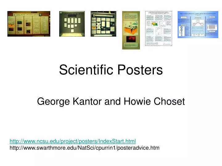
Scientific Posters. George Kantor and Howie Choset. http://www.ncsu.edu/project/posters/IndexStart.html http://www.swarthmore.edu/NatSci/cpurrin1/posteradvice.htm. Undergraduate Research Symposium (Meeting of the Minds). http://www.cmu.edu/uro/Symposium_front_page.htm

E N D
Scientific Posters George Kantor and Howie Choset http://www.ncsu.edu/project/posters/IndexStart.html http://www.swarthmore.edu/NatSci/cpurrin1/posteradvice.htm
Undergraduate Research Symposium (Meeting of the Minds) • http://www.cmu.edu/uro/Symposium_front_page.htm • April 12, 2006 deadline • Poster • Abstract
Abstract An abstract is a succintly description of your work. It should ... (1) Explain why your work is important - set the context and pre-empt the question "So what?“ (2) Describe the objective(s) of your work. What are you adding to current knowledge? (3) Briefly explain the methods. Unless the research is about methods, this should not be a major focus of your abstract. (4) Succinctly state results, conclusions, and recommendations. This is what most people want to know. Do not say "We present the results of our study and recommendations for action" - tell them what you found and recommend!
Sample Abstract from last year's ECE winner: Obstacle Map Construction from Aerial Information for Unmanned Ground Vehicle Navigation Boris Sofman Carnegie Institute of Technology Electrical & Computer Engineering Abstract My research explores techniques to significantly improve automated obstacle detection currently based on elevation data by utilizing additional sensor information such as color and signal reflectance. I exhibit methods to represent this sensor data in such a way that a learning algorithm can successfully train on a small set of labeled data in order to classify a much larger map. Additionally, I show how these algorithms can be customized for the intended vehicle's capabilities in order to create more accurate obstacle maps that can be then used for path planning.
First, middle, last thing • Summarize the work in one sentence
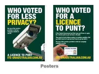
Benefits of a Poster • engage colleagues in conversation. • get your main point(s) across to as many people as possible • Posters operate on multiple levels ... • source of information • conversation starter • advertisement of your work • summary of your work
Poster vs. Talk • Tailor Presentation • Reach more people interested in specific details of your work • Engage people who might not be well versed in your work • It is there all the time • ICRA now encourages it for Undergrads!!
Second Class Presentations?? • NO!!! Take advantage of the opportunity However Hot congested rooms Concurrent with wine and cheese (socialize)
Poster Big Picture • It all starts with an ideaYou must turn that idea into a succinct message • Know your messageWhat is the ONE thing you want your audience to learn? • Focus on your message throughout the posterIf it doesn't reinforce your message, leave it out!! • Know your audience • Create an effective poster: you can use a template • Present your poster effectively • Evaluate the results
Before starting, answer • What's my message? • You must be able to state your main point(s) or conclusion(s) succintly. • All visuals and text should relate to those points and conclusions. • Who's my audience? • Specialists => OK to use jargon, acronyms, technical language (but never to intentionally hide things). • Wide-ranging => minimize jargon and simplify language. • Very general => eliminate jargon and use common terms. • How big is my poster?
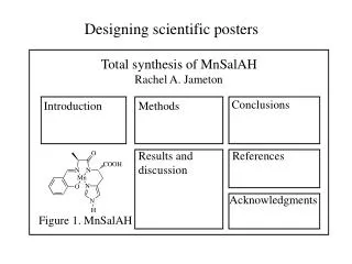
Possible Sections • Title and Authors • Abstract……NO!!!!! • Intro (problem) • Materials and Methods • Results (solution) • Conclusion • Literature Cited • Further info (and contact info)
Layout • Headings help readers find key sections - objectives, results, etc. • Balance the placement of text and graphics. • Use white space creatively to define flow of information. • Don't fight "reader gravity" that pulls eye from top to bottom, left to right • Column format makes poster easier to read in a crowd.
Graphics All Human vs. Human/Computer • Artistic ability? • Lots of time? • Mattes with construction paper – 20th century
Graphics • Graphs communicate relationships: e.g., graph’s vs. tables. • Graphs should be simple and clean • Stick to simple 2-D line graphs, bar charts, and (if you must) pie charts. • Avoid 3-D graphs unless you're displaying 3-D data. • Use photos that help deliver your message. • Use spot art - but not too much - to attract attention. Vs.
Text • Minimize text - use images and graphs instead! Keep text elements to 50 words or less. • Use phrases rather than full sentences. • Use an active voice. • Avoid jargon • Font • Use a serif font (e.g., Times) for all text - easier to read. • Sans-serif font (e.g., Helvetica) OK for titles and headings. • Size • Text should be large - at least 36 point for title panels; 24 point for text. • Text in figures should also be large. • Title should be at least two inches tall.
Color • Use a light color background and dark letters for contrast. • Avoid dark background with light letters - very tiring to read. • Stick to a theme of 2-3 colors, no more. • Overly bright colors will attract attention, but wear out readers' eyes. • Consider people who have problems differentiating colors - one of the most common is an inability to tell green from red.
Edit and Evaluate • Edit! Edit! Edit! to reduce text. • If it's not relevant to your message, remove it! • Have colleagues comment on drafts. Print a small version and circulate for comment, or hang a full-size draft with pens and invite them to critique. • Evaluate your work – use form we suggest • Are your objective and main message obvious? • Will readers be able to contact you?
Evaluation Poster Evaluation Building the Future Presenter __________________________________________________ Poster Title_________________________________________________ Evaluator __________________________________________________ Overall Appearance Cluttered or sloppy appearance. Gives the impression of a solid mass of text and graphics, or pieces are scattered and disconnected. Little white space. Pleasant to look at. Pleasing use of colors, text, and graphics Very pleasing to look at. Particularly nice colors and graphics. White Space Very little. Gives the impression of a solid mass of text and graphics. OK. Sections of the poster are separated from one another. Lots. Plenty of room to rest the eyes. Lots of separation.
More Evaluation Text / Graphics Balance Too much text. The poster gives an overwhelming impression of text only. OR Not enoughtext. Cannot understand what the graphics are supposed to relate. Balanced. Text and graphics are evenly dispersed in the poster; enough text to explain the graphics. Text Size Too small to view comfortably from a distance of 1-1.5 meters. 0.5 Main text OK, but text in figures too small Easy to read from 1-1.5 meters Very easy to read. Organization and Flow Cannot figure out how to move through poster Implicit. Headings (Introduction, Methods, etc.) or other device implies organization and flow. Explicit numbering, column bars, row bars, etc.
More Evaluation Author Identification None. Partial. Not enough information to contact author without further research. This includes missing zip codes on addresses Complete. Enough information to contact author by mail, phone, or e-mail without further research. Research Objective Can't find. Present, but not explicit. Buried at end of "Introduction", Background", etc. Explicit. This includes headings of "Objectives", "Aims", "Goals", etc. Main Points Can't find. Present, but not obvious. May be imbedded in monolithic blocks of text. Explicitly labeled (e.g., "Main Points", "Conclusions", "Results"). Summary Absent "Summary", "Results", or "Conclusions" section present
Presenting your poster • Arrive early at the display site. • Unless you're confident the organizers will have proper supplies • Hang your poster square and neat. • Bring copies of a handout for your readers. • Consider leaving a pen and pad inviting comments from viewers. • Make sure you're at your poster during your assigned presentation slot. • Have a 3-5 minute presentation prepared for people who ask you to walk them through the poster. • Don’t read the poster
Internet Sites • George Hess & Leon Liegel Effective Poster Presentation Site http://www.ncsu.edu/project/posters/, visited 2004 Jan 22. • Kathryn Tosney's Effective Poster Presentation Site (U. Michigan) http://www.biology.lsa.umich.edu/research/labs/ktosney/file/PostersHome.html, visited 2004 Jan 22. • Society for Industrial and Applied Mathematics http://www.siam.org/siamnews/general/poster.htm, visited 2004 Jan 22. • Edward Tufte's Web Site (focus on visualizing data) http://www.edwardtufte.com/tufte/, visited 2004 Jan 22.http://www.biology.lsa.umich.edu/research/labs/ktosney/file/PostersHome.html
How to Books • Books and Articles Block, Steven M. 1996. Do's and dont's of poster presentations. Biophysical Journal 71: 3527-3529. • Briscoe, Mary Helen. 1996. Preparing Scientific Illustrations: A Guide to Better Posters, Presentations, and Publications. Springer, New York. • Davis, Martha. 1997. Scientific Papers and Presentations. Academic Press, New York. • Gosling, Peter J. 1999. Scientist's Guide to Poster Presentations. Kluwer Academic Press, New York. • Harms, Michael. 1995. How to prepare a poster presentation. Physiotheraphy 81(5): 276. • Hess, George R. and Elizabeth N. Brooks. 1998. The class poster conference as a teaching tool. Journal of Natural Resources and Life Sciences Education 27: 155-158. • Liegel, Leon H. and Delbert Thompson. 1989. Poster presentations for scientific meetings. Journal of Agronomic Education 18: 69-75. • Nicol, Adelheid A. M. and Penny M. Pexman. 2003. Displaying your findings: a practical guide for creating figures, posters, and presentations. American Psychological Association, Washington, DC. • Teixeira, Art. 1997. Preparing posters for technical presentations. Resource 4(4): 15-16. • Tufte, Edward. 1983. The Visual Display of Quantitative Information. Graphics Press, Cheshire, CT. • Tufte, Edward. 1995. Envisioning Information. Graphics Press, Cheshire, CT. • Tufte, Edward. 1997. Visual Explanations: Images and Quantities, Evidence and Narrative. Graphics Press, Cheshire, CT. • Wheildon, Colin. 1995. Type and Layout. Strathmoor Press, Berkeley, CA. • Woolsey, J.D. 1989. Combating poster fatigue: How to use visual grammar and analysis to effect better visual communication. Trends in Neurosciences 12: 325-332.