Download
1 / 37
380 likes | 511 Views
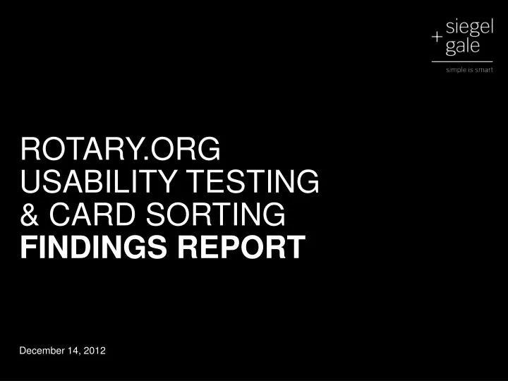
ROTARY.ORG USABILITY TESTING & CARD SORTING FINDINGS REPORT. December 14, 2012. Purpose. E valuate the navigation, labeling and interaction design proposed for Rotary.org with relevant audiences around the world.

E N D
ROTARY.ORG USABILITY TESTING & CARD SORTING FINDINGS REPORT December 14, 2012
Purpose Evaluate the navigation, labeling and interaction design proposed for Rotary.orgwith relevant audiences around the world. Investigate and adjust early to confirm the site supports the intended purpose and perception.
A two-track approach for this round of usability testing Face-to-Face Usability Sessions Task-based, think-aloud protocol where users are assigned simple, relevant tasks and they describe their experience, confusions, anticipated behaviors and overall impressions of the prototype while using the site to accomplish those tasks. Moderated in English Approximately 45 minutes each session One-on-one, face-to-face sessions, (a few dyads)
Atwo-track approach for this round of usability testing (cont’d) Card Sorting Card sorting is a simple technique where we identify navigational categories or concepts and then subject experts or “users” organize the content items into the groups that make the most sense to them as the target audience. Available in English, French, German, Italian and Spanish Self-running Online
Participants 105 Total Usability 15 Europe 23 Malaysia 18 USA Card sorting 49 Europe Representing • Prospective New Members • Rotaractors • <5 yrs Rotarians • District Governor/Elect • Assistant Governor • District President, Future Vision • District Foundation Committee Chair • District Foundation Chairman • Trainer • President/Past President • Editor • Executive Secretary • Regional Public Image Coordinator • Nominating Committee Chair Bangkok Bangladesh Ecuador France Germany Guiana Hong Kong Indonesia Israel Italy Malaysia The Netherlands Nepal Pakistan Philippines Russia Singapore Spain Taiwan Thailand USA
Key findings The site—the home page in particular—does not convey Rotary’s global breadth or local opportunity. • Understanding Rotary’s global and local impact was important to all participants, particularly in Our Impact and Get Involved, but participants could not easily find this information. • A number of people wanted a club finder or a zip-code based tool to be persistently available. While the map on the home page may provide this, it was often overlooked or misunderstood. • Participants navigated via content as well as formal navigation. The home page image was the first thing to catch attention; participants perceived that the organization was focused on one type of activity, audience and location—in this case, based abroad—potentially hindering exploration.
Key findings The formal navigation needs to be simpler for novice* users, but remains efficient for experienced Rotarians. • It was difficult to understand what would be protected or personalized based on authentication. • Experienced Rotarians liked the detailed options in the deep roll over menus and Rotarians thought the navigation is a vast improvement over the current site. Still, they unanimously agreed that prospects should have a simpler view. • Novice users were overwhelmed with the amount of information and options on the roll over menus and on the category level pages. Details such as Trustee Chair, Rotary Radio, Recurring Gifts, Campaigns, Regional Magazines for example, contributed to this perception. *Novice users include Prospective Rotarians, Rotaractors and Rotarians that had less than 5 years experience.
Key findings The prototype emphasized service over fellowship, funding and news. • The Our Impact page offered the most balanced perspective. • Participants got a sense of the service projects Rotary supports. The six big areas, easily identified in Europe in particular, were considered standard, “nothing unusual.” • Polio stood out as different from the rest, based on the level of detail and it’s historical significance rather than present impact. • It was unclear what the role and value of clubs are. • Give buttons were virtually invisible except on the Our Impact page. • Most Prospects had difficulty finding scholarship, grant and exchange opportunities and events.
Key findings Participants liked direct invitations to volunteer time and donate money, but the prototype does not explain how or why to become a Rotarian. • Few were left with a strong understanding of what it means to be a Rotarian. • Only experienced Rotarians cared about the distinction between Rotary International and Rotary Foundation (which many described as the difference between service and fellowship vs. donating). • Prospects wanted information about the values of the organization, service projects and how money is spent before taking any action. • Both Rotarians and non-Rotarians wanted to be able to designate donations to specific causes.
Key findings Novice users are unlikely to register based only on local opportunities and opportunities to connect. • The integration of protected and public content was confusing in part because protected information was visible to all. Protected contents should be organized into a separate and distinct location that is easy to access. • Experienced Rotarians sign-in for business need or role responsibilities. • Many Rotarians use social tools to conduct Rotary business. Some Rotarians want to be able to separate Rotary business from personal sharing (I may like my Rotarian colleagues but I wouldn’t share a photo from my recent trip to the beach with them). • The prototype failed to explain the value of a proprietary Rotary social network or dynamic content.
Key findings Search results continue to be a focal point of the experience. • Search, rather than formal navigation, is often the first choice for navigating to targeted information. • Participants expect Google-like ease of use, performance and accuracy. • Those who explored the search results page like the implied, Kayak-like filtering.
Key findings Clarify language. Minimize jargon and when necessary, explain it. • Some labels were vague and therefore confusing, including Connect, Community Marketplace, Affinity Fellowships, Groups and Financials. • There is a lot of confusion between Our Impact, Get Involved and Connect. • Other terms or labels were considered to specific and therefore irrelevant for example, Paul Harris (rather than Our founder) or Rotarian (rather than member), US club insurance. • Some terms that are familiar, even important, to Rotarians are confusing to Prospects and need to be explained, such as Clubs, Rotoractors, Interactors, RYLA, RAG, Ambassadorial scholarship. • In some cases icons could serve as a useful (language agnostic) explanation.
How did it resonate*? Informational Everyone said Interesting Simple Accessible Extensive Organized Well structured Sensitive Easy to use Intuitive Moving Inspirational Informative *We asked many participants to provide three adjectives to describe their perception of the prototype experience upon completion of the evaluation.
How did it resonate*? Informational Rotarians also said Interesting Simple Accessible Extensive Organized Well structured Sensitive Easy to use Intuitive Moving Inspirational Informative *We asked many participants to provide three adjectives to describe their perception of the prototype experience upon completion of the evaluation.
How did it resonate*? Informational Prospects said Interesting Simple Unclear Accessible Extensive Organized Well structured Sensitive Easy to use Intuitive Outdated Moving Inspirational Complicated Informative *We asked many participants to provide three adjectives to describe their perception of the prototype experience upon completion of the evaluation.
Homepage Most participants thought this image meant Rotary is focused on poor people in Africa. It makes Rotary seem far away, though it evokes some emotion. Show Rotarians in action instead. The “role-based” roll over on the home page was considered useful but the placement is distracting and should be changed. The “What is Rotary” description was considered too vague. The map functionality is appreciated. Most participants assumed the projects, clubs, offices and events would scale with zoom tool. The city or region entry field gets lost and some participants didn’t notice they had the ability to type content in the entry field. Some suggested auto type and ability to enter zip code or club number. The relationship between the quick links and map was confusing and should be clarified. 03 05 01 04 02 06
Masthead and Footer 07 08 09 10 11 Most participants used the logo to get Home though some preferred a home button. A number of participants felt the site name “Rotary” is vague and inaccurate; Rotary International or Rotary Foundation was preferred by members. Search is often the first thing participants tried when asked to look for specific items. Participants often mentioned Google when describing expected functionality. Participants found Region/Language functionality understandable, but the functionality and layout of the page was confusing. Sign in/Register is easy to find and use. Many participants expected this to link to Member Access or Personalized Member Resources. Give was frequently overlooked and should be placed in context of a Service Project or within Member Resources. Most participants wanted to “know how the money will be used, before I make a donation.”
About Rotary 12 19 17 13 14 16 18 15 Most participants methodically explored the navigation from left to right. Perhaps because of this, many participants investigated About Rotary before doing anything else. The detail within Mission & Values was valuable to Rotarians but too refined for non-Rotarians. Leadership thought Why Rotary, Mission & Values was useful in “legitimizing” the Rotary Organization to non-Rotarians and interesting for Rotarians. History was considered useful background information for all. Some items are too detailed or specific for non-Rotarians. Many participants felt Visitor Center, Research and Rotary Radio were “out of place”. Some Rotarians said Rotary Foundation should be placed under Who We Are not at the same level. Interest in Rotary Foundation varied depending on role or experience, with Governors and District Foundation Chairs appreciative of the call out and others apathetic. Partners as a descriptive label was confusing. Some suggested that it be a call to action like Partner With Us or felt it should be listed under Get Involved. Participants considered Financials critical but the label was considered confusing. Many suggested Annual Reports. Contact Us is considered unnecessary in the primary navigation. Most participants expected to see it in footer. The informational teaser is overlooked and didn’t add value during usability testing. 21
About Rotary Sometimes the copy in the feature area did not relate to the image, generating some irritation. Few participants noticed the breadcrumbs, but those that did, appreciated it. Both Rotarians and non-Rotarians wanted less text and more images on this page. Rotarians enjoyed having well organized options and easy access to detailed information, but non-Rotarians were overwhelmed. Few participants noticed the Rotary Foundation information on this page though the Subheading generated a few “good, good” comments.Experienced Rotarians liked information about the foundation but considered it too much detail for the general public in the navigation. Participants considered Partners information out of place. It could be moved to “Get Involved” or “Take Action”. Financial information was very important to all participants. The page should be designed so Financials draws the same attention as Mission, Leadership and History. Most participants assumed or hoped social tools enabled them to follow, not share, on category level pages. Role/Goal tool was considered “cool” and “helpful” but many did not see themselves in the list. 20 21 26 22 23 27 28 24 25
Our Impact 30 31 32 33 34 Participants expressed some confusion between Our Impact, Get Involved and Connect both before and after the roll over navigation was exposed Many participants like the Our Impact nomenclature stating that it expressed results not just activities. The information within this section of the site generally meets expectations as expressed during both usability testing and card sorting. Community or local information was important for all participants. It was unclear that the areas of focus applied to local service projects. Most assumed they were unrelated. Even though there is great pride in the Polio work Rotary has done, some participants considered it “the past, not the future” or felt it should be a subset of Fighting Disease. Non-Rotarians understood that Developing Leaders was a service area for Rotary. Some Rotarians didn’t consider Developing Leaders a service area but rather part of the Club experience/responsibility. Regardless of background most participants felt links to tertiary navigation (Scholarships, RYLA, etc.) was too detailed. Non-Rotarians were very confused by terms like Rotaract clubs and Interact clubs. The six service areas were easy to understand and were considered common. Some participants wanted items organized by impact or urgency suggesting that Saving Mothers & Children “needs to happen” before others.
Our Impact Participants appreciated being able to see visuals of the service projects and liked the overall layout of this page compared to About Rotary. It was understood that more information could be found on subsequent pages and many expressed they would want or need that level of detail before taking action. All participants like the options to Volunteer or Give describing it as easy, clear, and “good options”. Many participants were curious why Developing Leaders was designed to be different than the rest of the service categories. It was unclear to both Rotarians and non-Rotarians for example if Rotary Youth had on impact on developing leaders or if it was an internal program that had an impact on local or global communities. 35 36 37 38
Get Involved 39 40 43 42 45 44 41 Many participants like the Get Involved nomenclature, stating that it was a good call to action. During both usability testing and card sorting, they expressed that this information met expectations but many participants also felt the content was redundant with Our Impact. Participants unanimously liked the simple, “give time, give money” options. Rotarians pointed out that this section should also tell people how to become Rotarian and about student exchange programs and scholarships. Rotarians and non-Rotarians like the conversational tone of the Join Us invitation. A few Rotarians explained that it was as easy as joining Rotary. Other felt the terms was addressing “outsiders” appropriately. Most participants were confused by Become a Partner but once explained (or possibly explored more), it made sense. Many participants read the list of service areas as a checklist that led to the Give Now button below. They like the ability to designate areas before donating, but Rotarians felt the list was not reflective of their needs or requirements for giving. Few participants noticed the Give Now button on their own. Participants who visited this page like the options with the exception of recommended amounts, which made Europeans and Asians uncomfortable: “its useful, but pretty bold”. The More Giving Options section did not resonate as well with Rotarians as other options in the roll over menus. It was considered to be unnecessary at this point.
Get Involved Overall, participants considered the Get Involved page clear though text heavy and unexciting. Some items under Volunteer Your Time were considered misplaced, including Attend Our Convention and Apply for a Grant; neither were considered volunteer opportunities. Participants considered Give Now to be self explanatory. Some wanted more of this simple options revealed immediately format, particularly non-Rotarians. 46 47
News & Media 48 53 49 51 52 50 All participants were interested in local and global stories, but the listing of articles on the roll over navigation was considered unnecessary or overwhelming. It was expected that News & Feature stories would be displayed on the homepage as well as having an archive with this section. News & Stories are considered highly relevant in Our Impact and Get Involved also. Announcements were assumed by Rotarians to be information about organizational change or process. Many felt this was useful but could be rolled into a single “new” archive with labels or tags, such as announcements. Some participants learned from placement in the roll over menu that Rotary offered a variety of Magazines. As with News and features, it was considered unnecessary to list the specific magazine in the menu. Few participants expressed a need or interest in campaign materials outside of the descriptions service areas or service projects. Most participants did not see a need for a link to social site when share/follow functionality is already displayed in the right column of most pages. Many participants were confused by the term Press Center in News & Media explaining that all the material listed here would also be necessary in Press Center.
News & Media As on the roll over menu, the Press Center seemed redundant with the News & Media section, but Rotarians who served as Public Image Coordinators really appreciated top left placement. Participants also considered the Photos, Videos & Audio section to be redundant with the archive in a Press Center. They expected photos and videos to be available throughout the site as useful and relevant for storytelling. Some participants also liked the option to view all photos or videos sequentially. Announcements & Alerts were valued. Many participants expected to continue getting this information via social media feeds and email newsletters but also wanted the ability to sort, filter and archive. 54 56 55
Connect 57 58 59 60 62 63 61 The label Connect was confusing for many and should be reconsidered. My Rotary was not expected in a section called Connect. Most Rotarians thought they were already in My Rotary when they logged in. Rotarians considered My Rotary (as implied by the list beneath the header) to be useful and interesting. Non-Rotarians did not understand what Clubs were and wanted an introduction before jumping to connect with them. Rotarians understood the concept of clubs but expected to be able to find club information from the Home Page and near options to Get Involved or learn about Rotary. Few non-Rotarians understood the difference between Clubs and Groups. Rotarians were confused by the label and by the “mixed bag” of items that fell within that section. The term Affinity Fellowships was not understood by most participants. Ambassadorial Scholarships was also considered confusing and misplaced as part of Groups. Fewer than a handful of participants were able to accurately guess the type of information that would be on a page called Community Marketplace.
Connect Most participants were surprised to see My Rotary as the primary content featured in Connect, but they liked the idea of having personalized / localized content. Upon seeing Connection Activity, many participants shared stories about their activity (for personal, club or district business) on Facebook, LinkedIn, Twitter and Google Groups, Calendar and Drive. One participant said she would prefer to keep her Rotary business separate from the sharing tools offered on standards Social Media services. Rotarians wanted the Club Finder to be universally available in the header or footer. Finding a club is a very common task. Non-Rotarians also wanted to find local information including local club (once they understood the role of a Club) via zip code entry. 66 64 65
Member Resources 67 68 73 69 70 71 72 Rotarians highly valued the information presented in Member Resources. Non-Rotarians understood what was presented but did not see significant value for themselves other then one or two who felt it showed “what’s under the hood”. Rotarians are very interested in training and wanted to be able to easily locate manuals by role and by topic. This high level organization in the Learning & Reference section was on target. As on other roll over menus the third level of detail was considered by all to be overwhelming. The title This Year in Rotary was very appealing to Rotarians as was the content listed within. Rotarians were very interested in seeing event information but felt the third level of information was premature at this level of navigation. Rotarians considered the content listed within Conduct Rotary Business to be useful but many felt it could be combined with Learning & Reference as one is the outcome or daily activity as a result of the other. Travel and Expenses needs further explanation. Many expected this to be included in a section called forms or downloads. A few participants understood that there were more extensive travel services offered by Rotary. The label Products & Services was confusing for many and should be reconsidered. US club insurance was considered confusing or even frustrating for European and Asian participants. Seeing a section dedicated to website templates generated a lot of Rotarian enthusiasm. Most expected a complete template library not just digital tools.
Member Resources Rotarians felt this page was a vast improvement compared to the current Member Access. They found this page much more transparent and anticipated it would make it easier to find information. The order of items on this page should be re-evaluated. For example, some participants felt Grants was not the most important topic compared to Club Administration. Content may be more personalized on the live site. Learn by Topic was of great interest to participants. Many thought this area would help them find highly desired information that would help them become proficient in their Rotary responsibilities. 73 75 74
Background Why you only need to test with5 participants: Jakob Nielsen's Alertbox, March 19, 2000
How did it resonate*? Informational Everyone said Interesting Simple Accessible Extensive Organized Well structured Sensitive Easy to use Intuitive Moving Inspirational Informative *We asked many participants to provide three adjectives to describe their perception of the prototype experience upon completion of the evaluation.
How did it resonate*? Informational Rotarians also said Interesting Simple Accessible Extensive Organized Well structured Sensitive Easy to use Intuitive Moving Inspirational Informative *We asked many participants to provide three adjectives to describe their perception of the prototype experience upon completion of the evaluation.
How did it resonate*? Informational Prospects said Interesting Simple Unclear Accessible Extensive Organized Well structured Sensitive Easy to use Intuitive Outdated Moving Inspirational Complicated Informative *We asked many participants to provide three adjectives to describe their perception of the prototype experience upon completion of the evaluation.