Download
1 / 38
380 likes | 544 Views
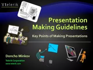
http://schoolacademy.telerik.com. Presentation Making Guidelines. Key Points of Making Presentations. Doncho Minkov. Telerik School Academy. http://academy.telerik.com. Technical Trainer. http://minkov.it. Table of Contents. Clearing the Idea Collecting the Information Getting Started

E N D
http://schoolacademy.telerik.com Presentation Making Guidelines Key Points of Making Presentations Doncho Minkov Telerik School Academy http://academy.telerik.com Technical Trainer http://minkov.it
Table of Contents • Clearing the Idea • Collecting the Information • Getting Started • Formatting the Content • Styling of the Content • Using PPT Templates • Decorations • Tips and Tricks • Summary
Clearing the Idea What to Include? What to Exclude?
Clearing the Idea • Use mind mappings • Draw a circle • Write the topic • Draw more circles • Connect with the first • Select the most relevant circles • Remove the rest Smth Smth Topic Smth Smth
Arranging Styling Making Presentation making Collect Research Before Clear the Idea Mind mapping
Clearing the Idea (2) • At the end you should have something like a Table of Contents • Or at least a blueprint, something to begin with • Mind mapping software • FreeMind • iMindMap • Etc…
While Clearing the Idea Know your audience! Remember the complexity How detailed should it be?
Google Colleagues Collecting the Information How to do it? Books Blogs
Getting Started Table of Contents (mind map) Bunch of materials What we have so far?
Getting Started • You should make sure that your presentations are well structured, organized and consistent • Not a random list of bullet points with no logical order
Formatting the Content How to Format the Information?
Key Principles Key principles of presentation creation Use as large fonts as possible Keep the sentences short Use high contrast colors Keep the text on slide small
Example of Bad Presentation Hello! My name is Doncho Minkov and today we will talk about HTML Fundamentals. We will see the basics of the Hyper-Text-Markup Language and will explain what is a tag in HTML, the parts of a HTML document, and some of the tags…. <a> this is the tag 'a'. 'a' comes from anchor and this tag is used for redirecting from one HTML document to another… bla bla bla
Avoid "all words slides" Arrange text into bullet points Content Formatting Keep lines up to 7 (+/-2)for a slide Limit the bullet points to 4-8
Content Formatting (2) When too much text on a slide The audience starts readingand notlistening Less flexible for the speaker The audience could fall asleep
Arranging the Content The title is not fully corresponding with the content • Example of a bad slide This could be split into at least four bullet points (4 sentences)
Arranging the Content • Can be easily transformed in two slides
Styling of the Content What Background, Font and Colors to Use?
Use contrast background and foreground! or Dark background andlight foreground? Light background and dark foreground?
Example of a Badly Selected Background and Colors • Can anything be seen? • Hardly • Image if the sun is lighting the screen • This looks much better! • But generally this background is too fancy
Large Consistent Font Contrast to the background Use commonfont faces Gives impression of professionalism
Example of a Badly Selected Font • What if I choose such a Font? • Does it look Good? • Does it look good? • Does it look good? • Does it look good? • Does it look good? • Does it look good? • No it doesn't!
Avoid Fancy Colors! • Sample text with different colors • This is an example how not to use colors • This is an example how not to use colors • This is an example hownot to use colors • This is an examplehow not to usecolors • Sample text with non contrast colors • This is an example how not to use colors • This is an example how not to use colors • This is an example how not to use colors
Using PPT Templates Build-In and Professional Templates
What is a PTT Template? • This is a ready template for your presentations • Defined font colors and faces • Defined places for the titles, contents, etc. • Defined background • Etc. • Sometimes it is a good idea to use templates • Not all ready templates are good • Spares you thinking of the right colors • They are made by designers
PowerPoint Templates • There are some built-in templates • But can also be downloaded from the web • Examples of free PPT templates: • http://www.presentationpoint.com/powerpoint-templates/ • http://www.templateswise.com/
Styling the Content Live Demo
Decorations It is Almost Over
What to decorate? • Title slides • Contents slides • In all empty places of the presentation
Final Touches (2) • The pictures/images should not be random • This only makes the presentation more distracting • The pictures should be connected with the subject • i.e. if the title is "C# OOP" Good picture is Bad picture is
Tips and Tricks Media, Animations
Very pretty So Shiny! Takes timeto make Animations? But Harmful Or may be…
Some Bad Animations • Avoid using animation • Use as simple animation as you can • Use it consistently • If you decide to use animation • Limit it as much as you can • Another example line • Yet another one This is a very bad animation
Some Very Bad Animations • Avoid using animation • Use as simple animation as you can • Use it consistently • If you decide to use animation • Limit it as much as you can • Another example line • Yet another one This is a very bad animation
Summary • Clearing the Idea • Collecting the Information • Getting Started • Formatting the Content • Styling of the Content • Using PPT Templates • Decorations • Tips and Tricks • Summary