Download
1 / 20
230 likes | 351 Views
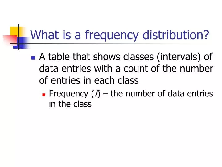
What is a frequency distribution?. A table that shows classes (intervals) of data entries with a count of the number of entries in each class Frequency ( f ) – the number of data entries in the class. How do you create a frequency distribution?.

E N D
What is a frequency distribution? • A table that shows classes (intervals) of data entries with a count of the number of entries in each class • Frequency (f) – the number of data entries in the class
How do you create a frequency distribution? • Choose how many classes (you will be given this information) • Calculate class width: highest entry – lowest entry # of classes • Find each class’s lower and upper limits • Sort entries into classes (tallies) • Count tallies to find f for each class
Example 1 • The following sample data lists the number of minutes 50 Internet subscribers spent on the Internet during their most recent session. Construct a frequency distribution that has seven classes. 50 40 41 17 11 7 22 44 28 21 19 23 37 51 54 42 88 41 78 56 72 56 17 7 69 30 80 56 29 33 46 31 39 20 18 29 34 59 73 77 36 39 30 62 54 67 39 31 53 44
Example 1 (cont’d) • Number of classes is given to you (7) • Class width: 88 – 7 = 11.57 ≈ 12 7 • Since the lower limit of the first class will be 7, the lower limit of the second class will be 7+12 = 19, and so on.
Example 1 - Frequency Distribution • ClassTally f 7-18 19-30 31-42 43-54 55-66 67-78 79-90 Σf=50 6 10 13 8 5 6 2
What else can be done in a frequency distribution? • Midpoint=lower class limit+upper class limit 2 • Relative Frequency: portion of the data set is in a class RF = class frequency = f sample size n • Cumulative Frequency: sum of the frequency for that class plus all previous classes
Example 2 • Using the frequency distribution constructed for Example 1, find the midpoint, relative frequency, and cumulative frequency for each class.
Example 2 (cont’d) Class f Mdpt RelFreq CumFreq 7-18 6 19-30 10 31-42 13 43-54 8 55-66 5 67-78 6 79-90 2 Σf = 50 12.5 .12 6 24.5 .2 16 36.5 .26 29 48.5 .16 37 60.5 .1 42 72.5 .12 48 50 84.5 .04 Σf/n = 1.00
HOMEWORK Worksheet 2-1 #3, 4, 5, 6, 15, 16
What is a frequency histogram? • Bar graph showing the frequency distribution of a data set • Horizontal scale (x-axis) is quantitative and measures data values • Vertical scale (y-axis) measures frequency of classes • Bars MUST touch each other (no gaps) • Use MIDPOINTS as x-values • Bars should be drawn to straddle each midpoint line
Example 3 • Draw a frequency histogram for the frequency distribution in Example 2. 2 4 6 8 10 12 14 Frequency (# of subscribers) 12.5 24.5 36.5 48.5 60.5 72.5 84.5 Time online (minutes)
What is a frequency polygon? • Line graph to show CHANGE in frequencies • USES MIDPOINTS as x-values
Example 4 • Draw a frequency polygon for the frequency distribution in Example 2. 2 4 6 8 10 12 14 Frequency (# of subscribers) 12.5 24.5 36.5 48.5 60.5 72.5 84.5 96.5 Time online (minutes)
HOMEWORK Worksheet 2-1 #17, 18, 29, 30
What is a relative frequency histogram? • Same as a frequency histogram, but shows RELATIVE frequencies • Use UPPER CLASS BOUNDARIES as x-values • Have one more decimal place than the data • Eliminates any gaps between classes • Example: If the class LIMITS are 10-15, the class BOUNDARIES will be 9.5 to 15.5 • Use relative frequencies as y-values • Bars should be drawn to span from the lower class boundary to upper class boundary (between vertical lines, not straddling the lines)
Example 5 • Draw a relative frequency histogram for the frequency distribution in Example 2. Relative Frequency (Portion of subscribers) .04 .08 .12 .16 .2 .24.28 6.5 18.5 30.5 42.5 54.5 66.5 78.5 90.5 Time online (minutes)
What is an ogive? • Also known as cumulative frequency graph • Line graph • Use UPPER CLASS BOUNDARIES as x-values • Use cumulative frequencies as y-values • Points are placed on the upper class boundary lines
Example 6 • Draw an ogive for the frequency distribution in Example 2. Estimate how many subscribers spent less than 60 minutes during their last session. Cumulative Frequency (# of subscribers) 10 20 30 40 50 6.5 18.5 30.5 42.5 54.5 66.5 78.5 90.5 Time online (minutes)
In conclusion… • How do you create a frequency distribution? • Draw a quick sketch of each: • Frequency histogram • Frequency polygon • Relative frequency histogram • Ogive
HOMEWORK Worksheet 2-1 #21, 22, 25, 26