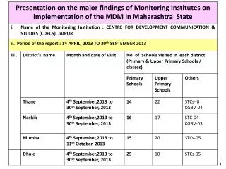
Download
1 / 18
190 likes | 298 Views
Welcome to MDM. Statistics – turning data into useful information Probability – Calculating how likely things will occur Thesis – A project where you will propose, pose, study and answer a question 70 % term work, 5% Project presentation, 25% Exam. Graphical Displays of Data.

E N D
Welcome to MDM • Statistics – turning data into useful information • Probability – Calculating how likely things will occur • Thesis – A project where you will propose, pose, study and answer a question 70 % term work, 5% Project presentation, 25% Exam
Graphical Displays of Data • Frequency Tables • Histogram • Stem and leaf plot • Pictogram • Box and Whisker plot • Frequency Polygon • Circle graphs
Grouped Data • The ranges in the table group the data. This done to make the analysis more practical. It would not be reasonable to chart each individual employee in this case.
Stem and Leaf • Class 1 63, 83, 72, 76, 31, 91, 68, 64, 74, 86, 73, 53,88, 84, 86, 77, 74, 73, 64, 52, 73, 72, 75, 45, 91, 76, 52, 65 • Class 2 62, 43, 88, 93, 72, 32, 55, 69, 58, 49, 44, 64, 56, 74, 95, 86, 57, 68, 85, 95, 46, 87, 68, 57, 78, 96 • Which class is doing better?
What does better mean? • Pass = 50% • Provincial Standard =70% • Above standard = 80% • Special aptitude = 90% • How can we organize the class data?
Class 1 Stem leaf 3 1 4 5 5 223 6 34458 7 22333445667 8 34668 9 11 Class 2 Stem leaf 3 2 4 3469 5 56778 6 24889 7 248 8 8657 9 3556 Stem and leaf plot
Pictogram Each picture represents 10 sales at Pet-Mart this week. How many of each were sold? What is the advantage of this type of representation?
Box and Whisker Plot • Is everyone pulling their weight? • Hours of contribution by each of 10 group members: • 8,4,10,3,7,9,9,12,6,11
Frequency Polygon A Frequency Polygon is a graph that shows the frequency of values represented as dots, connected by lines. If you have a histogram of ranges of values, you polygon dots will be placed in the middle of the ranges.
Cumulative Frequency We are looking at the total that has accumulated up to and including the given value.
Relative Frequency We are looking at the percentage of data at each value (or interval)
Circle Graph • Also known as a pie chart. • Multiply the percentage by 360 to find how many degrees to allocate to each item. • E.g. 30% or 0.3 * 360 degrees is 108 degrees. Pumpkin gets 108 degrees on this chart
Home Work • Page 101 • 1 and 2 (discuss together) • Make a histogram of heights in the class. • 1’=0.3048 m so multiply your height in feet by 0.3048. remember to divide inches by 12 so 5’6” is 5 +6/12 feet • (or 5.5’) • 3,5,7,8,9,12,14