Download
1 / 4

E N D
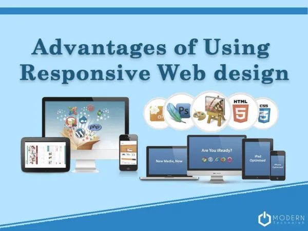
Using Sketch for Responsive Web Design Sketch, a web design app was formed and created by a little known development company Bohemian Coding, especially made for user interface designers that are more comfortable working on code separately in a code editor. The UI makes it great for any type of work flow. Here we will discuss some outstanding functionalities that made it better than the Photoshop and illustrator. Since it is launched it has become the best tool for UI or responsive web design. Though some designers are battling with a lot of bugs in this app .We will explain you why use Sketch for responsive web design? With sketch you will be able to handle large ecommerce projects more Smoothly, easily and quickly than using any other program. A Look at the Basics The app toolset only includes HTML and CSS3, not contain any unnecessary tools that would slow down your work.
The first thing I recommend you to download is sketch toolbox.This plugin manager allows you to directly browse and install plugins and to keep track of what you’re using. Everything is Vector - vector is a key for any design process. Designers constantly have to think about high-definition versus normal-definition displays, narrow versus wide screens and so on. Sketch has ability to rescale objects saves time and energy. Now let’s look at the fleet feet store and a newly created website design for this website. Define content strategy using Sketch plugin called AEFlowchart to create site trees for the websites
AE Flowchart plugin in action Multiple art boards – it allows you to quickly scroll between files and for a project like this you will be able to quickly jump back and forth between the site trees. The app uses Font rendering is closer to web that means text will appear in the browser exactly how it appears in the design file.it has useful typographic elements. You can create the color palette in your moodboard to use it late in the design process. Easily export objects-You can copy and paste elements, objects from one file into another Designing the Home Page Now we have learnt some basic styles needed to start any design process. Let’s look at some of the elements of Home Page.
One of the best features sketch has is the build in layout grid. In sketch you can easily change the column and gutter sizes.To edit the layout grid, go to “View” → “Layout Settings.” Remember, anything possible in CSS is possible in Sketch Automatically adjusts the padding using Dynamic button plugin ss You can also design Mobile and Tablet Mockups Faster program Conclusion So we have discussed some elements of sketch that made it is so great for responsive web design also its support for multiple art boards on one canvas. So you can make your work flow easier using these tools and interface and prioritize them according to the project. As prototyping and mocking up is an important step in any design workflow. That is why this program is ideal for screen design. Have you tried Sketch yet? If you have any other tips or tricks from your workflow that I haven’t mentioned? Let us know in the comments! iMediaDesigns is a full-service web development toronto based digital agency that helps brand create unique identity and successful marketing campaigns.