Download
1 / 42
420 likes | 550 Views
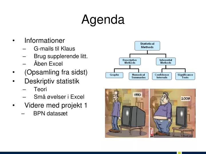
Agenda. Informationer G-mails til Klaus Brug supplerende litt. Åben Excel (Opsamling fra sidst) Deskriptiv statistik Teori Små øvelser i Excel Videre med projekt 1 BPN datasæt. Opsamling fra sidst: Opgave 1. Identify the variable type as either categorical or quantitative

E N D
Agenda • Informationer • G-mails til Klaus • Brug supplerende litt. • Åben Excel • (Opsamling fra sidst) • Deskriptiv statistik • Teori • Små øvelser i Excel • Videre med projekt 1 • BPN datasæt
Opsamling fra sidst: Opgave 1 • Identify the variable type as either categorical or quantitative • Number of siblings in a family • County of residence • Distance (in miles) to school • Marital status
Opsamling fra sidst: Opgave 2 • Identify each of the following variables as continuous or discrete • Length of time to take a test • Number of people waiting in line • Number of speeding tickets received last year • Your dog’s weight
Proportion & Percentage (Relative Frequencies) • The proportion (andelen) of the observations that fall in a certain category is the frequency (count) of observations in that category divided by the total number of observations • Frequency of that class Sum of all frequencies • The Percentage is the proportion multiplied by 100. Proportions and percentages are also called relative frequencies.
Frequency, Proportion, & Percentage Example • If 4 students received a “10” out of 40 students, then, • 4 is the frequency • 4/40 = 0,10 is the proportion (and relative frequency) • 10% is the percentage 0,1*100=10%
Frequency Table • A frequency table is a listing of possible values for a variable, together with the number of observations and / or relative frequencies for each value
Opgave #3 • Et webbureau holder øje med antallet af billeder på en række toneangivende hjemmesider. I en periode har man først statistik med, om antallet af billeder på forsiden er højere, uændret eller mindre. Resultaterne var: • Flere: 21 • Uændret: 7 • Færre: 12 • Spørgsmål: • Navngiv den variabel webbureauet interesserer sig for? • Hvilken slags variabel er det? • Udregn andelene i Excel • Data til næste opgave i Excel: http://www.dst.dk/da/Statistik/emner/navne/Baro.aspx
Exploring Data with Graphs and Numerical Summaries • Calculating the mean • Calculating the median • Comparing the Mean & Median • Definition of Resistant
Mean (gennemsnittet) • The mean is the sum of the observations divided by the number of observations • n betegner antallet af observationer (=stikprøvestørrelsen) • y1, y2, y3, … yi ,..., yn betegner de n observationer • betegner gennemsnittet • It is the center of mass. Do it in Excel
Median • The median is the midpoint of the observations when they are ordered from the smallest to the largest (or from the largest to smallest) • Order observations • If the number of observations is: • Odd, then the median is the middle observation • Even, then the median is the average of the two middle observations
Median 1) Sort observations by size, n = number of observations ______________________________ 2,a) If n is odd, the median is observation (n+1)/2 down the list n = 9 (n+1)/2 = 10/2 = 5 Median = 99 2,b) If n is even, the median is the mean of the two middle observations n = 10 (n+1)/2 = 5,5 Median = (99+101) /2 = 100
Find the mean and median in Excel Det gns. tidsforbrug (sek.), som det tager at indlæse nyheder på en app fra 8 nyhedssider: 2,3 1,1 19,7 9,8 1,8 1,2 0,7 0,2 Hvad er mean og median? • Mean = 4,6 Median = 1,5 • Mean = 4,6 Median = 5,8 • Mean = 1,5 Median = 4,6 Hvad sker der med gns. og median, hvis den største observation ganges med 10?
Comparing the Mean and Median • The mean and median of a symmetric distribution are close together, • For symmetric distributions, the mean is typically preferred because it takes the values of all observations into account
Comparing the Mean and Median • In a skewed distribution, the mean is farther out in the long tail than is the median • For skewed distributions the median is preferred because it is better representative of a typical observation
Resistant Measures • A numerical summary measure is resistant if extreme observations (outliers) have little, if any, influence on its value • The Median is resistant to outliers • The Mean is not resistant to outliers • Hvis I kun kan få én oplysning om løn-niveauet i en virksomhed med 4 ansatte, vil I så have gennemsnit eller median?
Exploring Data with Graphs and Numerical Summaries • Calculate the range (variationsbredden) • Calculate the standard deviation • Know the properties of the standard deviation, s • Know how to interpret the standard deviation, s: The Empirical Rule
Range • One way to measure the spread is to calculate the range. The range is the difference between the largest and smallest values in the data set; Range = max min • The range is strongly affected by outliers
Standard Deviation • Find the mean • Find the deviation of each value from the mean • Square the deviations • Sum the squared deviations • Divide the sum by n-1
Standard Deviation Gives a measure of variation by summarizing the deviations of each observation from the mean and calculating an adjusted averageof these deviations.
Properties of the Standard Deviation • s measures the spread of the data • s = 0 only when all observations have the same value, otherwise s > 0, As the spread of the data increases, s gets larger, • s has the same units of measurement as the original observations. The variance=s2 has units that are squared. • s is not resistant. Strong skewness or a few outliers can greatly increase s.
Exploring Data with Graphs and Numerical Summaries • Obtaining quartiles and the 5 number summary • Calculating interquartile range and detecting potential outliers • Drawing boxplots • Comparing Distributions
Percentile • The pth percentile is a value such that p percent of the observations fall below or at that value
Finding Quartiles • Splits the data into four parts • Arrange the data in order • The median is the second quartile, Q2 • The first quartile, Q1, is the median of the lower half of the observations • The third quartile, Q3, is the median of the upper half of the observations
Measure of spread: quartiles Quartiles divide a ranked data set into four equal parts. The first quartile, Q1, is the value in the sample that has 25% of the data at or below it and 75% above The second quartile is the same as the median of a data set, 50% of the obs are above the median and 50% are below The third quartile, Q3, is the value in the sample that has 75% of the data at or below it and 25% above Q1= first quartile = 2,2 M = median = 3,4 Q3= third quartile = 4,35
Quartile Example Find the first and third quartiles Number of downloaded apps the last 10 days: 2 4 11 13 14 15 31 32 34 47 What is the correct answer? • Q1 = 2 Q3 = 47 • Q1 = 12 Q3 = 31 • Q1 = 11 Q3 = 32 • Q1 =12 Q3 = 33
Calculating Interquartile range • The interquartile range is the distance between the third quartile and first quartile: • IQR = Q3 Q1 • IQRgives spread of middle 50% of the data
Criteria for identifying an outlier • An observation is a potential outlier if it falls more than 1,5 x IQR below the first quartile or more than 1,5 x IQR above the third quartile
5 Number Summary • The five-number summary of a dataset consists of the • Minimum value • First Quartile • Median • Third Quartile • Maximum value
Boxplot • A box goes from the Q1 to Q3 • A line is drawn inside the box at the median • A line goes from the lower end of the box to the smallest observation that is not a potential outlier and from the upper end of the box to the largest observation that is not a potential outlier • The potential outliers are shown separately
Comparing Distributions Box Plots do not display the shape of the distribution as clearly as histograms, but are useful for making graphical comparisons of two or more distributions
Exploring Data with Graphs and Numerical Summaries • Distribution • Graphs for categorical data: Bar graphs and pie charts • Graphs for quantitative data: Dot plot, stem-leaf, and histogram • Constructing a histogram • Interpreting a histogram
Distribution (Fordeling) • A graph or frequency table describes a distribution • A distribution tells us the possible values a variable takes as well as the occurrence of those values (frequency or relative frequency)
Graphs for Categorical Variables • Use pie charts and bar graphs to summarize categorical variables • Pie Chart: A circle having a “slice of pie” for each category • Bar Graph: A graph that displays a vertical bar for each category
Pie Charts • Pie charts: • Used for summarizing a categorical variable • Drawn as a circle where each category is represented as a “slice of the pie” • The size of each pie slice is proportional to the percentage of observations falling in that category • Draw a pie chart for the web bureau data!
Bar Graphs • Bar graphs are used for summarizing a categorical variable • Bar Graphs display a vertical bar for each category • The height of each bar represents either counts (“frequencies”) or percentages (“relative frequencies”) for that category • Usually easier to compare categories with a bar graph than with a pie chart • Draw a bar graph for the web bureau data!
Histograms • A histogram is a graph that uses bars to portray the frequencies or the relative frequencies of the possible outcomes for a quantitative variable. • Make a histogram with 12 observations
Interpreting Histograms • Overall pattern consists of center, spread, and shape • Assess where a distribution is centered by finding the median (50% of data below median 50% of data above), • Assess the spreadof a distribution, • Shape of a distribution: roughly symmetric, skewed to the right, or skewed to the left
Shape • Symmetric Distributions: if both left and right sides of the histogram are mirror images of each other • A distribution is skewed to the left if the left tail is longer than the right tail • A distribution is skewed to the right if the right tail is longer than the left tail
Shape and Skewness • Consider a data set of the scores of students on a very easy exam in which most score very well but a few score very poorly: • What shape would you expect a histogram of this data set to have? • Symmetric • Skewed to the left • Skewed to the right • Bimodal