Download
1 / 1

E N D
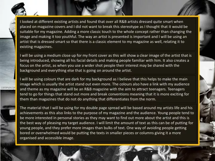
I looked at different existing artists and found that over all R&B artists dressed quite smart when placed on magazine covers and I did not want to break this stereotype as I thought that it would be suitable for my magazine. Adding a more classic touch to the whole concept rather than changing the image and making it too youthful. The way an artist is presented is important and I will be using an artist that is dressed smart so that there is a classic element to my magazine as well, relating it to existing magazines. I will be using a medium close up for my front cover as this will show a clear image of the artist that is being introduced, showing all his facial details and making people familiar with him. It also creates a focus on the artist, as when you use a wider shot people their interest may be shared with the background and everything else that is going on around the artist. I will be using colours that are dark for my background as I believe that this helps to make the main image which is usually the artist stand out even more. The colours also have a link with my audience and theme as my magazine will be an R&B magazine with the aim to attract teenagers. Teenagers tend to go for things that stand out more and break conventions meaning that it is more exciting for them than magazines that do not do anything that differentiates from the norm. The material that I will be using for my double page spread will be based around my artists life and his achievements as this also links to the purpose of my magazine and the audience. Young people tend to be more interested in personal stories as they may want to find out more about the artist and this is the best way of pleasing my target audience. I will limit the amount of text as this can be of putting for young people, and they prefer more images than bulks of text. One way of avoiding people getting bored or overwhelmed would be putting the texts in smaller pieces or columns giving it a more organised and accessible image.