Download
1 / 47
470 likes | 623 Views
Surabhi Agarwal. Systems Biology Visualization.

E N D
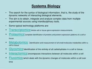
Surabhi Agarwal Systems Biology Visualization There has been a rapid accumulation of data from protein interaction, gene expression and metabolic pathway analysis. To derive meaningful information out of this data, we need to develop integrative visualization techniques, which provide an insight into its biological relevance.
Definition of the Problem 1 We will consider the case study of the disease condition known as Glioma which is a group of brain tumors. In the first part of the animation, we take an insight into the regulation of genes in Glioma by gene expression data analysis . It will give us an insight into the genes, which are modulated (up- or down-regulated) during Glioma. In the second part of the study, we will find the metabolic pathways that are involved in Glioma by undertaking a study with the protein Interaction data . In the third part, we will explore pathway databases and its features to study the pathways that were retrieved from the gene and protein interaction studies. 2 3 4 Action Description of the action Audio Narration Static Image Dsiplay image and read narration We will consider the case study of the disease condition known as Glioma which is a group of brain tumors. In the first part of the animation, we take an insight into the regulation of genes in Glioma by gene expression data analysis . It will give us an insight into the genes, which are modulated (up- or down-regulated) during Glioma. In the second part of the study, we will find the metabolic pathways that are involved in Glioma by undertaking a study with the protein Interaction data . In the third part, we will explore pathway databases and its features to study the pathways that were retrieved from the gene and protein interaction studies. 5
Master Layout (Part 1) 1 This animation consists of 3 parts: Part 1: Gene Expression Data Analysis Part 2 : Protein Interaction Data Analysis Part 3: Metabolic Profile Databases Chose the problem to study and extract relevant data 2 Send the gene expression profile data as input to the tool 3 4 Compute the features related to gene regulation 5 Genes up- or down-regulation http://www.genome.jp/kegg/
Definitions of the components:Part 1 – Gene expression data analysis 1 • Interaction Data:Interaction data refers to information regarding the nature and type of bonding between various biological components. It can be Protein Interaction Data, Gene Expression Data and Metabolic Pathway Data. • Visualization tools: Software tools that are capable of reading interaction data and then representing it in a graphical format thereby providing a simplistic biological insight. E.g. Cytoscape for Protein Interaction data, Genespring for Gene Expression Data. • Microarray: Microarrays are printed on a solid surface, typically glass, and used to study and analyze large number of samples simultaneously in high-throughput. 2 3 4 5
Gene Expression Profile Data–Option 1 OUTPUT DATA GENERATION INPUT VISUALIZATION 2 3 Proceed to Full Animation 4 Action Description of the action Audio Narration Option for user to view Input Or Output The Data generation box should be linked to step 1. Input box should be linked to the step 2 input slides. Same goes for output. Output slides should be linked to step 3. Visulaization slide should be linked to Step 4.This SLIDE is to provide the user an option to go through only specific content from the animation To view the protocol for submitting files, click on input. To view the protocol for retrieving and analyzing output files, click on output. To proceed to full animation click on the arrow. 5
Step 1.a - Gene Expression Profile Data – Data Extraction from Experiments 1 2 Biological Samples e.g. gliomas 3 Microarray Chips Scanned Slides 4 Audio Narration Action Description of the action Schematic for extracting the data for defined problem Follow the animation. Re-draw the figures. Users can extract gene microarray data from Microarray Experiments. The normalized microarray data gives an insight into the regulation of the genes. This regulation is checked by studying the microarray data through Gene Expression Profile Data Analysis software. For a detailed insight into the Microarray Technique, study the OSCAR animation for Microarray Technologies. 5 Biochemistry by A.L.Lehninger et al., 3rd edition
Step 1.b - Gene Expression Profile Data – Data Extraction from Databases 1 B Input - Extracting microarray data For analysis Microarray Data Repository Query Term High-Grade glioma 2 3 Microarray Data file 4 Audio Narration Action Description of the action Schematic for extracting the data for defined problem Follow the animation and show storage of files in Local System Users can extract microarray data directly from experiments or from Public repositories such as GEO datasets from NCBI. Premier microarray research institutes have their own dedicated databases for the microarray data that has been extracted in their labs. This data is in the form of compressed files due to their large file sizes. These files need to be stored in a local Personal Computer System. Here, as an example, we’ll study the regulation of genes in brain tumor, known as Glioma. Gene expression data analysis will give us a picture of the genes, which are modulated (up- or down-regulated) during Glioma. 5
Step 2: Gene Expression Profile Data - Input 1 The technology used in Microarray Experiments refers to the reference organism used for making the microarray chip Glioma ADD PROJECT Browse File Name of the Project ADD EXPERIMENT Select Experimental Type Affymentrix Expression 2 Agilent Single Color Agilent Two Color Affymentrix Copy Number Affymentrix Expression Illumina Association Analysis Illumina Copy Number Illumina Single Color RealTime - PCR SELECT PLATFORM Select Technology (if applicable) Human Barley Bovine E.Coli BSubtilis Drosophila Human Mouse Maize Human 3 UPLOAD DATA Folder A/GSE123/GSM456.CEL 4 Action Description of the action Audio Narration Schematic for entering data and setting parameters Follow the animation and re-draw images to replicate the working of a software environment The software follows the input procedure in a sequential manner. Initial steps are to add a new project and experiment. While adding experiment, user needs to define the type of experiment. Due to lack of standardization, microarray data is saved in various file formats such as CEL, GPR, GAL, CDT. Various tools support one or more of such formats. 5 http://www.genome.jp/kegg/
Step 3.a - Gene Expression Profile Data - Output 1 High cutoff to give significant results. >=8 Fold Change Cutoff 2 Filter data - Fold Change Heat Map 3 Summary Statistics Functional Analysis - GO 4 Action Description of the action Audio Narration Schematic for interpreting the results of Gene Expression Data Analysis High cutoff is provided to give significant results. During comparison, probe sets that satisfy the fold change cutoff of more than 8 in at least one condition pair will be displayed in the result. Regulation is reported by comparing ratio of conditions 1 and 2. Thus, highlighted gene HMGCS1 is up-regulated in sample GSM34580 as compared to GSM 34586. Show the simulation of the software. In each slide, the tab that is high-lighted is ACTIVE. In the animation format, the tab should highlight when you click on it followed by the content of the slide. Then the mouse should move to the second tab and click on it leaving the first tab inactive and second tab active. Activity of tabs can be differentiated by separate Colors 5 http://www.genome.jp/kegg/
Step 3.b - Gene Expression Profile Data - Output 1 upregulated downregulated 2 Filter data - Fold Change Heat Map 3 Legend for color coding of regulation Summary Statistics Functional Analysis - GO 4 Action Description of the action Audio Narration Schematic for interpreting the results of Gene Expression Data Analysis Animator needs to re-draw all screen shots as they have been taken from the references software. Animator must not copy the image or a part thereof., in the final animation. Show the simulation of the software. In each slide, the tab that is high-lighted is ACTIVE. In the animation format, the tab should highlight when you click on it followed by the content of the slide. Then the mouse should move to the second tab and click on it leaving the first tab inactive and second tab active. Activity of tabs can be differentiated by separate Colors Heat Map is the graphical visualization of the regulation of genes, which is determined by the cut-off value of fold change provided by the user. The up-regulation of the gene is marked in “red” while the down-regulation is marked by “blue” color as explained in the figure legend. 5 http://www.genome.jp/kegg/
Step 3.c - Gene Expression Profile Data - Output 1 2 Filter data - Fold Change Heat Map 3 Summary Statistics Functional Analysis - GO 4 Action Description of the action Audio Narration Schematic for interpreting the results of Gene Expression Data Analysis Show the simulation of the software. In each slide, the tab that is high-lighted is ACTIVE. In the animation format, the tab should highlight when you click on it followed by the content of the slide. Then the mouse should move to the second tab and click on it leaving the first tab inactive and second tab active. Activity of tabs can be differentiated by separate Colors The summary statistics result gives the statistical gist of the genes screened after specifying a cut-off to the gene expression analysis server. This includes the number of genes observed to be regulated and the statistical significance of the fold change corresponding to it. 5 http://www.genome.jp/kegg/
Step 3.d - Gene Expression Profile Data - Results 1 Molecular Functions catalytic activity hydroxymethylglutaryl-CoA synthase activity cytokine activity protein binding chemokine activity G-protein-coupled receptor binding signal transducer activity Cellular Components affected endoplasmic reticulum extracellular region soluble fraction cytoplasm membrane fraction 2 Filter data - Fold Change Heat Map Biological Functions lipid metabolic process fatty acid metabolic process positive regulation of endothelial cell proliferation angiogenesis apoptosis cell adhesion response to hypoxia 3 Summary Statistics Functional Analysis - GO 4 Action Description of the action Audio Narration Schematic for interpreting the results of Gene Expression Data Analysis Show the simulation of the software. In each slide, the tab that is high-lighted is ACTIVE. In the animation format, the tab should highlight when you click on it followed by the content of the slide. Then the mouse should move to the second tab and click on it leaving the first tab inactive and second tab active. Activity of tabs can be differentiated by separate colors The Functional Analysis tools gives the functions that the regulated genes are involved in at the molecular level, biological level and the cellular components they modulate. 5 http://www.genome.jp/kegg/
Step 4. - Gene Expression Profile Data - Visualization 1 2 3 4 5 http://www.ingenuity.com/
Step 3.d - Gene Expression Profile Data - Visualization 1 Action Description of the action Audio Narration The pathway information relevant in Gliomas Studies, from the input data, can be extracted. In this we show the merged gene regulatory pathway. We zoom into the pathway titled “Cell Cycle, Cellular Assembly and Organization, DNA Replication, Recombination, and Repair” and see the interactions of TP53 pathway. Static Slide Animator needs to re-draw all screen shots as they have been taken from the references software. Animator must not copy the image or a part thereof, in the final animation. Show the image with audio narration. Show the zooming effect a shown in the animation. 2 3 4 5 http://www.ingenuity.com/
Master Layout (Part 2) 1 This animation consists of 3 parts: Part 1: Gene Expression Data Analysis Part 2 : Protein Interaction Data Analysis Part 3: Metabolic Profile Databases Retrieve protein interaction data from experiments or public repositories or experiments 2 Input the data in the software tool in the right format 3 4 View, download and interpret the results 5 http://www.genome.jp/kegg/
Definitions of the components:Part 2 – Protein Interaction Data Analysis 1 • Knowledgebase: The Protein Interaction Network tools accept the user data and map it to its repository. These storage units of the tools are called their knowledgebase. • Accession Number: The accession number of a protein refers to the unique identifier, which acts as a common link to relate the data provided as input by the users with the knowledgebase of the tool. • Protein microarray: These are miniaturized arrays, commonly printed on glass, polyacrylamide gel pads or microwells, onto which small quantities of thousands of proteins can be simultaneously immobilized for high-throughput assaying. 2 3 4 5
Gene Expression Profile Data–Option 1 OUTPUT DATA GENERATION INPUT VISUALIZATION 2 3 Proceed to Full Animation 4 Action Description of the action Audio Narration Option for user to view Input Or Output The Data generation box should be linked to step 1. Input box should be linked to the step 2 input slides. Same goes for output. Output slides should be linked to step 3. Visulaization slide should be linked to Step 4.This SLIDE is to provide the user an option to go through only specific content from the animation To view the protocol for submitting files, click on input. To view the protocol for retrieving and analyzing output files, click on output. To proceed to full animation click on the arrow. 5
Step 1.a - Protein Molecular Interaction Network –Data Extraction 1 2 Protein Samples 3 Protein Microarray Chips Scanned Slides 4 Action Description of the action Audio Narration Schematic for extracting the data for defined problem Follow the animation. Re-draw the figures. Users can extract protein microarray data from Microarray Experiments. The normalized microarray data gives an insight into the regulation of the genes. This regulation is checked by studying the microarray data through Gene Expression Profile Data Analysis software. For a detailed insight into the Microarray Technique, study the OSCAR animation for Microarray Technologies. 5
Step 1.b - Protein Molecular Interaction Network –Data Extraction 1 Extract Data from Literature sources and store it in a spreadsheet Literature Resource Query Term High-Grade glioma Rawdata.xls 2 Extract data from Microarray Data repositories 3 4 Action Description of the action Audio Narration • Protein molecular interaction software are used to build and analyze networks of proteins, given their accession numbers. The networks are built by mapping input data to the software’s knowledgebase. Here, we explain with a list of proteins modulated in the disease condition called glioma, which are extracted from • literature resources. • Microarray Databases • As an output we get a spreadsheet containing microarray data The first panel is about extracting information from web resource. Show the required PDFs getting downloaded and read through to extract data. Follow this by a screen shot of Microarray databases. In the end show the “Raw.xls” file being formed. Schematic for extracting the data for defined problem 5
Step 1.c - Protein Molecular Interaction Network –Data Extraction 1 2 Extract data from Microarray Data repositories 3 Rawdata.xls 4 Action Description of the action Audio Narration Schematic for extracting the data for defined problem The first panel is about extracting information from web resource. Show the required PDFs getting downloaded and read through to store specific data in spreadsheets Protein molecular interaction software are used to build and analyze networks of proteins, given their accession numbers. The networks are built by mapping input data to the software’s knowledgebase. Here, we explain with a list of proteins modulated in the disease condition called glioma, which are extracted from literature resources or databases. 5
Step 2.a - Protein Molecular Interaction Network –Input 1 CREATE PROJECT UPLOAD MAP DATA Project Glioma Enter Project Name 2 Core Analysis Enter Experiment Type Biomarker Analysis Core Analysis Toxicology Analysis Metabolic Analysis 3 4 Action Description of the action Audio Narration The name of the project and experiments must be entered by the user in the software for the purpose of saving the current status of the work. In the experiment type, the user must select the type of analysis that needs to be conducted on the dataset. For this Glioma case study, we undertake core analysis of the data to identify its network. Schematic for Input Show the simulation of the software. In each slide, the tab that is high-lighted is ACTIVE. In the animation format, the tab should highlight when you click on it followed by the content of the slide. Then the mouse should move to the second tab and click on it leaving the first tab inactive and second tab active. Activity of tabs can be differentiated by separate Colors 5
Step 2.b - Protein Molecular Interaction Network –Input 1 CREATE PROJECT UPLOAD DATA MAP DATA Folder1/Rawdata.xls Upload Excel File 2 3 4 MENTION THE TYPE OF IDENTIFIER SUCH AS: UNIPROT, GENEBANK ID, REFSEQ ID, ENTREZ GENE, ETC 5
Step 2.c - Protein Molecular Interaction Network –Input 1 Action Description of the action Audio Narration Upload the Raw data file that was created after scrutinizing the papers. The format of the Raw data file to be uploaded varies amongst different software. Although most software recognize Spreadsheet format of data, some of them have their own specific input file format such as .sif file for Cytoscape. Once the raw data file is uploaded, the tool will display all columns. The user needs to select the columns that are to be given to the tool. Out of all the columns, it is compulsory to enter the ACCESSION NUMBER (OR ANY OTHER PROTEIN IDENTIFIER). This column is highlighted in red. These identifiers can be of multiple types, which need to be defined so that the tool can match the user’s data to its dictionary of identifier terms called the knowledgebase. All other information provided is optional and the users can provide them depending on the nature of analysis. Schematic for Input Show the simulation of the software. In each slide, the tab that is high-lighted is ACTIVE. In the animation format, the tab should highlight when you click on it followed by the content of the slide. Then the mouse should move to the next tab and click on it leaving the first tab inactive and second tab active. Activity of tabs can be differentiated by separate colors. 2 3 4 5
Step 2.d - Protein Molecular Interaction Network –Input 1 CREATE PROJECT UPLOAD DATA MAP DATA 2 3 4 5
Step 2.d - Protein Molecular Interaction Network –Input 1 Action Description of the action Audio Narration The input raw data is mapped to the knowledgebase of the software to provide a uniform set of IDs for building a network. The IDs from the input file that are not matched with its knowledgebase are highlighted in red Schematic for Input This file is same as input file. Only the entries that are not mapped need to be highlighted as animation 2 3 4 5
Step 2.e - Protein Molecular Interaction Network –Input 1 CREATE PROJECT UPLOAD MAP DATA Data gets mapped to Knowledgebase of software to produce output files 2 3 4 5
Step 2.e - Protein Molecular Interaction Network –Input 1 Action Description of the action Audio Narration Schematic for Input Show the simulation of the software. In each slide, the tab that is high-lighted is ACTIVE. In the animation format, the tab should highlight when you click on it followed by the content of the slide. Then the mouse should move to the next tab and click on it leaving the first tab inactive and second tab active. Activity of tabs can be differentiated by separate Colors The tool also extracts other relevant information from its knowledgebase corresponding to that ID. The uniform IDs and the new columns are displayed in the form of a new spreadsheet which has the refined data. The columns highlighted in blue are the ones that are newly added. The red column is provided for uniformity by taking one specific naming scheme for identifiers. 2 3 4 5
Step 3 - Protein Interaction Data Analysis - Output 1 BUILD PATHWAY OUTPUT NETWORK OUTPUT PATHWAY TOP DISEASE NETWORK TOP PHYSIOLOGICAL NETWORK TOP NETWORK FUNCTIONS 2 • Genetic Disorder, Neurological Disease, Nucleic Acid Metabolism • Cell-To-Cell Signaling and Interaction, Nervous System Development and Function, Cellular Assembly and Organization • Cancer, Reproductive System Disease, Gastrointestinal Disease • Cancer • Gastrointestinal Disease • Neurological Disease • Nervous System Development and Function • Hematological System Development and Function • Immune Cell Trafficking 3 TOP CANONICAL PATHWAY • Glycolysis/Gluconeogenesis • Mitochondrial Dysfunction • 14-3-3-mediated Signaling 4 Action Description of the action Audio Narration The tools provide a summary of results which show the top networks produced in each category. The ranking is based on the number of mappings from user input dataset to software’s knowledgebase. The prediction of “Neurological Disease”, “Cancer”, “Nervous System” as top networks reinforce our data analysis. The data analysis from this tool also shows that “Glycolysis/Gluconeogenesis” is the pathway that is getting modulated from our list of proteins Schematic for Output summary Follow the animation 5
Step 4.a -Protein Molecular Interaction Network - Output 1 BUILD PATHWAY OUTPUT NETWORK OUTPUT PATHWAY 2 Select the number of networks to be constructed 1 Select the maximum number of Molecules in the network 70 3 Select endogenous chemicals No 4 Action Description of the action Audio Narration Users can modulate parameters which define the number and size of networks to be formed. Users can also modulate the presence of molecules apart from genes, proteins or RNA. The molecules that have shown relationships with other genes or proteins of the knowledgebase are mapped into the network. The IDs that are repetitive will point to the same node in the network Schematic for Output summary Follow the animation 5
Step 4.b - Protein Molecular Interaction Network - Output 1 BUILD PATHWAY OUTPUT NETWORK OUTPUT PATHWAY Starch and sucrose metabolism α-D-Glucose-1P 2 α -D-Glucose-6P Pentose Phosphate Pathway α -D-Glucose β-D-Fructose-6P β-D-Glucose 3 β-D-Fructose-1,6-P2 Glyceraldehyde-3P Glycerone-P Seed Molecules Molecular interaction Another Small Interaction Network Network interaction Glyceraldehyde-2P 4 Phosphoenol pyruvate Action Description of the action Audio Narration From the input given by users, the tool analyzes the set of molecules, which are present in its database of metabolic network. The molecules that are found to occur most frequently are used as seeds which connect to other such molecules. Networks are also extended based on interactions between two small networks to produce a larger network. Such analysis will depend on the parameters set by the user in the initial steps. Based on this information, the tool will predict the pathway to which the molecules are most likely to belong. Further analysis of these pathways can be carried out using metabolic profile databases. Schematic for Output summary Follow the animation. Highlight the yellow boxes in animation as well. 5
Step 4.c - Protein Molecular Interaction Network - Visualization 1 2 3 4 5 http://www.ingenuity.com/
Step 3.d - Gene Expression Profile Data - Visualization 1 Action Description of the action Audio Narration Zoom effect Animator needs to re-draw all screen shots as they have been taken from the references software. Animator must not copy the image or a part thereof, in the animation. Show the image with each part zooming and then coming as a zoomed image. The pathway information relevant in Gliomas Studies, from the input data, can be extracted. In this pathway, we can observe the role of Isocitrate Dehydrogenase (IDH), in regulation of metabolism during Glioma. Recently a published study has also shown the involvement of IDH in Gloma related pathways. Most such software are linked to Protein Pathway Interaction Software, which are described in detail in the next part of the animation. 2 3 4 5 http://www.ingenuity.com/
Master Layout (Part 3) This animation consists of 3 parts: Part 1: Gene Expression Data Analysis Part 2 : Protein Interaction Data Analysis Part 3: Metabolic Profile Databases 1 Select the level of organization of the biological system to study 2 Select from one of the publicly available databases 3 Select the relevant options in the database to view the pathway network and interaction data of the system under consideration 4 5 http://www.genome.jp/kegg/
Definitions of the components:Part 3 – Metabolic profile databases 1 • 1. Biological System: In the biological context, a system refers to an entity that exists with the help of mutual interactions between its components. • 2. Level of organization: The level of organization describes the complexity of the biological system being studied. Components of one system could be made up of constituent parts, which in turn form another system at a different level of organization. For example, a cell is a system in itself. However for larger physiological systems, a cell would only be a component within it. • 3. Visualization: To explore various protein-protein interactions, it is critical to percept lists of protein interaction data, which is retrieved as elaborate spreadsheets that make the analysis cumbersome. Mapping of such data in a diagrammatic form makes it easier for scientists to develop a biological insight into the interaction data. • 4. Functional annotation: By examining the maps of protein–protein interaction data, researchers can discover new biological relationships between proteins or predict their functions based on specific interactions. • 5. Graphical Notation: The first step in the analysis of protein interaction data is the identification of protein complexes and groups of complexes. In a simple graphical notation, a “Node” represents a protein while the “Edges” represent the interaction between the two proteins. 2 3 4 5
Definitions of the components:Part 3 – Metabolic profile databases 1 • 6. Pathway: A pathway in Biology refers to a series of inter-related metabolic reactions, which depicts the order of conversion of one entity to another. • 7. Meta node: It is a single node onto which all members of a protein cluster are collapsed. These meta nodes help in deciphering biological applications of the networks which are collapsed as one. 2 3 4 5
Step 1: Pathway Databases – Input 1 Choose the system PATHWAY DISEASE ENZYMES ORGANISM 2 CANCER IMMUNE SYSTEM DISEASE NEURO DEGENERATIVE DISEASE CARDIO-VASCULAR DISEASE METABOLIC DISEASES INFECTIOUS DISEASES PROKARYOTES PROTISTS FUNGI PLANTS ANIMALS METABOLISM GENETIC INFORMATION PROCESSING ENVIRONMENTAL INFORMATION PROCESSING CELLULAR PROCESSES ORGANISMAL SYSTEMS ENZYME NAME EC NUMBER SYNONYMS CANCER IMMUNE SYSTEM DISEASE NEURO DEGENERATIVE DISEASE CARDIO-VASCULAR DISEASE METABOLIC DISEASES INFECTIOUS DISEASES 3 4 Action Description of the action Audio Narration The pathway databases are repositories to gain a visual insight into the biological interaction of genes and proteins. The general features of these databases include searching by Pathway: The entire network information in the web based database can be searched by selecting the metabolic pathway of interest, such as cellular processes, genetic information flow, etc. Diseases: Here all the networks are grouped based on the diseases which are caused by their modulation. Enzymes: The enzymes belonging to the pathway database are grouped and the pathways can be searched by giving their enzyme information as a query. Organism: All organisms are given a unique identifier. Users can also select the organism, and then study the pathway as it occurs in those organisms. Animation of the Input search strategies for Pathway databases Follow the steps in the animation. Re-draw images. The audio narration must be read, as the cursor in the animation moves to the 4 headings of the web-page 5 http://www.genome.jp/kegg/
Step 2.a - Pathway Databases – Visualization of Pathways for Glioma 1 Nodes 2 3 Edges 4 Description of the action Audio Narration Action Animator needs to re-draw all screen shots as they have been taken from the references software. Animator must not copy the image or a part thereof., in the final animation. Display Image. Highlight the “nodes” and “edges” as shown in animation. The red box zooms to show the area of the network which is getting zoomed into. This is followed by the zoomed image of that part of the network. Each zoomed image is followed by the narration in the order given. We use pathway databases to study one of the pathways from our Glioma studies in Protein Interaction Networks, namely “Cell Cycle, Cellular Assembly and Organization, DNA Replication, Recombination, and Repair”. Here we highlight the nodes and edges within the pathway. Here the nodes are the corresponding gene and the edges are interaction between them. Users can also find images from such visualization tools for specific gene interaction such as in this case we depict the interactions of TP53, derived from Glioma studies. Zoomed Images 5 http://www.ingenuity.com/, http://www.cytoscape.org/
Step 2.c - Pathway Databases – Interpretation 1 ORTHOLOGY ENZYME REACTION 2 Definition: glucose-1-phosphate phosphodismutase Pathways it belongs to: Pathway_ID1: Glycolysis / GluconeogenesisPathway_ID2: Starch and sucrose metabolism Genes involved: Gene_ID123: BSU Gene_ID273: BLIGene_ID987: BLD Gene_ID789: SPZ 3 4 Audio Narration Action Description of the action Pathways can also be pbtained for protein interaction networks. In such networks, the metabolites are the “nodes” and the reaction between them are the “edges”. Each node such as a substrate, reactant or an enzyme is hyper-linked to another page which gives the detailed information about the particular entity. Each element of the pathway including the pathway itself is assigned an identifier for the purpose of referring to it from anywhere in the database. It also gives all the information related to the molecule or reaction such as its orthology, the pathways it belongs to and the corresponding gene IDs. Options given once you click on a particular entity of Pathway In each slide, the tab that is high-lighted is ACTIVE. In the animation format, the tab should highlight when you click on it followed by the content of the slide. Then the mouse should move to the second tab and click on it leaving the first tab inactive and second tab active. Activity of tabs can be differentiated by separate Colors 5 http://www.genome.jp/kegg/
Step 2.d - Pathway Databases – Interpretation 1 ORTHOLOGY ENZYME REACTION Enzyme Commission Number: 5.4.2.2 Class of Enzyme: Transferases Transferring phosphorus-containing groups Phosphotransferases with an alcohol group as acceptor Substrate: D-glucose 1-phosphate Products: D-glucose, D-glucose 1,6-bisphosphate 2 3 4 Action Description of the action Audio Narration It also gives all the enzyme related information for the reaction such as the Enzyme nomenclature, Enzyme Commission Number, Class of Enzyme, substrates and products. Options given once you click on a particular entity of Pathway In each slide, the tab that is high-lighted is ACTIVE. In the animation format, the tab should highlight when you click on it followed by the content of the slide. Then the mouse should move to the second tab and click on it leaving the first tab inactive and second tab active. Activity of tabs can be differentiated by separate Colors 5 http://www.genome.jp/kegg/
Step 2.e - Pathway Databases – Interpretation 1 ORTHOLOGY ENZYME REACTION Metabolic Reaction: Metabolism; Carbohydrate Metabolism; Glycolysis / Gluconeogenesis 2 D-Glucose 1-phosphate <=> alpha-D-Glucose 1,6-bisphosphate +alpha-D-Glucose 2 3 4 Action Description of the action Audio Narration The metabolic reaction that the enzyme is involved in is also provided in its equation form along with structures of reaction substrates. Options given once you click on a particular entity of Pathway Re-Draw the equation. In each slide, the tab that is high-lighted is ACTIVE. In the animation format, the tab should highlight when you click on it followed by the content of the slide. Then the mouse should move to the second tab and click on it leaving the first tab inactive and second tab active. Activity of tabs can be differentiated by separate Colors 5 http://www.genome.jp/dbget-bin/www_bget?R00960+RP00303+RC00078
Interactivity option 1:Step No: 1 - Assignment 1 Type of Input Data Name of Disease .gal Files Name of Enzyme List of Protein Identifiers .cel Files Name of Pathway 2 .gpr Files .sif Files .cdt Files 3 Type of Analysis Tools Metabolic Profile Data Input Protein Interaction Data Input Gene Expression Profile Data Input 4 Results Interactivity Type Options Boundary/limits Drag the yellow buttons into one amongst the 3 Analysis Tools. The correct results are given in the next slide If the user drags it into the right box, the animation should flash a “Tick” Sign. If the box is incorrect, flash a “Cross” Sign and ask the user to “Try Again” Drag and Drop. 5
Interactivity option 1:Step No: 2 -RESULTS 1 .cdt Files Name of Enzyme 2 .gpr Files Name of Pathway .sif Files .gal Files Name of Disease List of Protein Identifiers .cel Files 3 Metabolic Profile Data Input Protein Interaction Data Input Gene Expression Profile Data Input 4 Results Interacativity Type Options Boundary/limits Drag the yellow buttons into one amongst the 3 Analysis Tools. The correct results are given in the next slide If the user drags it into the right box, the animation should flash a “Tick” Sign. If the boox is incorrect, flash a “Cross” Sign and ask the user to “Try Again” Drag and Drop. 5
Questionnaire - 1 1 1. Which amongst these is not a feature of a Protein network? a. Edges b. Nodes c. Metanodes d. Antinodes 2. What are the results of Gene Expression Analysis? a. Heat Map b. Fold Change c. P-value d. All of the Above 3. Protein Pathways can be studied using? a. Stand-alone tools b. Web-based tools c. Both d. None 2 3 4 5
Questionnaire - 2 1 4. Which is a mandatory entry to study Protein Interaction Pathways? a. Fold Change b. p-Value c. Unique Identifier like Accession Number d. All of the Above 5. In case of Gene Expression Data Analysis, Heat Map represents? a. Significance of the Gene b. Fold Change c. p-value d. Gene Ontology 6. Which amongst these is a valid Microarray File Extension? a. GAL b. GPR c. CEL d. All of the Above 2 3 4 5
Links for further reading Books Systems Biology: An Approach P Kohl1, EJ Crampin2, TA Quinn1 and D Noble1 An introduction to Systems Biology: Design Principles of Biological Circuits by Uri Alon June 2006, Chapman&Hall/CRC, Taylor and Francis Group Introduction to Systems Biology Choi, Sangdun (California Institute of Technology) July 2007, Humana Press Research Papers Visualizing biological pathways: requirements analysis, systems evaluation, and research agenda. Saraiya, P., North, C. & Duca, K. (2005). Tools for visually exploring biological networks. Suderman, M. & Hallett, M (2007). A survey of visualization tools for biological network analysis. Pavlopoulos, G.A.G., Wegener, A.L.A. & Schneider, R.R. (2008). Visualization of omics data for systems biology Nils Gehlenborg, Seán I O’Donoghue, Nitin S Baliga, Alexander Goesmann, Matthew A Hibbs, Hiroaki Kitano, Oliver Kohlbacher, Heiko Neuweger, Reinhard Schneider, Dan Tenenbaum & Anne-Claude Gavin. Nature (2010)
Links for further reading Webliography http://www.genome.jp/kegg/ http://www.chem.agilent.com/Library/usermanuals/Public/GeneSpring-manual.pdfhttp://www.moleculardevices.com/pages/software/gn_genepix_pro.html http://www.cytoscape.org/ http://www.ingenuity.com/ http://www.genego.com/metacore.php http://www.ece.cmu.edu/~brunos/Lecture3.pdf http://pathways.embl.de/ http://www.biocyc.org/ http://www.arena3d.org/ http://spotfire.tibco.com/ http://www.bioconductor.org/ http://www.chem.agilent.com/en-US/Products/software/lifesciencesinformatics/genespringgx/pages/gp34727.aspx http://www.cytoscape.org/download.php
Links for further reading Following URLs are used for animations http://www.genome.jp/kegg/ Biochemistry by A.L.Lehninger et al., 3rd edition http://www.ingenuity.com/ http://www.cytoscape.org/ http://www.genome.jp/dbget-bin/www_bget?R00960+RP00303+RC00078 http://www.genego.com/metacore.php http://www.ece.cmu.edu/~brunos/Lecture3.pdf http://pathways.embl.de/ http://www.chem.agilent.com/Library/usermanuals/Public/GeneSpring-manual.pdfhttp://www.moleculardevices.com/pages/software/gn_genepix_pro.html