Download
1 / 69
700 likes | 852 Views
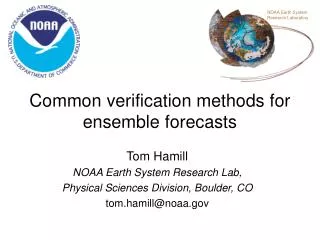
NOAA Earth System Research Laboratory. Common verification methods for ensemble forecasts, and how to apply them properly. Tom Hamill NOAA Earth System Research Lab, Physical Sciences Division, Boulder, CO tom.hamill@noaa.gov.

E N D
NOAA Earth System Research Laboratory Common verification methodsfor ensemble forecasts, andhow to apply them properly Tom Hamill NOAA Earth System Research Lab, Physical Sciences Division, Boulder, CO tom.hamill@noaa.gov
Part 1: two desirable properties of ensembles, and the challenges of evaluating these properties • Property 1: Reliability, no matter how you slice and dice your ensemble data. • Property 2: Specificity, i.e., sharpness.
Unreliable ensemble? Here, the observed is outside of the range of the ensemble, which was sampled from the pdf shown. Is this a sign of a poor ensemble forecast?
Unreliable ensemble? You just don’t know…it’s only one sample You just don’t know; it’s only one sample. Here, the observed is outside of the range of the ensemble, which was sampled from the pdf shown. Is this a sign of a poor ensemble forecast?
Rank 1 of 21 Rank 14 of 21 Rank 5 of 21 Rank 3 of 21
“Rank histograms,” aka “Talagrand diagrams” With lots of samples from many situations, can evaluate the characteristics of the ensemble. Happens when observed is indistinguishable from any other member of the ensemble. Ensemble hopefully is reliable. Happens when observed too commonly is lower than the ensemble members. Happens when there are either some low and some high biases, or when the ensemble doesn’t spread out enough. ref: Hamill, MWR, March 2001
Underlying mathematics n-member sorted ensemble at some point probability the truth V is less than the ith sorted member if V and X’s memberssample the same distribution … equivalently our rank histogram vector overbar denotes the sample average overmany (hopefully independent) samples ref: ibid.
Rank histograms of Z500, T850, T2m(from 1998 reforecast version of NCEP GFS) Solid lines indicate ranks after bias correction. Rank histograms are particularly U-shaped for T2M. Ref: Hamill and Whitaker, MWR, Sep 2007.
Rank histograms…pretty simple, right? Let’s consider some of the issues involved with this one seemingly simple verification metric.
Issues in using rank histograms (1) Flat rank histograms can be created from combinations of uncalibrated ensembles. Lesson: you only be confident you have reliability if you see flatness of rank histogram having sliced the data many different ways. Ref: Hamill, MWR, Mar 2001
Issues in using rank histograms (2) Same rank histogram shape may result from ensembles with different deficiencies Here, half of ensemble members from low-biased distribution,half from high-biased distribution Here, all of ensemble members from under-spread distribution. Ref: ibid
Issues in using rank histograms (3) Evaluating ensemble relative to observations with errors distorts shape of rank histograms. small obs error medium obs error large obs error A solution of sorts is to dress every ensemble member with a random sample of noise, consistent with the observation errors. Ref: ibid.
Rank histogram shapes under “location” and “scale” errors truth from N(0,1) forecast from N(μ,σ); no implicit correlations between members or between member and truth Ref: ibid.
CarenMarzban’s question:what if we did have correlations between members, and w. truth? r is correlation between ensemble members R is correlation between ensemble member and the observation Ref: Marzban et al., MWR 2010, in press.
Rank histograms, r = R = 0.9 μ=0.0 μ=0.2 μ=0.4 μ=0.8 μ=1.6 Marzban’s rank histograms include box & whiskers to quantify sampling variability (nice!). σ=0.25 σ=0.5 σ=1.0 σ=2.0 σ=4.0
Rank histograms, r = R = 0.9 μ=0.0 μ=0.2 μ=0.4 μ=0.8 μ=1.6 Marzban’s rank histograms include box & whiskers to quantify sampling variability (nice!). σ=0.25 σ=0.5 σ=1.0 What’s going on here? Why do we nowappear to have diagnosed under-spread with an ensemble with apparent excess spread? σ=2.0 σ=4.0
Dan Wilks’ insight into this curious phenomenon… Property of multivariate Gaussian distribution: (= 0, since in this case assumed y~ N(0,1)) When μx= 0 (unbiased forecast), and given σy=1, expected value for ensemble member is Rσxy, which will bemore extreme (further from origin) than y for relatively large σx. Ref: Wilks, 2010 MWR, submitted.
Illustration, μx=0 Many realizations of truth and synthetic 1-member ensemble were created, μx= 0,σx = 2, r = R = 0.9 slope Rσx Here, for a 1-member ensemble, that forecast member x1tends to be further from the origin than the verification y. If we generated another ensemble member, it would tend to be further from the origin in the same manner. Hence, you have an ensemble clustered together, away from the origin, and the verification near the origin, i.e., at extreme ranks relative to the sorted ensemble.
Rank histograms in higher dimensions: the “minimum spanning tree” histogram • Solid lines: minimum spanning tree (MST) between 10-member forecasts • Dashed line: MST when observed O is substituted for member D • Calculate MST’s sum of line segments for all forecasts, and observed replacing each forecast member. Tally rank of pure forecast sum relative to sum where observed replaced a member. • Repeat for independent samples, build up a histogram Ref: Wilks, MWR, June 2004. See also Smith and Hansen, MWR, June 2004
Rank histograms in higher dimensions: the “minimum spanning tree” histogram • Graphical interpretation of MST is different and perhaps less intuitive than it is for uni-dimensional rank histogram. Ref: Wilks, MWR, June 2004. See also Smith and Hansen, MWR, June 2004
Multi-variate rank histogram “Mahalanobis” transform (S is forecasts’ sample covariance) • Standardize and rotate using Mahalanobis transformation (see Wilks 2006 text). • For each of n members of forecast and observed, define “pre-rank” as the number of vectors to its lower left (a number between 1 and n+1) • The multi-variate rank is the rank of the observation pre-rank, with ties resolved at random • Composite multi-variate ranks over many independent samples and plot rank histogram. • Same interpretation as scalar rank histogram (e.g., U-shape = under-dispersive). based on TilmannGneiting’s presentation at Probability and Statistics, 2008 AMS Annual Conf., New Orleans. and http://www.springerlink.com/content/q58j4167355611g1/
Multi-variate rank histogram calculation F1, F2, F3, F4, F5, O pre-ranks: [1, 5, 3, 1, 4, 1]; sorted: obs = either rank 1, 2, or 3 with p=1/3. based on Tilmann Gneiting’s presentation at Probability and Statistics, 2008 AMS Annual Conf., New Orleans
Reliability diagrams Curve tells you what the observed frequency was each time you forecast a given probability. This curve ought to lie along y = x line. Here this shows the ensemble-forecast system over-forecasts the probability of light rain. Ref: Wilks text, Statistical Methods in the Atmospheric Sciences
Inset histogram tells you how frequently each probability was issued. Perfectly sharp: frequency of usage populates only 0% and 100%. Reliability diagrams Ref: Wilks text, Statistical Methods in the Atmospheric Sciences
BSS = Brier Skill Score Reliability diagrams BS(•) measures the Brier Score, which you can think of as the squared error of a probabilistic forecast. Perfect: BSS = 1.0 Climatology: BSS = 0.0 Ref: Wilks text, Statistical Methods in the Atmospheric Sciences
Brier score • Define an event, e.g., precip > 2.5 mm. • Let be the forecast probability for the ith forecast case. • Let be the observed probability (1 or 0). Then (So the Brier score is the averaged squared error of the probabilistic forecast) Ref: Wilks 2006 text
Brier score decomposition Ref: 2006 Wilks text
Brier score decomposition Decomposition only makes sense when every sample is drawn from a distribution with an overall climatology of . For example, don’t use if your forecast sample mixes together data from both desert and rainforest locations. For more, see Hamill and Juras, Oct 2006 QJ
Degenerate case: Skill might appropriately be 0.0 if all samples with 0.0 probability are drawn from climatology with 0.0 probability, and all samples with 1.0 are drawn from climatology with 1.0 probability.
“Attributes diagram” Uncertainty term always positive, so probability forecasts will exhibit positive skill if resolution term is larger in absolute value than reliability term. Geometrically, this corresponds to points on the attributes diagram being closer to 1:1 perfect reliability line than horizontal no-resolution line (from Wilks text, 2006, chapter 7) Again, this geometric interpretation of the attributes diagram makes sense only if all samples used to populate the diagram are drawn from the same climatological distribution.If you are mixing samples from locations with different climatologies, this interpretation is no longer correct! (Hamill and Juras, Oct 2006 QJRMS) www.bom.gov.au/bmrc/wefor/staff/eee/verif/ReliabilityDiagram.gif, from Beth Ebert’s verification web page, http://www.bom.gov.au/bmrc/wefor/staff/eee/verif/verif_web_page.html based on Hsu and Murphy, 1986, Int’l Journal of Forecasting
Proposed modifications to standard reliability diagrams (1) Block-bootstrap techniques (perhaps each forecast day is a block) to provide confidence intervals. See Hamill, WAF, April 1999, and Bröcker and Smith, WAF, June 2007. (2) BSS calculated in a way that does not attribute false skill to varying climatology (talk later this morning) (3) Distribution of climatological forecasts plotted as horizontal bars on the inset histogram. Helps explain why there is small skill for a forecast that appears so reliable (figure from Hamill et al., MWR, 2008).
When does reliability ≠ reliability? 10 members 50 members Probabilities directly estimated from a “reliable” ensemble system with only a few members may not produce diagonal reliability curves due to sampling variability. ref: Richardson 2001 QJRMS
Sharpness also important “Sharpness” measures the specificity of the probabilistic forecast. Given two reliable forecast systems, the one producing the sharper forecasts is preferable. But: don’t want sharp if not reliable. Implies unrealistic confidence.
Sharpness ≠ resolution • Sharpness is a property of the forecasts alone; a measure of sharpness in Brier score decomposition would be how populated the extreme Ni’s areis.
“Spread-error”relationships are important, too. Small-spread ensemble forecasts should have less ensemble-mean error than large-spread forecasts, in some sense a conditional reliability dependent upon amount of sharpness. ensemble-mean error from a sample of this pdf on avg. should be low. ensemble-mean error should be moderate on avg. ensemble-mean error should be large on avg.
Why would you expectspread-error relationship? • Ensemble-mean error ought to be the same expected value as ensemble spread. • If V, xi are sampled from the same distribution, then • Sometimes quantified with a correlation between spread and error. (spread)2 (ens. mean error)2
Spread-error correlations with 1990’s NCEP GFS At a given grid point, spread S is assumed to be a random variable with a lognormal distribution where Sm is the mean spread and βis its standard deviation. Asβincreases, there is a wider range of spreads in the sample. One would expect then the possibility for a larger spread-skill correlation. β corr Lesson: spread-error correlations inherently limited by amount of variation in spread Ref: Whitaker and Loughe, Dec. 1998 MWR
Spread-error relationships and precipitation forecasts True spread-skill relationships harder to diagnose if forecast PDF is non-normally distributed, as they are typically for precipitation forecasts. Commonly, spread is no longer independent of the mean value; it’s larger when the amount is larger. Hence, you may get an apparent spread-error relationship, but this may reflect variations in the mean forecast rather than real spread-skill. Ref & possible solution: Hamill and Colucci, MWR, Mar. 1998
Is the spread-error correlation as high as it could be? Hurricane track error and spread 40 Ref: Hamill et al., MWR 2010 conditionally accepted.
…use one member as synthetic verification to gauge potential spread-error correlation
Spread vs. error in more than one dimension: verificationof ellipseeccentricity Hurricane Bill, initialized 00 UTC 19 August 2009. Fitted bi-variate normal to each ensemble’s forecast track positions. Ellipse encloses 90% of the fitted probability. Ref: Hamill et al., MWR 2010 conditionally accepted.
Ellipse eccentricity analysis Question: are errors projections larger along the direction where the ellipse is stretched out?
Ellipse eccentricity analysis (non-homogeneous)
Ellipse eccentricity analysis Notes for GFS/EnKF: Along major axis of ellipse, consistent average projection error of errors and projection of members; spread well estimated. Along minor axis of ellipse, slightly larger projection of errors than projection of members. Too little spread. Together, imply more isotropy needed. Still (dashed lines) some separation of projection of error onto ellipses indicates there is some skill in forecasting ellipticity. (non-homogeneous)
Another way of conveying spread-error relationships. Averaging the individual samples into bins, then plotting a curve. Ref: Wang and Bishop, JAS, May 2003.
Part 2: other common (and uncommon) ensemble-related evaluation tools • What do they tell us about the ensemble? • How are they computed? • Is there some relation to reliability, sharpness, or other previously discussed attributes? • What are some issues in their usage?
Isla Gilmour’s non-linearity index how long does a linear regime persist? Ref: Gilmour et al., JAS, Nov. 2001
Power spectra and saturation The 0–curve represents the power difference between analyses as a function of global wavenumber. Other numbered curves indicate the power difference at different forecast leads, in days. Diagnostics like this can be useful in evaluating upscale growth characteristics of ensemble uncertainty. Ref: Tribbia and Baumhefner, MWR, March 2004
Satterfield and Szunyogh’s“Explained Variance” How much of the error ξ (difference of truth from ens. mean) lies in the space spanned by the ensemble (||) vs. orthogonal to it ( )? (calculation is done in a limited-area region). Would expect that as EV decreases, more U-shaped multi-dimensional rank histograms would be encountered. Ref: Satterfield and Szunyogh, MWR, March 2010