Download
1 / 33
330 likes | 335 Views
Learn about common types of website organization, principles of visual design, targeting your audience, improving navigation, enhancing readability, using graphics effectively, and applying universal design principles to web pages.

E N D
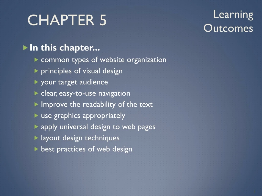
Chapter 5 Learning Outcomes • In this chapter... • common types of website organization • principles of visual design • your target audience • clear, easy-to-use navigation • Improve the readability of the text • use graphics appropriately • apply universal design to web pages • layout design techniques • best practices of web design
Overall Design Is Related to the Site Purpose Consider the target audience of these two sites.
Hierarchical Organization is the most popular * • A clearly defined home page • Navigation links to major site sections • Often used for commercial and corporate websites * Linear & Random are other methods
CRAP Design Principles • Contrast • Add visual excitement and draw attention • Repetition • Repeat visual elements throughout design • Alignment • Align elements to create visual unity • Proximity • Group related items Please Browse her site while I talk
Website by M. Maniaci Contrast
Website by T. Deitz Repetition
Website by G. Cordoba Alignment
Website by C. Noble Proximity
Website by C. Burke A teachable moment
Go to https://www.donaldjtrump.com to see how colors are used.
Design to Provide for Accessibility “The power of the Web is in its universality. Access by everyone regardless of disability is an essential aspect.” – Tim Berners-Lee • Who benefits from increased accessibility? • A person with a physical disability • A person using a slow Internet connection • A person using an old, out-dated computer • A person using a mobile phone • Legal Requirement: Section 508 • Standards: WCAG 2.0
Design for Accessibility • Web Content Accessibility Guidelines 2.0WCAG 2.0 Based on Four Principles (POUR) • Perceivable Content must be Perceivable • Operable Interface components in the content must be Operable • Understandable Content and controls must be Understandable • Robust. Content should be Robust enough to work with current and future user agents, including assistive technologies • http://www.w3.org/TR/WCAG20/Overview • http://www.w3.org/WAI/WCAG20/quickref
Writing for the WebRead Section 5.5 • Avoid long blocks of text • Use bullet points • Use headings and subheadings • Use short paragraphs
Color Theory • Color Theory: • the study of color and its use in design • Color Wheel • Primary Colors • Secondary Colors • Tertiary Colors
Color Schemes Based on The Color Wheel (1) • Monochromatic – shades, tints, or tones of the same colorhttp://meyerweb.com/eric/tools/color-blend • Analogous – a main color and two colors adjacent to it on the color wheel • Complementary – two colors that are opposite each other on the color wheel
Color Schemes Based on The Color Wheel (2) • Split Complementary – a main color, the color opposite it on the color wheel (the complement) and two colors adjacent to the complement • Triadic- three colors that are equidistant on the color wheel • Tetradic – two complementary color pairs
Making Color Choices • choose a color scheme e.g. (Adobe Kuler) • Choose from a photograph or image (colr.org) • Begin with a favorite color or company color
Implementing a Color Scheme • Choose one color to be dominant • Use other colors in the color scheme as accent colors • headings, • subheadings • borders, • list markers, etc. • Use neutrals such as white, off-white, gray, black, or brown • Feel free to use tints, shades, or tones of colors
Color & Target Audience Appealing to Kids & Preteens Appealing to Everyone Appealing to Young Adults Appealing to Older Adults
Graphic Design Best Practices • Be careful with large graphics! • Remember 60K recommendation • Use the alt attribute to supply descriptive alternate text • Be sure your message gets across even if images are not displayed. • If using images for navigation provide plain text links at the bottom of the page. • Use animation only if it makes the page more effective and provide a text description.
Graphic Design Best Practices • There is no requirement to limit your color choices to web safe colors. • Use anti-aliased text in images
Graphic Design Best Practices Do you really need to see a photo of my dog right now? • Use only necessary images • Reuse images • Goal: image file size should be as small as possible with acceptable display quality
Web Page Design Browsers & Screen Resolution • Test with multiple browsers • Internet Explorer, Google Chrome, Mozilla Firefox, Apple Safari • Test at various screen resolutions • Design to look good at various screen resolutions
Navigation Design • Make your site easy to navigate • Provide clearly labeled navigation in the same location on each page • Most common – across top or down left side • Consider: • Breadcrumb Navigation • Using Graphics for Navigation • Dynamic Navigation • Site Map • Site Search Feature • “Skip to Content” Hyperlink
Other can’t-miss strategies • Above the fold: the most attention-getting items placed in first 600px vertically • White space: Placing blank space around blocks of information. Increases readability. Allows items to stand out.
Checklists Be sure to confer with the checklists at the end of the chapter while creating websites and afterwards… Recommended online source Design for non-designers http://www.designforfounders.com/tips-and-hacks
Wireframe • A sketch or blueprint of a web page • Shows the structure of the basic page elements, including: • Header • Navigation • Content • Footer • Image locations
Page Layout Design Techniques Fixed Layout • AKA rigid or “ice” design • Fixed-width often at left margin • More appealing if fixed with content is centered
Page Layout Design Techniques Fluid Layout • AKA “liquid” design • Expands to fill the browser at all resolutions. • Adaptation: • Page content typically centered andoften configured with a percentage width such as 80%
Design for the Mobile Web • Predicted that by 2015, more users will access websites using mobile devices than with desktop computers • Three Approaches: • Separate .mobi mobile site • Host the mobile site within your current domain • Configure your current website for mobile display using responsive web design techniques
Mobile Design Quick Checklist • Small screen size • Bandwidth issues • Single-column layout • Maximize contrast • Optimize images for mobile display • Descriptive alternate text for images • Avoid display of non-essential content
Responsive Web Design • Ethan Marcotte, noted web developerhttp://www.alistapart.com/articles/responsive-web-design • Progressively enhancing a web page for different viewing contexts (such as smartphones and tablets) through the use of coding techniques, including flexible layouts and media queries. • Examples: http://www.mediaqueri.es