Download
1 / 8
80 likes | 222 Views
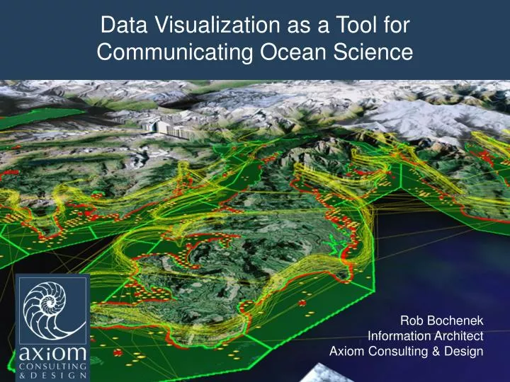
Data Visualization as a Tool for Communicating Ocean Science. Rob Bochenek Information Architect Axiom Consulting & Design. Presentation Summary. Explore why communicating ocean science data is difficult in a data rich world. Review an example dataset and discuss communication issues.

E N D
Data Visualization as a Tool for Communicating Ocean Science Rob Bochenek Information Architect Axiom Consulting & Design
Presentation Summary Explore why communicating ocean science data is difficult in a data rich world. Review an example dataset and discuss communication issues. Example visualizations. How does data visualization improve science communication for everyone? How an organization can prepare to rapidly and cost effectively visualize their data.
Why is communicating ocean science data difficult? Data is complex (measurements spread over space and time). The amount of data being created is increasing with time. Raw data is not very accessible to scientists (and even less accessible to the public). Summarized data in report form is condensed lacking granular access.
Example Dataset: NOAA Mussel Contaminants Dataset Data is a simple table describing samples for lingering oil in the PWS oil spill affected area. Multiple samples at multiple locations sampled through time.
Example Dataset: NOAA Mussel Contaminants Dataset Example graphic from the final report. Graphs display contaminant data grouped into “common name” to show change over time. No way to tell where sampling events took place.
Google Earth Google Earth Client is free and available. Renders .kml or .kmz documents (very much like a word document). 4 Dimensional Visualization (x,y,z,t). Can interact with the web but is not required. Can create data mosaics (layers from multiple sources).
Website Based Data Visualization 2 D (x,y). Requires Web Server. Systems include : google maps, open layers, mapserver.
How to be Prepared to Visualize your Data Require investigators to create descriptive metadata during (NOT five years after) data collection Federal Geospatial Data Committee (FGDC) Send them to the Friday workshop with USGS on metadata. Require data fields for latitude, longitude and time for data which has a geospatial/temporal component (avoid the “Beaver Creek” ambiguity). Make sure images and other information acquired during data collection are logically linked to sampling efforts. GEODB Standardization Documentation Programming Visualizations Data