Download
1 / 35
530 likes | 1.11k Views
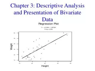
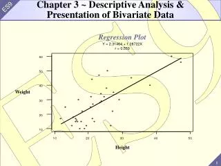
Chapter 3 Presentation of Data. Presentation of Data. 1. Classification and Tabulation Frequency and Cumulative Frequency Tables 2. Diagrammatic/Graphical Presentation Stem and Leaf Diagram Bar Chart Pareto Chart Pie Chart Histogram Ogive Line Graph Lorenz Curve

E N D
Presentation of Data 1. Classification and Tabulation • Frequency and Cumulative Frequency Tables 2. Diagrammatic/Graphical Presentation • Stem and Leaf Diagram • Bar Chart • Pareto Chart • Pie Chart • Histogram • Ogive • Line Graph • Lorenz Curve 3. Use of Graphs as Management Tool
Stem and Leaf Diagram • A stem and leaf diagram presents a visual summary of a data. • The diagram provides sorting of the data and helps in detecting the distributional pattern of the data.
Classification and Tabulation • Classification is the first step in Tabulation • Classification implies bringing together the items which are similar in some respect(s) • After classification, tabulation is done to condense the data in a compact form which can be easily comprehended
Specific advantages or objectives of Tabulation • It summarises data into rows and columns • It gives appropriate classification with number of data items into cells (intersection of rows and columns), subtotals of rows and columns, etc.This help in drawing useful interpretations about the data • provides significant features of data including comparisons are revealed
Diagrammatic/Graphical Presentation • Stem and Leaf Diagram • Bar Chart • Pareto Chart • Pie Chart • Histogram • Ogive • Line Graph • Lorenz Curve
Bar Chart • It comprises of a series of bars of equal width – the base of the bars being equal to the width of the class interval of a grouped data. • The bars ‘stand’ on a common base line, the heights of the bars being proportional to the frequency of the interval.
Educational Qualification Number of Students B.Tech 55 B.Com 70 B.Sc. 25 B.A. 45 C. A. 20 Bar Chart
Subdivided Bar Chart • A Subdivided Bar chart is a bar chart wherein each bar is divided into further components.
Educational Qualification Metro Large Medium Total B.Tech 15 25 15 55 B.Com 35 20 15 70 B.Sc. 10 10 5 25 B.A. 15 10 20 45 C. A. 10 5 5 20 Subdivided Bar Chart
Percentage Bar Chart • Percentage Bar chart is a bar chart wherein each bar is divided into components which are expressed as percentage of the total bar. • This chart is usually used when we wish to make a visual presentation of comparing the components of various bars which could represent different entities.
Automakers Average Sales Estimates (i) Average Net Profit Estimates (ii) Percentage of Profit to Sales (iii) = (ii)(i) 100 Tata Motors 6,484.80 466 7.2 Hero Honda 2,196.50 224.2 10 Bajaj Auto 2,444.70 345.4 14 TVS Motor 1,032.90 35.1 3.4 Bharat Forge 461.6 63.4 14 Ashok Leyland 1,635.80 94.7 5.8 Percentage Bar Chart
Multiple Bar Chart • Multiple bar chart is a bar chart wherein two or more bars are placed together for each entity. • The bars are placed together to give comparative assessment of values of some parameter over two periods of time or at two different locations, etc. • This chart is normally used when we wish to present visual comparision of two year’s data for several entities, brands, etc.
Pain Killer 2005(Rs. in Crores) 2006(Rs. in Crores) Voveran 16.5 23.2 Calpol 13.2 18.2 Nise 15.2 18.6 Combiflam 9.4 14.1 Dolonex 6.8 10.3 Sumo 5.1 7.4 Volini 6.9 9.6 Moov 3.8 4.9 Nimulid 3.5 4.9 Multiple Bar Chart
Pareto Chart • This specialised bar chart, named after the famous Italian economist, is used to classify a variable into groups or intervals from largest to smallest frequency. • It facilitates in identification of the most frequent occurrence or causes of an event or phenomenon. It is used for sorting data by using any criteria like geographical regions, organisations like management institutes, banks, countries, cities, etc., and time zones like day/week/month, etc.
Academic Background Frequency Commerce 18 Economics 6 Engineer 17 Information Technology 7 Science 8 Pareto Chart
Pie Chart • It is one of the most popular charts for presenting the ‘whole’ into parts. • It is a circular chart divided into sectors representing relative magnitude of various components.
Sources of Funds Percentage of Total Use of Funds Percentage of Total Excise 17 Central Plan 20 Customs 12 Non-plan Assistance and Expenditure 23 Corporate Tax 21 Defense 12 Income Tax 13 Interest Payments 20 Service Tax 7 States’ Share 18 Borrowings & Others 30 Subsidies 7 Total 100 100 Pie Chart GOVERNMENT OF INDIA’S BUDGET 2007-08
Sources of Funds Percentage of Total * Size of Segment (Degrees) Excise 17 61.2 Customs 12 43.2 Corporate Tax 21 75.6 Income Tax 13 46.8 Service Tax 7 25.2 Borrowings & Others 30 108 Total 100 360 Pie Chart
Use of Funds Percentage of Total Central Plan 20 72 Size of Segment (Degrees) Non-plan Assistance and Expenditure 23 82.8 Defense 12 43.2 Interest Payments 20 72 States’ Share 18 64.8 Subsidies 7 25.2 100 360 Pie Chart
Uses of Funds Central Plan, 20, Subsidies, 7, 9% 24% Interest Payments, 20, 24% Non-plan Defence , 12, 15% Assistance and Expenditure , 23, 28% Pie Chart
Histogram/Frequency Polygon • A histogram comprises of vertical rectangles whose base is proportional to the class interval and height is proportional to the frequency in an interval. • The polygon formed by joining the middle points of the above rectangles is known as the frequency polygon. It gives an idea of the shape of the distribution frequencies of
7 6 6 5 5 4 4 3 3 2 2 1 0 2000 – 3000 3000 – 4000 4000 – 5000 5000 – 6000 6000 – 7000 Equity Holdings in Millions of Rs. Histogram
Ogive • An ogive graph gives an idea about the number of observations less or greater than the values in the range of the variable. • Accordingly, there are two types of ogives, viz. ’Less Than’ and ‘Greater Than’.
Ogive Less than type Greater than type
Line Graph • A line graph is a visual presentation of a set of data values joined by straight lines. • The data values could be over a period of time or over a set of entities like banks, individuals, etc
Bank Business per Emp 05-06 Allahabad Bank 336 153 Andhra Bank 426.75 195.96 Bank of Baroda 396 222.76 Bank of India 381 218.74 Bank of Maharashtra 306.18 191.44 Canara Bank 441.57 214.88 Central Bank of India 240.46 148.77 Corporation Bank 527 290.44 Dena Bank 364 221 Indian Bank 295 156 Indian Overseas Bank 354.73 175.41 Business per Emp 06-07
Line Graph Business per Employee in Banks
Cumulative Percentage of Billionaires Cumulative Equity Holding % of Total Equity Holding 20 16420 18 40 33423 37 60 52135 57 80 71330 78 100 91308 100 Lorenz Curve
120 100 Line of Perfect Equality 80 60 40 20 0 20 40 100 Lorenz Curve
Budgeted • XActual x Business x x x x x x x x x x 80 60 Months M A M J J A S O N D J F Use of Graphs as a Management Tool: A Case Study