Download
1 / 42
420 likes | 564 Views
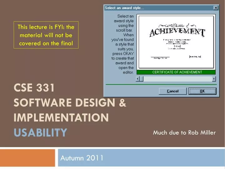
This lecture is FYI: the material will not be covered on the final. CSE 331 Software Design & Implementation usability. Much due to Rob Miller. Autumn 2011. What’s wrong?. Usability is about creating effective user interfaces The first slide shows a WYSIWYG GUI – but it still fails – why?

E N D
This lecture is FYI: the material will not be covered on the final CSE 331Software Design & Implementationusability Much due to Rob Miller Autumn 2011
What’s wrong? • Usability is about creating effective user interfaces • The first slide shows a WYSIWYG GUI – but it still fails – why? • The long help message is needed for a simple task because the interface is bizarre! • The scrollbar is used to select an award template • Each position on the scrollbar represents a template, and moving the scrollbar back and forth changes the template shown • Cute but bad use of a scrollbar • How many templates? No indication on scrollbar • How are the templates organized? No hint
User Interface Hall of Shame Source: Interface Hall of Shame • Inconsistent with common usage of scrollbars – usually used for continuous scrolling, not discrete selection • How does a frequent user find a template they’ve used before?
Redesigning the Interface Source: Interface Hall of Shame
Another for the Hall of Shame Source: Interface Hall of Shame • The date and time look editablebut aren’t – click “Set Time” for a dialog box instead • Dialog box displays inconsistently with launch time – 12 vs. 24, analog vs. digital • Click left [right] button to increase the minutes [hours] by 1 – makes a sophisticated GUI into a clock radio! Launches housekeeping tasks at scheduled intervals
User Interfaces Are Hard to Design • You are not the user • Most software engineering is about communicating with other programmers • UI is about communicating with users • The user is always right • Consistent problems are the system’s fault • …but the user is not always right • Users aren’t designers
Iterative Design • UI development is an iterative process • Iterations can be costly – but the benefits can be high • If the design turns out to be bad, you may have to throw away most of your code Design Evaluate Implement
Spiral Model • Use throw-away prototypes and cheap evaluation for early iterations Design Evaluate Implement
Usability Defined • Usability: how wellusers can use the system • Dimensions of usability • Learnability: is it easy to learn? • Efficiency: once learned, is it fast to use? • Memorability: is it easy to remember what you learned? • Errors: are errors few and recoverable? • Satisfaction: is it enjoyable to use?
Lecture Outline 1. Design design principles 3. Evaluate 2. Implement user testing low-fidelity prototypes
Learnability • Related to “intuitive” and “user-friendly” • The first example had serious problems with learnability, especially with the scrollbar • Unfamiliar usage • Inconsistent usage • And outright inappropriate usage
Metaphorical Design • Designers based it on a real-world plastic CD case • Metaphors are one way to make an interface “intuitive,” since users can make guesses about how it will work • Dominated by static artwork – clicking it does nothing • Why? A CD case doesn’t actually play CDs, ao the designers had to find a place for the core player controls • The metaphor is dictating control layout, against all other considerations • Also disregards consistency with other desktop applications. Close box? Shut it down? Source: Interface Hall of Shame
Source: Interface Hall of Shame People Don't Learn Instantly • To design for learnability it helps to know how people actually learn • This example shows overreliance on the user’s memory • It’s a modal dialog box, so the user needs to click OK • But then the instructions vanish from the screen, and the user is left to struggle to remember them • Just because you've said it, doesn't mean they know it
Facts About Memory & Learning • Working memory • Small: 7 ± 2 “chunks” • Short-lived: gone in ~10 sec • Maintenance rehearsal is required to keep it from decaying (but costs attention) • Long-term memory • Practically infinite in size and duration • Elaborative rehearsal transfers chunks to long-term memory Working Memory Long-term Memory
Source: Interface Hall of Shame Design Principles for Learnability • Consistency • Similar things look similar, different things different • Terminology, location, argument order, ... • Internal, external, metaphorical • Match the real world • Common words, not tech jargon • Recognition, not recall • Labeled buttons are better than command languages • Combo boxes are better than text boxes
Visibility • Familiar, easy to use • But passes up some tremendousopportunities, including • Why only one line of display? Why not a history? • Why only one memory slot? Why display “M” instead of the actual number stored in memory? • Visibility also compromised by invisible modes • When entering a number, pressing a digit appends it to the number; but after pressing an operator button, the next digit starts a new number – no visible feedback the low-level mode • It also lets you type numbers on the keyboard, but there is no hint about this
Facts About Human Perception • Perceptual fusion: stimuli < 100ms apart appear fused to our perceptual systems • 10 frames/sec is enough to perceive a moving picture • Computer response < 100 ms feels instantaneous • Color blindness: many users (~8% of all males) can't distinguish red from green normal vision red-green deficient
Design Principles for Visibility • Make system state visible: keep the user informed about what's going on • Mouse cursor, selection highlight, status bar • Give prompt feedback – response time rules-of-thumb • < 0.1 sec seems instantaneous • 0.1-1 sec user notices, but no feedback needed • 1-5 sec display busy cursor • > 1-5 sec display progress bar
Efficiency • How quickly can an expert operate the system – input, commands, perceiving and processing output • About the performance of the I/O channel between the user and the program • Fewer keystrokes to do a task is usually more efficient; but it’s subtle • The Gimp interface uses only contextual, cascading submenus – studies show it’s actually slower to use than a menu bar
Some Facts About Motor Processing • Open-loop control • Motor processor runs by itself • Cycle time is ~ 70 ms • Closed-loop control • Muscle movements (or their effect on the world) are perceived and compared with desired result • Cycle time is ~ 240 ms Motor Perceptual Cognitive Muscles Senses Feedback
Pointing Tasks: Fitts’s Law • How long does it take to reach a target? • Moving mouse to target on screen • Moving finger to key on keyboard • Moving hand between keyboard and mouse D S
Source: Interface Hall of Shame Design Principles for Efficiency • Fitts's Law and Steering Law (constrained movement) • Make important targets big, nearby, or at screen edges • Avoid steering tasks • Provide shortcuts • Keyboard accelerators • Styles • Bookmarks • History
Mode Error • Modes: states in which actions have different meanings • Vi’s insert mode vs. command mode • Drawing palette • Reducing mode errors • Eliminate modes entirely • Visibility of mode • Disjoint action sets in different modes
Confirmation Dialogs: “Are you sure?” • They make common operations take two button presses rather than one • Frequent confirmations dialogs lead to expert users chunking it as part of the operation • Reversibility (i.e. undo) is a far better solution than confirmation – operations that are very hard to reverse may deserve confirmation, however
Source: Interface Hall of Shame Design Principles for Error Handling • Prevent errors as much as possible • Selection is better than typing • Reduce mode errors • Disable illegal commands • Separate risky commands from common ones • Use confirmation dialogs sparingly • Support undo • Good error messages • Precise • Speak the user’s language • Constructive help • Polite
Simplicity Source: Alex Papadimoulis
Design Principles for Simplicity • “Less is More” • Omit extraneous information, graphics, features • Good graphic design • Few, well-chosen colors and fonts • Group with whitespace • Use concise language • Choose labels carefully
Document your system • Write the user manual • Program and UI metaphors • Key functionality • Not: exhaustive list of all menus • What is hard to describe? • Who is your target user? • Power users need a manual • Casual users might not • Piecemeal online help is no substitute
Lecture Outline 1. Design design principles 3. Evaluate 2. Implement user testing low-fidelity prototypes
Low-fidelity Prototypes • Paper is a very fast and effective prototyping tool • Sketch windows, menus, dialogs, widgets • Crank out lots of designs and evaluate them • Hand-sketching is OK – even preferable • Focus on behavior & interaction, not fonts & colors • Similar to design of your data structures & algorithms • Paper prototypes can even be executed • Use pieces to represent windows, dialogs, menus • Simulate the computer’s responses by moving pieces around and writing on them
User Testing • Start with a prototype • Write up a few representative tasks • Short, but not trivial • e.g.: “add this meeting to calendar”, “type this letter and print it” • Find a few representative users • Three is often enough to find obvious problems • Watch them do tasks with the prototype
How to Watch Users • Brief the user first (being a test user is stressful) • “I’m testing the system, not testing you” • “If you have trouble, it’s the system’s fault” • “Feel free to quit at any time” • Ethical issues: informed consent • Ask user to think aloud • Be quiet! • Don’t help, don’t explain, don’t point out mistakes • Sit on your hands if it helps • Two exceptions: prod user to think aloud (“what are you thinking now?”), and move on to next task when stuck • Take lots of notes
Watch for Critical Incidents • Critical incidents: events that strongly affect task performance or satisfaction • Usually negative • Errors • Repeated attempts • Curses • Can also be positive • “Cool!” • “Oh, now I see.”
Summary • You are not the user • Keep human capabilities and design principles in mind • Iterate over your design • Write documentation • Make cheap, throw-away prototypes • Evaluate them with users
Further Reading • General books on usability • Johnson. GUI Bloopers: Don’ts and Dos for Software Developers and Web Designers, Morgan Kaufmann, 2000. • JefRaskin, The Humane Interface, Addison-Wesley 2000. • Hix & Hartson, Developing User Interfaces, Wiley 1995. • Low-fidelity prototyping • Rettig, “Prototyping for Tiny Fingers”, CACM April 1994. • Usability heuristics • Nielsen, “Heuristic Evaluation.” http://www.useit.com/papers/heuristic/ • Tognazzini, “First Principles.” http://www.asktog.com/basics/firstPrinciples.html
Next steps • Monday: UML; Wednesday: TBA • A5 and A6