Download
1 / 14
140 likes | 255 Views
Web Foundations. Thursday, October 31, 2013 LECTURE 22 : CSS Multicolumns , CSS Prefix Tools HTML/CSS WYSIWYG WEB Editors . CSS Multicolumn Layout.

E N D
Web Foundations Thursday, October 31, 2013 LECTURE 22: CSS Multicolumns, CSS Prefix Tools HTML/CSS WYSIWYG WEB Editors
CSS Multicolumn Layout CSS3 multicolumn layout has been a tantalizing possibility for some years now. However, with lack of support in Internet Explorer it hasn’t been taken up as much as it deserves. With IE 10 supporting these properties, and its usefulness in creating responsive designs, I hope we will very soon see it used more. .columns { column-count:4; column-gap:10px; }
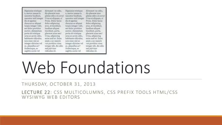
CSS Multicolumn Layout Multicolumn layout makes it possible to arrange contentin columns, in the same way that content flows in a newspaper. You can take a container in your document and state that you want it to be arranged into columns, and the browser will make it so. If you specify the number of columns that you want the content arranged into, the browser will work out the width of each column so that it will fit into the parent box. If you specify a width for the columns then the browser will display as many columns as it is able, maintaining that width for each.
CSS Multicolumn Properties Column Width & Count Setting the number or the width of columns is important to the multi column layout content. Columns should be set by using either ‘column-width’ or ‘column-count’, but should never be used together. Both of these properties are by default set to ‘auto’. ‘Column width’ does exactly what it says. It allows you to specify a fixed width for the columns. The measurement of this width can be carried out in the standard way using px, ems etc. Depending on what you enter for the column width it can vary and may be slightly wider or narrower to fit the space available. If this property is set to ‘auto’, then this means the width of the columns will be dictated by other properties, such as the one below. • column-count: (number of columns) | auto;
CSS Multicolumn Properties Column Count Should you want the layout to be split into a number of specified columns then this is the property that you would opt for. By setting the value of this the content is divided into the required amount of columns. If this property is set to ‘auto’, then this means the number columns will be decided by other properties, such as ‘column-width’. column-width: (length) | auto;
CSS Multicolumn Properties Column ‘Columns’ is effectively a shorthand property that allows you to set the ‘column width’ and ‘column count’. Here are a view valid values that you might associate with ‘columns’ columns: 12em; /* column-width: 12em; column-count: auto */ columns: auto 12em; /* column-width: 12em; column-count: auto */ columns: 2; /* column-width: auto; column-count: 2 */ columns: 2 auto; /* column-width: auto; column-count: 2 */ columns: auto; /* column-width: auto; column-count: auto */ columns: auto auto; /* column-width: auto; column-count: auto */ column-width: (length) | auto;
CSS Multicolumn Properties Column-Gap ‘Column gap’ give us the opportunity to add a space between each of the columns and gives the content room to breathe. We specify the width of the gap using standard CSS measurements. The width of the gap that you specify cannot be negative. • column-gap: (length) | normal;
CSS Multicolumn Properties Column-Rule ‘Column Rule’ effectively puts a border down the middle of the ‘column-gap’. Therefore, to enable this, a ‘column-gap’ width must be specified that has the same or larger value than the column rule. The column rule also has several separate sub properties as well as a shorthand version. This shorthand version works in the same way as the shorthand ‘border’ property. You can see this below: column-rule-width:1px; column-rule-style: solid; column-rule-color: #000; column-rule: 1px solid #000; /* This is the shorthand version */
CSS Multicolumn Properties Column-Span ‘Column-span’ allows us to span across all of the columns. If we take our simple example from earlier and add a h1 title to our content, we can easily get this h1 tag to span the entire 4 columns by adding column-span:allto it h1{ column-span: all; } column-span: all | none;
CSS Multicolumn Properties Column-Fill The ‘column-fill’ property gives us two controls for setting how the amount of the content is balanced over the columns. If set to ‘balance’ then the variation in the column length will be minimized and all lengths will be as equal as possible. If set to ‘auto’ then the columns will be filled in order and (for instance) may result in the 4th of 4 columns having less content than the 3 previous columns. If balance was set on this then it would allow all 4 columns to be roughly of equal height. This property solves the problem of undesirable gaps being left in the content. column-span: all | none;
CSS Multicolumn Properties Ovwerflow ‘Overflow’ should be used to control what happens if the content overflows the columns. If for instance the main ‘columns’ div had a fixed width and the content of the columns extends this then we can control whether this should be shown or clipped using the ‘overflow’ property. In the example we can see that the columns overflow the div. This is due to overflow not being set to ‘hidden’ on the parent element. column-span: all | none;
CSS Multicolumn Layout Example http://faculty.cascadia.edu/cduckett/foundations/multicolumn.html • Links • W3Schools: Multicolumn • W3C: Multicolumn • CSS3 Info: Multicolumns • Tutsplus: Multicolumns • CanIUse: Multicolumns • Multicolumn Layout Generator • Multicolumn Examples
CSS Vendor Prefix Tools In the mad rush to bring CSS3 properties to the masses, browser vendors added their own vendor prefixes to the property names as an interim solution. Now, we have a bit of a mess as a result. I'm not going to enumerate all of the ways in which vendor prefixes are bad and how the world would be a better place without them. You already know that. What's needed is a sane way to deal with them that doesn't take up all of your development time. One approach, is to use tools that generate CSS rules for you from unprefixed CSS3 properties. That allows you, the developer, to blissfully imagine that prefixes never existed, by shielding you from those evil little monsters. • Links • Prefixr • Prefix-Free • CSS3 Please • Prefix My CSS
HTML/CSS WYSIWYG Web Editors • Paid Editors • Dreamweaver (Free Trial) • CoffeeCup HTML Editor (Free Version Available) • TO Web (Free Version Available) • Web Architect (Free Trial Available) • Free Editors • KompoZer • NVU • Blue Griffon • Microsoft Expression Web 4(Now Free!) • Amaya(W3C) • Page Breeze • Trellian • Add-On Tools • Web Assist • Extend Studio • Adobe Exchange