Download
1 / 13
130 likes | 240 Views
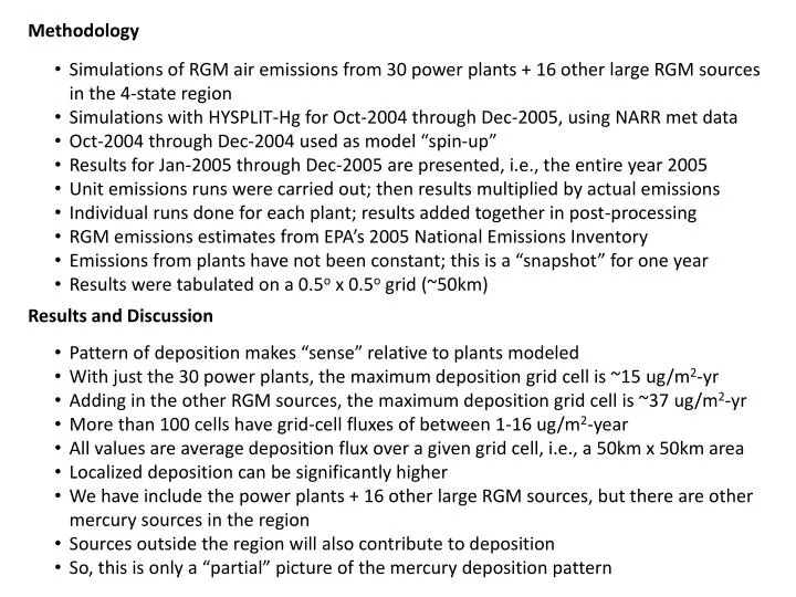
Methodology. Simulations of RGM air emissions from 30 power plants + 16 other large RGM sources in the 4-state region Simulations with HYSPLIT-Hg for Oct-2004 through Dec-2005, using NARR met data Oct-2004 through Dec-2004 used as model “spin-up”

E N D
Methodology • Simulations of RGM air emissions from 30 power plants + 16 other large RGM sources in the 4-state region • Simulations with HYSPLIT-Hg for Oct-2004 through Dec-2005, using NARR met data • Oct-2004 through Dec-2004 used as model “spin-up” • Results for Jan-2005 through Dec-2005 are presented, i.e., the entire year 2005 • Unit emissions runs were carried out; then results multiplied by actual emissions • Individual runs done for each plant; results added together in post-processing • RGM emissions estimates from EPA’s 2005 National Emissions Inventory • Emissions from plants have not been constant; this is a “snapshot” for one year • Results were tabulated on a 0.5o x 0.5o grid (~50km) Results and Discussion • Pattern of deposition makes “sense” relative to plants modeled • With just the 30 power plants, the maximum deposition grid cell is ~15 ug/m2-yr • Adding in the other RGM sources, the maximum deposition grid cell is ~37 ug/m2-yr • More than 100 cells have grid-cell fluxes of between 1-16 ug/m2-year • All values are average deposition flux over a given grid cell, i.e., a 50km x 50km area • Localized deposition can be significantly higher • We have include the power plants + 16 other large RGM sources, but there are other mercury sources in the region • Sources outside the region will also contribute to deposition • So, this is only a “partial” picture of the mercury deposition pattern
We explicitly modeled sources representing about 90% of the RGM emissions in the four-state area, according to the 2005 NEI
Here’s what we had before, when we just included the power plants • Location of modeled power plant 15
Here’s what we get when we add in other large RGM sources in the region • Location of modeled power plant • Location of other large RGM source
Just in case its helpful, here’s something I did a few weeks earlier… These are illustrative overall and time-series results just for one plant (Big Cajun) First map is for the overall simulation, over 15 months The second set of slides shows the time-series of deposition, on a finer-grid close-in to the source, that demonstrates how things evolve… for a unit emissions of RGM from the plant, for 3-hr time steps… This “movie” might be interesting to show?
Movie showing illustrative simulation of deposition arising • from 1 g/hr emissions of RGM from Big Cajun II power plant • each frame represents 3 hours; four weeks shown • actual plant emits ~9 g/hr RGM (according to 2005 National Emissions Inventory)