Download
1 / 3
30 likes | 98 Views
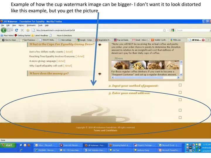
Example of how the cup watermark image can be bigger- I don’t want it to look distorted like this example, but you get the picture. I want Contact and About to look more like tabs and less like floating boxes. This Tab should read: “PROGRESS”

E N D
Example of how the cup watermark image can be bigger- I don’t want it to look distorted like this example, but you get the picture
I want Contact and About to look more like tabs and less like floating boxes This Tab should read: “PROGRESS” *The tabs should be a green color that matches the green color scheme of the site
Landing Page Mock-up [ENTER SITE] So far we are raised: The Equality Cup is: 47.2% $X,XXX.XX Full to support Equality initiatives Cups for Equality Giving Campaign Goal: $2,000,000 X