Download
1 / 13
160 likes | 373 Views
Charts: the good, the bad, and the tasty. FUEL-EFFICIENT CARS Here is a small part of a data set that describes the fuel economy (in miles per gallon) of 1998 model motor vehicles. (a) What are the individuals in this data set ?

E N D
FUEL-EFFICIENT CARS Here is a small part of a data set that describes the fuel economy (in miles per gallon) of 1998 model motor vehicles. • (a) What are the individuals in this data set? • (b) For each individual, what variables are given? Which of these variables are categorical and which are quantitative?
MEDICAL STUDY VARIABLES Data from a medical study contain values of many variables for each of the people who were the subjects of the study. Which of the following variables are categorical and which are quantitative? (a) Gender (female or male) (b) Age (years) (c) Race (Asian, black, white, or other) (d) Smoker (yes or no) (e) Systolic blood pressure (millimeters of mercury) (f) Level of calcium in the blood (micrograms per milliliter)
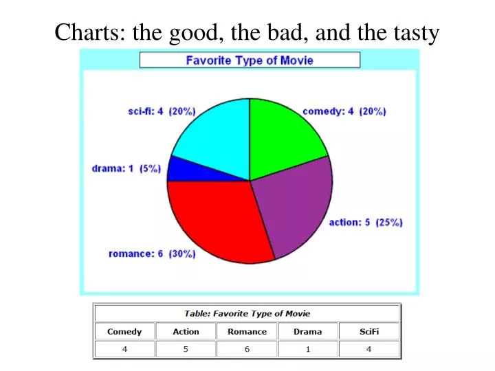
Pie Charts versus other graphs • Advantages :Simplicity, clarity • Easilyrememberedvisual image • Picture of complexrelationships • Emphasis • Popular • Pie charts MUST represent parts of a WHOLE study • Disadvantages : Lack of precision • Lack of flexibility • Provide for distortion
Charts:the good, the bad, and the tasty #14, page 21
Bar chart example • The bar chart below shows average per capita income for the four "New" states - New Jersey, New York, New Hampshire, and New Mexico. What is the case/individual, what is the variable, what type of variable is it? Does anything stick out as “weird” to you?
Female Doctorates: Here are data on the percentage of females among people earning doctorates at Vanderbuilt University in 1994. (multiple fields of study) Create a bar chart from this data: Would it be correct to use a pie chart? Why or why not?
Female Doctorates: Create a bar chart from this data: Would it be correct to use a pie chart? Why or why not? * These are categorical, they could be in any order, here is my first graph A pie chart is not fitting for this data set. The entries in this table are not from the same field of study.
ACCIDENTAL DEATHS In 1997 there were 92,353 deaths from accidents in the United States. Among these were 42,340 deaths from motor vehicle accidents, 11,858 from falls, 10,163 from poisoning, 4051 from drowning, and 3601 from fires. Find the percent of accidental deaths from each of the causes, rounded to the nearest percent. What percent of deaths were due to other causes? (b) Make a well-labeled bar graph of the distribution of causes of accidental deaths. Be sure to include an “other causes” bar. (c) Would it also be correct to use a pie-chart to display these data? If so, construct the pie-chart. If not, explain why not.
ACCIDENTAL DEATHS In 1997 there were 92,353 deaths from accidents in the United States. Among these were 42,340 deaths from motor vehicle accidents, 11,858 from falls, 10,163 from poisoning, 4051 from drowning, and 3601 from fires. Find the percent of accidental deaths from each of the causes, rounded to the nearest percent. What percent of deaths were due to other causes? Motor Vehicles = 46% Falls = 13% Drowning = 4% Fires = 4% Poisoning = 11% Other causes = 22%
ACCIDENTAL DEATHS In 1997 there were 92,353 deaths from accidents in the United States. Among these were 42,340 deaths from motor vehicle accidents, 11,858 from falls, 10,163 from poisoning, 4051 from drowning, and 3601 from fires. (b) Make a well-labeled bar graph of the distribution of causes of accidental deaths. Be sure to include an “other causes” bar.
ACCIDENTAL DEATHS In 1997 there were 92,353 deaths from accidents in the United States. Among these were 42,340 deaths from motor vehicle accidents, 11,858 from falls, 10,163 from poisoning, 4051 from drowning, and 3601 from fires. (c) Would it also be correct to use a pie-chart to display these data? If so, construct the pie-chart. If not, explain why not. A pie chart could also be used, since the categories represent parts of a whole (all accidental deaths).