Download
1 / 18
180 likes | 187 Views
CHAPTER 1: Picturing Distributions with Graphs. Lecture PowerPoint Slides. Chapter 1 Concepts. Individuals and Variables Categorical Variables: Pie Charts and Bar Graphs Quantitative Variables: Histograms Interpreting Histograms Quantitative Variables: Stemplots Time Plots.

E N D
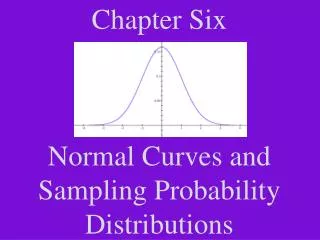
CHAPTER 1:Picturing Distributions with Graphs Lecture PowerPoint Slides
Chapter 1 Concepts • Individuals and Variables • Categorical Variables: Pie Charts and Bar Graphs • Quantitative Variables: Histograms • Interpreting Histograms • Quantitative Variables: Stemplots • Time Plots
Chapter 1 Objectives • Define statistics. • Define individuals and variables. • Categorize variables as categorical or quantitative. • Describe the distribution of a variable. • Construct and interpret pie charts and bar graphs. • Construct and interpret histograms and stemplots. • Construct and interpret time plots.
Statistics Statistics is the science of data. The first step in dealing with data is to organize your thinking about the data: Categorical Variable Places individual into one of several groups or categories. Individual An object described by data Variable Characteristic of the individual Quantitative Variable Takes numerical values for which arithmetic operations make sense.
Exploratory Data Analysis An exploratory data analysis is the process of using statistical tools and ideas to examine data in order to describe their main features. Exploring Data • Begin by examining each variable by itself. Then move on to study the relationships among the variables. • Begin with a graph or graphs. Then add numerical summaries of specific aspects of the data.
Distribution of a Variable • To examine a single variable, we want to graphically display its distribution. • The distribution of a variable tells us what values it takes and how often it takes these values. • Distributions can be displayed using a variety of graphical tools. The proper choice of graph depends on the nature of the variable. Categorical Variable Pie chart Bar graph Quantitative Variable Histogram Stemplot
Categorical Data The distribution of a categorical variable lists the categories and gives the count or percent of individuals who fall into that category. Pie Charts show the distribution of a categorical variable as a “pie” whose slices are sized by the counts or percents for the categories. Bar Graphs represent each category as a bar whose heights show the category counts or percents.
Pie Charts and Bar Graphs US Solid Waste (2000)
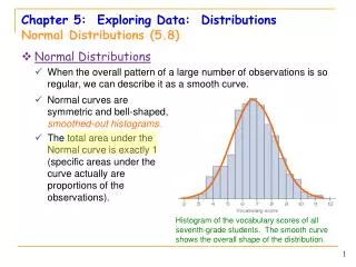
Quantitative Data • The distribution of a quantitative variable tells us what values the variable takes on and how often it takes those values. • Histograms show the distribution of a quantitative variable by using bars whose height represents the number of individuals who take on a value within a particular class. • Stemplots separate each observation into a stem and a leaf that are then plotted to display the distribution while maintaining the original values of the variable.
Histograms • For quantitative variables that take many values and/or large datasets. • Divide the possible values into classes(equal widths). • Count how many observations fall into each interval (may change to percents). • Draw picture representing the distribution―bar heights are equivalent to the number (percent) of observations in each interval.
Histograms • Example: Weight Data―Introductory Statistics Class
Stemplots (Stem-and-Leaf Plots) • For quantitative variables. • Separate each observation into a stem(first part of the number) and a leaf(the remaining part of the number). • Write the stems in a vertical column; draw a vertical line to the right of the stems. • Write each leaf in the row to the right of its stem; order leaves if desired.
10 0166 11 009 12 0034578 13 00359 14 08 15 00257 16 555 17 000255 18 000055567 19 245 20 3 21 025 22 0 23 24 25 26 0 Stemplots • Example: Weight Data – Introductory Statistics Class 5 2 2 Key 20|3 means203 pounds Stems = 10’sLeaves = 1’s Stems Leaves
151516161717 Stemplots (Stem-and-Leaf Plots) • If there are very few stems (when the data cover only a very small range of values), then we may want to create more stems by splittingthe original stems. • Example: If all of the data values were between 150 and 179, then we may choose to use the following stems: Leaves 0-4 would go on each upper stem (first “15”), and leaves 5-9 would go on each lower stem (second “15”).
Describing Distributions • In any graph of data, look for the overall patternand for striking deviationsfrom that pattern. • You can describe the overall pattern by its shape,center, and spread. • An important kind of deviation is an outlier, an individual that falls outside the overall pattern.
Describing Distributions • A distribution is symmetricif the right and left sides of the graph are approximately mirror images of each other. • A distribution is skewed to the right (right-skewed) if the right side of the graph (containing the half of the observations with larger values) is much longer than the left side. • It is skewed to the left (left-skewed) if the left side of the graph is much longer than the right side. Symmetric Skewed-right Skewed-left
Time Plots • A time plot shows behavior over time. • Time is always on the horizontal axis, and the variable being measured is on the vertical axis. • Look for an overall pattern (trend), and deviations from this trend. Connecting the data points by lines may emphasize this trend. • Look for patterns that repeat at known regular intervals (seasonal variations).
Chapter 1 Objectives Review • Define statistics. • Define individuals and variables. • Categorize variables as categorical or quantitative. • Describe the distribution of a variable. • Construct and interpret pie charts and bar graphs. • Construct and interpret histograms and stemplots. • Construct and interpret time plots.