Download
1 / 23
230 likes | 388 Views
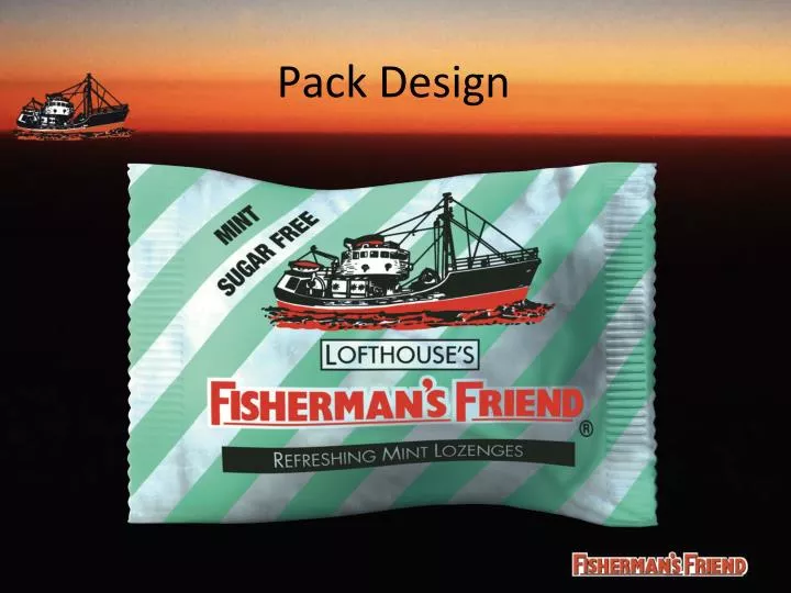
Pack Design. Pack History. 1960. Pack History. 1972 UK. 3. Pack History. 1972 Export. Pack History. 1975. Pack History. 1984. Pack History. 2010. Pack History. 2011. Other Brand Changes. Other Brand Changes. Other Brand Changes. Other Brand Changes. Other Brand Changes.

E N D
Pack History 1960
Pack History 1972 UK 3
Pack History 1972 Export
Pack History 1975
Pack History 1984
Pack History 2010
Pack History 2011
Other Brand Changes OLD NEW
Other Brand Changes OLD NEW Better shelf impact
Colour not directly linked to flavour, all flavour panels are black 2 colour print and illustration Flavour names are complex and in small thin font Doubly placed information increases complexity Unique landscape layout Stripes stand out on shelf Stripes are not clear as a signal of sugar free as they are not related directly to the words sugar free The customer may think the design without the stripes is sugar free Current Design Issues Fancy colour schemes are too complex and less classic
New Design Objectives • Keep the heritage of the product • Improve the flavour communication • Improve sugar free/non sugar free communication • Improve communication hierarchy • Improve visibility on shelf • Reduce double information • Reduce visual “noise”.
Heritage Proposed Design 2 colour print and illustration EU Energy requirement Clear refreshing white sugar free text Bolder colour to enable standout on shelf More modern trawler image White panel enables clearer text Revised logo easier to read Flavour text in bold black print on a tone of main colour Room for legislative text when required Unobtrusive technical panel
Proposed Design test