Download
1 / 20
200 likes | 202 Views
Learn about the key stages involved in statistical thinking, from defining the problem to making inferences and decisions. Explore the importance of data, information, and knowledge in the decision-making process.

E N D
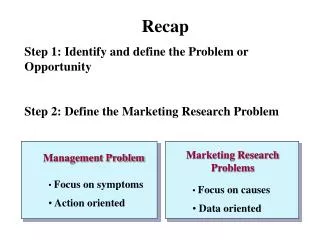
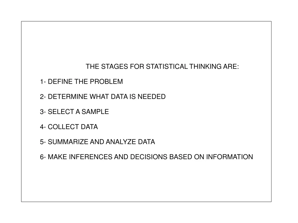
THE STAGES FOR STATISTICAL THINKING ARE: 1- DEFINE THE PROBLEM 2- DETERMINE WHAT DATA IS NEEDED 3- SELECT A SAMPLE 4- COLLECT DATA 5- SUMMARIZE AND ANALYZE DATA 6- MAKE INFERENCES AND DECISIONS BASED ON INFORMATION
The Journey to Making Decisions Begin Here: Identify the Problem DATA DATA Descriptive Statistics, Probability, Computers INFORMATION Experience, Theory, Literature Inferential Statistics, Computers KNOWLEDGE DECISION MAKING
DATA: Specific observations of measured numbers. INFORMATION: Processed and summarized data yielding facts and ideas. KNOWLEDGE: Selected and organized information that provides understanding, recommendations, and the basis for decisions.
Descriptive Statistics include graphical and numerical procedures that summarize and process data and are used to transform data into information Descriptive Statistics include graphical and numerical procedures that summarize and process data and are used to transform data into information Descriptive Statistics include graphical and numerical procedures that summarize and process data and are used to transform data into information Descriptive Statistics include graphical and numerical procedures that summarize and process data and are used to transform data into information Inferential Statistics provide the bases for predictions, forecasts, and estimates that are to transform information to knowledge
POPULATION: A complete set of individuals, objects or measurements having common observable characteristics. Examples of Populations - Names of all registered voters in TURKEY - Incomes of all families living in ANKARA - Annual return of all stocks traded on the ISTANBUL STOCK EXCHANGE - Grade Point Averages of all the students in your University - BILKENT
SAMPLE: A subset or part of a population Examples of Samples - Names of 50.000 registered voters in TURKEY - Incomes of 10.000 families living in ANKARA - Annual return of 150 stocks traded on the ISTANBUL STOCK EXCHANGE - Grade Point Averages of 500 students from different departments in your University - BILKENT
N: POPULATION n: Sample n: Sample n: Sample
Construct a stem-and-leaf display for the following data, using 0.1 as the leaf unit.
DATA FROM A SAMPLE OF 25 STUDENTS A B B AB 0 0 0 B AB B B B 0 A 0 A 0 0 0 AB AB A 0 B A
DATA ON TESTING CENTER THE NUMBER OF CARDIOGRAM PERFORMED EACH DAY FOR 20 DAYS 25 31 20 32 13 14 43 2 57 23 36 32 33 32 44 32 52 44 51 45
THE STEM_AND_LEAF DISPLAY This technique can be used to show both the rank order and a shape of a data set simultaneously. To develop a stem_and_leaf display, we first arrange the leading digits of each data value to the left of the vertical line. To the right of the vertical line, we record the last digit for each data value as we pass through the observations in the order they were recorded. The numbers to the left of the vertical line form the STEM. Each digit to the right of the vertical line is a LEAF Advantages: 1- It is easier to construct by hand 2- Since it shows the actual data, this display provides more information than histograms
BAR GRAPHS A Bar graph (chart) is a graphical device for depicting qualitative data summarized in: • Frequency • Relative Frequency • Percent Frequency On one axis of the graph (usually the horizontal axis) we specify the labels that are used for the classes (Categories) of data. A frequency; relative frequency or percent frequency scale can be used for the other axis of the graph (usually the vertical axis)
FREQUENCY DISTRIBUTION FOR QUANTITATIVE DATA With quantitative data, we must be more careful in defining the non-overlapping classes to be used in the freq. distribution. There are three steps necessary to define classes for a freq. diApp. with quantitative data. 1- Determine the number of non-overlapping classes. 2- Determine the width of each class. 3- Determine the class limits 1- NUMBER OF CLASSES: Classes are formed by specifying ranges that will be used to group the data. As a general guideline, we recommend using between 5 and 20 classes. For a small number of data items, as few as five or six classes may be used to summarize the data.
3- CLASS LIMITS: Class limits must be chosen so that each item belongs to one and only one class. The lower class limit identifies the smallest possible data value assigned to the class. The upper class limit identifies the largest possible data value assigned to the class.
CLASS MIDPOINT (M): The class midpoint is the value halfway between the lower and upper class limits. The definitions of the Relative Freq. and Percent Freq. Distributions are as the same as for qualitative data Cumulative Distributions: Cumulative Distribution is another tabular summary of data (quantitative). Cumulative Distribution use the number of classes, class widths and class limits developed for the frequency distributions. Cumulative Distribution shows the number of data items with values “less than or equal to the upper class limit” of each class. We also note that a cumulative relative frequency distribution shows the proportion of data items, and a cumulative percent frequency distribution shows the percentage of data items with values less than or equal to the upper limit of each class.
HISTOGRAM A common graphical presentation for quantitative data is a Histogram. This graphical summary can be prepared for data previously summarized in either a frequency, relative frequency or percent frequency distributions. Variable of interest is placed on the horizontal axis. The frequency/relative/percent frequency is placed on the vertical axis for each class which is shown by drawing a rectangle whose base is determined by the class limits on the horizontal axis and whose height is the corresponding frequency/relative/percent frequency.
The following Table represents a sample of 50 final exam scores
These data show the time in days required to complete year-end audit for a sample of 20 clients of a small accounting firm