Download
1 / 4
40 likes | 134 Views
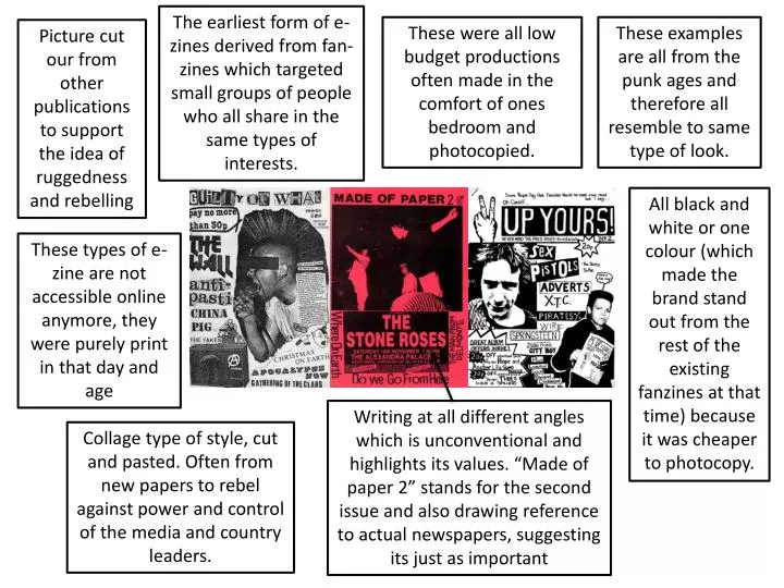
The earliest form of e-zines derived from fan- zines which targeted small groups of people who all share in the same types of interests. . These were all low budget productions often made in the comfort of ones bedroom and photocopied.

E N D
The earliest form of e-zines derived from fan-zines which targeted small groups of people who all share in the same types of interests. These were all low budget productions often made in the comfort of ones bedroom and photocopied. These examples are all from the punk ages and therefore all resemble to same type of look. Picture cut our from other publications to support the idea of ruggedness and rebelling All black and white or one colour (which made the brand stand out from the rest of the existing fanzines at that time) because it was cheaper to photocopy. These types of e-zine are not accessible online anymore, they were purely print in that day and age Writing at all different angles which is unconventional and highlights its values. “Made of paper 2” stands for the second issue and also drawing reference to actual newspapers, suggesting its just as important Collage type of style, cut and pasted. Often from new papers to rebel against power and control of the media and country leaders.
Fonts the same through the e-zine, headings and titles bolder than the articles font. Its a traditional font which we can gather from the serif’s, it makes the e-zine look official and aimed at a higher target audience A lot of white space makes the e-zine look minimalistic which is a very new and trendy making it stand out and appeal to a young audience This e-zine has the ability to turn the page making it much more interactive. It looks much more professional and pretty to the reader enticing them to keep reading Carries a Orange, Black and White colour scheme throughout the e-zine Mimic's conventional print magazine like a mirror, doesn't use internet format to its advantage The e-zine moves across rather than down like most webpage's which mimics the idea of reading a magazine much more Pictures placed around the outside of the articles rather than in the middle on full page spreads
Pictures over the whole page, unconventional for a magazine however will appeal to target audience as this magazine is a recipe magazine and its main focus is food Dark colour schemes broken up by the write writing, exact opposites make it stand out and catch attention Text surrounds the focus of the image and makes it stand out from the rest of the page Images are cleverly placed, uses the rule of thirds to catch the audiences attention and lead their eye to the image Other e-zine from ISSUU also have the picture as the main attraction to the page with the text surrounding them where every they are. Quirky layouts attract the target audience of ISSUU, people with niche interests in art, cooking and travel, for example. All ISSUU e-zine have a front page to each e-zine and the issue within that range of e-zine. Makes it look more like a magazine and attracts the audience by making a first impression Ability to turn pages increases the interactivity and image of the e-zine, it looks a lot more slick and professional
Scroll down through the pages of the magazine as opposed to skipping across or turning the pages as if the publication was print Full page layouts are unique to this publication and make it stand out This e-zine is in the form of an online PDF file. No front page like a conventional e-zine, starts with a blank page and the title very small in the bottom left of the page, as well as the e-zine provider (destructed) Ezine about art however does not contain any articles about the piece or the artist themselves which is very unconventional. Its different to others, its a lot more visual. Block capital font to show dominance and boldness which is what art is all about, it links to subject matter. Reinforces the idea of a formal publication while the rest of the e-zine defies everything you would expect No set colour scheme, all seems to be lack and white from all of the e-zine produced by destructed