Download
1 / 14
140 likes | 243 Views
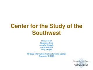
Center for the Study of the Southwest. Lisa Ancelet Stephanie Byrd Jennifer Gravely Janiece Green Terry Vaughn INF385E Information Architecture and Design December 2, 2003. Overview. Introduction Planning Analysis Design Implementation Verification Post Mortem. Introduction.

E N D
Center for the Study of the Southwest Lisa Ancelet Stephanie Byrd Jennifer Gravely Janiece Green Terry Vaughn INF385E Information Architecture and Design December 2, 2003
Overview • Introduction • Planning • Analysis • Design • Implementation • Verification • Post Mortem
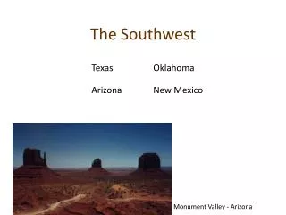
Introduction • Center located at Texas State University • Site provides information about Southwestern literature, the Center and its two publications and the minor in Southwestern Studies • Site originally designed in 1997
Planning • Met with Director of the Center • Ideas for redesign • Look and feel (make the site livelier w/color) • Navigation/Access • Ensure site may be easily updated • Set expectations • Timeframe and skills • Weekly updates to client • Weekly team meetings
Analysis • Content • Two content inventories • One to assess the original site and one to see if we met our goals • Keep information on the site • Decrease the number of links opening to other, unnecessary sites • Reduce page opening • Tried to create text ‘chunks’ • Originally different pages opened for much of content we streamlined
Analysis • Labels • Tried to assign meaningful names; would have tried for further intuitiveness • Class exercise helped; all potential users
Analysis • Personas • Generated to help understand user needs • Helped to further streamline content • Information Taxonomy • Linear organization, helped different group members understand • Bridge between content inventory and sitemap
Design • Site Map • Mapped content inventory over to visual hierarchy • Referenced ID numbers from second content inventory • Design Comps • Color • Search • Journal buttons/Placement
Design • Wire Frames • General layout of content • Focused on placement on page • Work out navigation kinks • Screenshots • Graphics • External links • Navigation
Design • Color – warm neutrals and turquoise accent for emphasis • Type – Arial font family • Graphics – SW clips from client • Analyzed white space – scanned ‘old paper’ • Satisficing – no Flash - Smart, K. L., Rice, J.C., & Wood, L.E. (2000). Meeting the Needs of Users: Towards a Semiotic of the Web. IEEE Technology and Teamwork, 593-605.
Implementation • Server Platform • Macintosh G4/OS X • Apache HTTP Server 1.3.26 • PHP 4.3.3 • Graphic & Visualization Tools • Adobe Photoshop • Microsoft Visio
Implementation • Development Tool of Choice • Macromedia Dreamweaver • Browser Issues
Verification • Scenarios • Identify users • Make them realistic • User Testing • 4 users - two tasks each • Completed tasks (w/number under it) & failed tasks (w/number under it) • Likes and dislikes