Download
1 / 9
90 likes | 209 Views
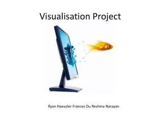
Visualisation . Making Something Invisible Visible Vikki Zhang z3411714 Sherry Yang z3413289 Jiaqi Zhao z3411617 . Visualisation. Make the Invisible Visible Abstract Complex Data into Visual F orm Draw from Data to Structure N ew R elationships and New F orms of K nowledge .

E N D
Visualisation Making Something Invisible Visible Vikki Zhang z3411714 Sherry Yang z3413289 Jiaqi Zhao z3411617
Visualisation • Make the Invisible Visible • Abstract Complex Data into Visual Form • Draw from Data to Structure New Relationships and New Forms of Knowledge
The Invisible event • General Information about the Top Seven Universities in Australian • The World Rankings • Geographic Locations • The Academic Reputation • Average Annual Tuition Fees
Making it visible • ‘Information Map’ for Australian Top Seven Universities • Visualisation of the • The World Rankings • Geographic Locations • The Academic Reputation • Average Annual Tuition Fees
Pre-exist Content • All the Statistics Data Exists in the Form of Written Information • The 2012 QS World University Ranking Exists in the form of Table Chart and Diagram • The Badge of University is Pre-exist • The Geography Map of Australia is Pre-exist
‘Creating’ Content • Select and Gather the Data • Pin Point the Geography Location of the Universities • Use different colours to represent different data • Connect Different information
What difference does it Make? • The ‘Information Map’ Collects and Combines Data from Different Resource • Turns Written Information into Visual Context • Highlight the Important Information • Gives Public a Clearer View of Higher Education in Australia
Target Audience and Publics • Potential Domestic Students • Potential International Students • High School Students • Parents • Potential Employer of the Universities