Download
1 / 43
570 likes | 768 Views
Unit V Big Data Visualization. Introduction to: Pentaho Flare Jasper Reports Dygraphs Datameer Analytics Solution and Cloudier Platfora NodeBox Gephi Google Chart API Flot D3 Visually. Introduction to Data visualization Challenges to Big data visualization

E N D
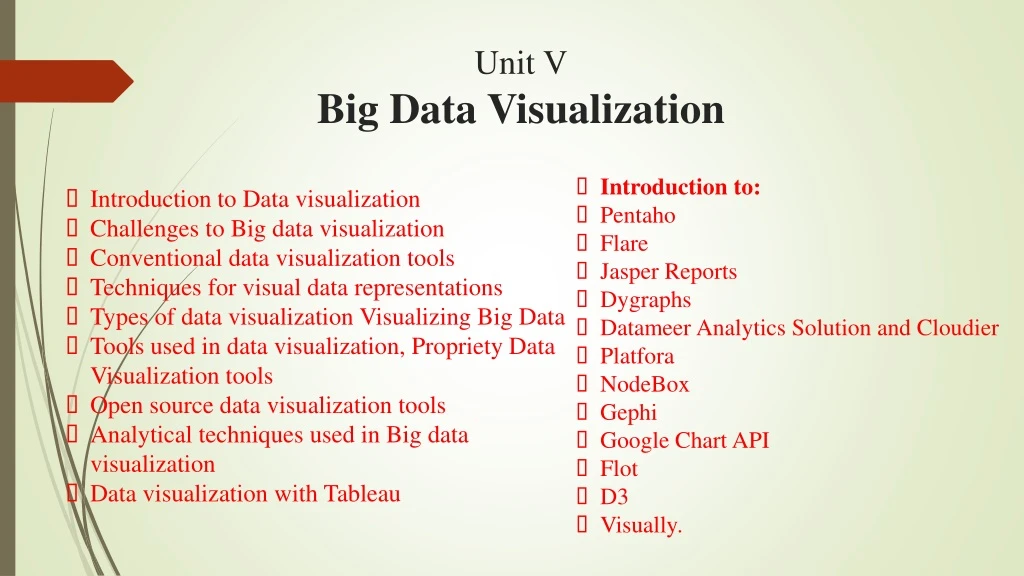
Unit VBig Data Visualization • Introduction to: • Pentaho • Flare • Jasper Reports • Dygraphs • Datameer Analytics Solution and Cloudier • Platfora • NodeBox • Gephi • Google Chart API • Flot • D3 • Visually. • Introduction to Data visualization • Challenges to Big data visualization • Conventional data visualization tools • Techniques for visual data representations • Types of data visualization Visualizing Big Data • Tools used in data visualization, Propriety Data Visualization tools • Open source data visualization tools • Analytical techniques used in Big data visualization • Data visualization with Tableau
Introduction to Data visualization • “Data Visualization is the technique use to communicate data by representing information using visual graphic object like point, lines or bars.” • Objective of data visualization • To enlighten the data or see data in context. • To solve or give solutions to problem. • For understanding data clearly explore data, help to take proper decision. • To illustrate or hide data. • To find patterns or relationship among data • To make comparison between statistical data
Visualizing Big Data • Amount of data generated by organization increased year and year through internet activitycalled as Big Data. • main Problem is collected data should be use full only. Big data visualization refers “Front End” of big data. • Data Visualization used to represent data in different sensitive objects like tables, diagram, images etc.
Challenges to Big data visualization Problems in Big Data Visualization • Problems occurs in Big Data Visualization : 1. Visual noise (too relative data, user unable separate) 2. Information loss (reduction of data set, but may be info loss) 3. Large image perception (limitations- aspect ratio, screen resolution) (only see data, can’t change it) 4. High rate of image change 5. High performance requirement (lower visualization speed)
Challenges to Big data visualization Solution in Big Data Visualization • Solution occurs in Big Data Visualization : 1. Speed upping process (By using fast h/w, increasing m/m) 2. Understanding the data (Take help of expertise to understand) 3. Addressing data quality (Assure quality by information management process) 4. Displaying meaningful results (effective visualization by clustering) 5. Dealing with outliers (removing outliers)
Types of Data Visualization Problems in Big Data Visualization 1. Tables 2. Histogram 3. Scatter plot 4. Various charts 5. Timeline 6. Various diagrams
1. Tables • Collection of rows and columns, represent data into structured. • Small unit is ‘cell’, represented as [4(row),2(columns)]
2. Histogram • Vertical bar chart is used • Represent distribution od set of data over continues interval
3. Scatter plot • Also known as X-Y Plots, Scattered Graph, Point Graphs or Scatter grams • use to represent relationship among 2 different variables where one may or may not correlate to another.
Correlation 1. Positive 2. Negative 3. Null 4. Linear 5. Exponential 6. U-shape
4. Charts Types of Chart 1. Line Chart 2. Bar Chart 3. Pie Chart 4. Area Chart 5. Flow Chart 6. Bubble Chart
3. Pie Chart 1. Line Chart 2. Bar Chart 5. Flow Chart 4. Area Chart 6. Bubble Chart
5. Timeline Timeline • Pictorial representation of events in chronological sequence along with drawing straight line . 1. Linear timeline 2. Comparative timeline
5. Various Diagram Various diagram 1. Venn Diagram 2. Data Flow Diagram 3. Entity Relationship Diagram
1. Venn Diagram 2. Data Flow Diagram 3. Entity Relationship Diagram
Conventional Data Visualization Tool Selection point on which interactive visualization takes place • The methods and ideas used by organization for visualizing data. • 1.Selection point on which interactive visualization takes place. 1. Size and Volume of data 2. Cardinality (To make perfect choice, size and volume should be visualize) (Cordiality should be visualize) 3. Portion of Data to be Convey (Visualizing the point/portion of data which user want to convey) 4. Audience (To whom user want to convey) 5. Type of visual (Which type of visualization user should use)
Interactive Visualization approaches 2. Interactive Visualization approaches 1. Zoom in and Zoom out or Zooming (allows user to change scale of interface are according to choice) 2. Overview + Detail (Multiple view simultaneously used) 3. Focus + Context or Flash Eye (Focus area represent detail about part of information)
3. Steps used to perform interactive visualization Steps used to perform interactive visualization 1. Interactive selection of data object (According to user data entities /subset/part of whole selected for visualization) 2. Linking data object with each other (use for connecting multiple views) 3. Filtering Information (only valuable data focused and unrelated remove) (rearrange data) 4. Rearranging or Remapping
Techniques For Visual Data Representation Visualization Techniques/Methods • According to diff author data visualization techniques are different. (Help to represent quantitative data with or without axes in diagrammatic form eg. Table, Line chart, pie chart) 1. Data Visualization (Provide interactivity in data to increase cognition. eg. Tree map, Clustering, Venn Diagram ) 2. Information Visualization (Used to explain ideas, plans, concept in detail and analyse easily eg. Decision Tree) 3. Concept Visualization (used to represent organizations strategies of development, Formulation, implementation. Eg. Organizational chart, failure Tree, Strategy map) 4. Strategic Visualization (organize and structure information graphically. Express insight of information. Metro Map, Tree) 5. Metaphor Visualization (allow merging diff graphic format in single shema. eg Cartoon ) 6. Compound Visualization
Data Visualization Tools Part of visualization tools • For visualizing data sets in the form of 2D and 3D various tool are used • Part of visualization tool divided into 2 part: 1. Multidimensional visualization 2. Multidimensional Visualization Tool
There are two categories of multidimensional visualization • First type examine the category properties or category count. • Example • Pie chart • Bar chart • Histogram • Tree map • Second type examines the relationship among the variables • Example • Scatter Plot • Line chart • Area chart • Tabular comparison 1. Multidimensional Visualization
2. Multidimensional Visualization Tool • Google Charts • This tool display live data on our website • Google Chart contains Introduction ,Quick Start and Chart Gallery for ideas.
Many Eyes • Many eyes is an research done by IBM research and IBM Cognos s/w grp. • Developed by using JAVA and Flash, Open Source • It is public website, allows user to upload data and for such data it will generate interactive visualization.
Tableau Public • Most popular tool, developed by US company Tableau Software. • According to their website it “Brings Data to Life”.
Weave • Web Based Analysis and Visualization Environment • Can handle diff datatypesbcz it has large array of option for working with various data.
Wordle • Wordle takes text as input from user and generate ‘Word Clouds’ • Clouds provide greater importance to words which frequently occurs in source text
Open – Source Data Visualization Tools Open – Source Data Visualization Tools 1. Datawrapper 2. Chart JS 3. Raw 4. Charted 5. Timeline 6. Leaflet
1. Datawrapper • Open –source, produce in Europe by the journalism organization. • designed to create data visualization for news institutes. • Graph can be created in 4 steps;: - To create graph click on “New Chart” link on top menu bar - paste your data in the text area. - Then, tool analyses, and show preview - if everything is fine then publish data
2. Chart JS • Open source, having clean charting library • Chart JS allow self control to user over look and feel of their chart • Before creating chart ,include library in frontend code(code must) • Then add chart and assign value to them
3. Raw • Open source, web based tool, built on D3.js library • Simple, ready to use tool for non-programmable user 4. Charted • Open source, invented by the product science team at Medium • To visualize data just paste link of Google spreadsheet or .csv as input • it check whether data is up-to-date or not after some interval(30 min).
5. Timeline • To display set of events in sequential manner • Need proper formatting of data in Google spreadsheet 6. Leaflet • Lightweight, mobile friendly JavaScript library, use to create interactive maps • take advantage of HTML5 and CSS3 • Well documented, easy to use, beautiful API and readable source code
Analytical Techniques used in Big Data Visualization Analytical Methods 1. Classification 2. Regression 3. Clustering 4. Association Rule
Supervised learning • SL is where you have input variables (X) and an output variable (Y) • We use an algorithm to learn mapping function from input to output Y=f(X). • Goal is when you have new input data(X) then you can predict output variables(Y) • For instance, suppose you are given an basket filled fruits. Now the first step is to train the machine with different fruits : • If shape of object is rounded and depression at top having color Red then it will be labelled as –Apple. • If shape of object is long curving cylinder having color Green-Yellow then it will be labelled as –Banana.
i) Classification • Classification problem is when the output variable is category, such as “red” or “blue.” • Classification model attempts to draw some conclusion from observed values. • Given one or more input to classification model will try to predict value of one or more outcomes. • for eg. When filtering emails “spam” or “not spam”
ii) Regression • Regression problem is when output variable is real or continuous value such as “Salary” or “Weight” • Diffbetween classification and regression, Classification predict something will happen whereas Regression predict how much of it will happen • The ans of following types of question Regression analysis use: 1) How much person expected income is? (ans- Linear regression) 2) What is the probability that an applicant will fail to clear loan? (ans- Logistic regression)
Unsupervised learning • Hidden structure is discovered from unlabeled data • Unsupervised learning is the training of machine using information that is neither classified nor labeled • Unlike supervised learning, no teacher is provided that means no training will be given to the machine • Task of machine is to group unsorted information according to similarities, patterns and differences without training data.
For instance, suppose it is given an image having both dogs and cats which have not seen ever • Thus machine has no any idea about the features of dogs and cat so we can’t categorize it in dogs and cats. But it can categorize them according to their similarities, patterns and differences .
i) Clustering • Unsupervised technique used for grouping similar object. • No prediction, find out similarities between object and grp in to cluster ii)Association Rule • Unsupervised technique • No prediction made, instead it find out remarkable relationship among item that are hidden in large dataset. • This discovered relation denoted as Rules
Data Visualization with Tableau • Tableau is Business Intelligence tool s/w data. • has its own in-memory data engine, Help to speed up the visualization • Hadoop embedded with Tableau, uses Hive • Features • Quick and easy data acquisition • Publication of interactive graphics • Data are public • Has 3 main product : i) Tableau Desktop ii) Tableau Server iii) Tableau Public
Introduction : • Pentaho: • It provide Data analysis designing, monitoring, Data Mining and integration features • Flare : • It is ActionScriptlibrary,runs on Adobe Flash Player • Jasper Reports • open source java reporting tool, define in XML format • Dygraphs • fast, flexible, open source JavaScript charting library • Datameer Analytics Solution and Cloudier • allows to store entire data in hadoop • Platfora • bult on Hadoop and Spark
NodeBox : • node-based s/w, used for creating 2D graphs • Gephi: • Written in java and OpenGL • open source java reporting tool, define in XML format • Google Chart API • provide simple visualization using online tool • Flot • Jquery library for line and Bar chart • D3.js • Data-Drivan Document(HTML + CSS) • Visual.ly • provide template, popular for infographics