Download
1 / 11
110 likes | 286 Views
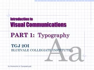
Introduction to Visual Communications PART 1: Typography. Aa. TGJ 2OI BLUEVALE COLLEGIATE INSTITUTE. 2a Introduction to Typography.ppt. Intro to Typography (write blue text).

E N D
Introduction toVisual CommunicationsPART 1: Typography Aa TGJ 2OIBLUEVALE COLLEGIATE INSTITUTE 2a Introduction to Typography.ppt
Intro to Typography (write blue text) • We often don’t pay much attention to typography, but it can dramatically affect how we react to an ad, poster, package or text. • Type forms the basis for many designs. • Designers are careful to choose type styles that suit the purpose of their designs. • The type should fit the “mood” of your work (suggests feeling).
Intro to Typography • Regardless of type uses or purpose, you want to make sure your text is readable. • Fonts are measured in POINTS (72 points = 1 inch)
Intro to Typography • All type faces, or FONTS, can be placed in one of four FONT FAMILIES. • Serif • Sans Serif • Script • Decorative / Novelty
Intro to Typography • SERIF Fonts: • Fonts in this family are categorized by tiny “feet,” called serifs, on the ends of letter lines. • Includes fonts like Times New Roman • Good for use as BODY TEXT – small type for articles, etc. (easy to read when small – 10-12pt) Aa serif (feet)
Intro to Typography • SANS SERIF Fonts • Fonts in this family are sometimes called BLOCK letters – no feet on ends of letters • Includes fonts like Arial and Helvetica • Suitable for HEADLINES or larger font sizes • Not easy to read when smaller than 12pt– avoid use as body text (except for web pages) Aa
Intro to Typography • SCRIPT Fonts • Fonts in this family look like fancy handwriting • Letters are joined together and flow smoothly • Use sparingly (too much gets annoying) • Never use as all capitals (difficult to read) or as body text • Ex. –Commercial Script BT Aa
Intro to Typography Aa • DECORATIVE / NOVELTY Fonts • Fonts in this family are unusual and don’t fit into other categories • Usually “trendy” or “funky” fonts such as, Jokerman, Slipstream. • Usesparingly – for emphasis or interest on a page • Neveruse these as body text • Can evoke many types of moods (fun, scary, cool) Aa Aa
Intro to Typography Font Styles: • You can change a font’s appearance by using styles: • 1. BOLD – letter lines are heavier (stand out) • 2. Italic – letters have a slight lean to the right • 3.Underline – kinda’ obvious • 4. You can alsostretchfonts orchangethe space (kerning)between letters to give adifferent appearanceorweight to text. • Styles create variety without cluttering a document with too many fonts.
Intro to Typography General Rules to Follow: • Avoid using more than 3 fonts on one page. Using too many fonts may make a document/publication look cluttered or sloppy) • Avoid using 2 fonts from the same family close together (use styles of same font if possible) • Make sure you use consistent type sizes for longer publications (brochures, newsletters, etc.) • Try to manipulate fonts (stretch, space letters apart, etc.) or add styles to create visual interest instead of adding different fonts to a page
Intro to Typography TYPE ASSIGNMENT #1: • Look through old magazines or newspapers to find at least 2 samples (large if possible) of fonts from each of the 4 font families (min. 8 total) • For each sample, record where you found it and what purpose you think it had in the publication, ad, etc.