Download
1 / 1
10 likes | 136 Views
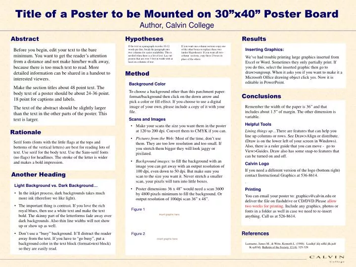
Title of a Poster to be Mounted on 30”x40” Poster Board Author, Calvin College. Abstract. Hypotheses. Results.

E N D
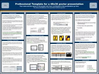
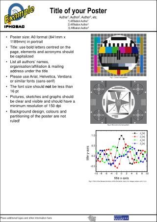
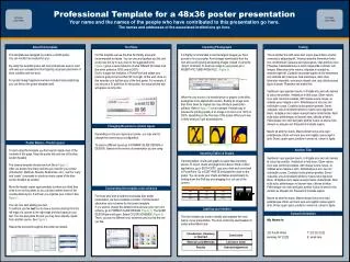
Title of a Poster to be Mounted on 30”x40” Poster Board Author, Calvin College Abstract Hypotheses Results If the text in a paragraph excedes 10-12 words per line, break the paragraph into two columns for easier readability. This is needed when there is a lot of text. Lay out posters that are over 3 feet in width with at least six columns of text. If you want one-column sections copy one of the other boxes to replace these two (under Hypotheses). If you want all two-column sections, copy these 2 boxes in place of the others. Before you begin, edit your text to the bare minimum. You want to get the reader’s attention from a distance and not make him/her walk away, because there is too much text to read. More detailed information can be shared in a handout to interested viewers. Make the section titles about 48 point text. The body text of a poster should be about 24-36 point. 18 point for captions and labels. The text of the abstract should be slightly larger than the text in the other parts of the poster. This text is larger. Inserting Graphics: We’ve had trouble printing large graphics inserted from Excel or Word. Sometimes they only partially print. If you do this, select the inserted graphic then go to draw>ungroup. When it asks you if you want to make it a Microsoft Office drawing object click yes. Now it is editable in PowerPoint. Method • Background Color • To choose a background other than this parchment paper: format/background then click on the down arrow and pick a color or fill effect. If you choose to use a digital image of your own, please include a copy of it with your file. • Scans and Images • Make your scans the size you want them in the poster at 120 to 200 dpi. Convert them to CMYK if you can. • Pictures from the Web: Most of the time, don’t use them. They are too low resolution and too small. If you stretch them bigger they will look jaggy or pixilated. • Background images: to fill the background with an image you can get away with an output resolution of 100 dpi, even down to 50 dpi. But make sure you scan to the size you want it. Never stretch a smaller scan, your pixels will turn into little boxes. • Poster dimensions 36 x 48” would need a scan 3600 by 4800 pixels minimum to fill the background. Or output resolution of 100dpi scan 36” x 48”. Conclusions Remember the width of the paper is 36” and that includes about 1.5” of margin. The other dimension is variable. Helpful Tools Lining things up…There are features that can help you line up columns or rows. See Draw>Align or distribute. (Draw is on the lower left of your screen in Windows). Also, there is a ruler guide that you can move - go to View>Guides. Draw also has some snap-to features that can be turned on and off. Calvin Logo If you need a different version of the logo (bottom right) contact Instructional Graphics at 536-8614. . Printing You can email your poster to: graphics@calvin.edu or deliver the file on flashdrive or CD/DVD.Please allow two weeks for printing. Include any graphics, photos or fonts in a folder as well in case we need to re-insert anything. Call us at 526-8614. Rationale Serif fonts (fonts with the little flags at the tops and bottoms of the vertical letters) are best for reading lots of text. Use serif for the body text. Use the Sans-serif fonts (no flags) for headlines. The stroke of the letter is wider and makes a bold impression. Another Heading • Light Background vs. Dark Background… • In the inkjet process, dark backgrounds takes much more ink (therefore we like light). • The important thing is contrast. If you love the rich royal blues, then use a white text and make the text bold. The skinny part of the letterforms fade away over dark backgrounds. Also thin line widths will not show up or show up as well. • Don’t use a “busy” background. It’ll distract the reader away from the text. If you have to “go busy”, put a background color in the text block (format>text block) so they are easily read. Figure 1 insert graphic here References Figure 2 insert graphic here Lastname, James M., & Witte, Kenneth L. (1988). Lasdkjf ;klj sdfkl jlk;jsdf lk;sjdf klj. Bulletin of the Society 12 (4), 325-328.