Download
1 / 26
260 likes | 418 Views
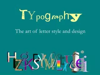
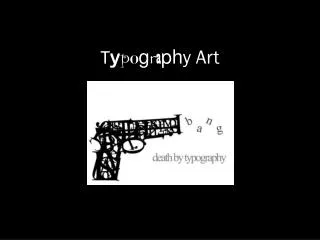
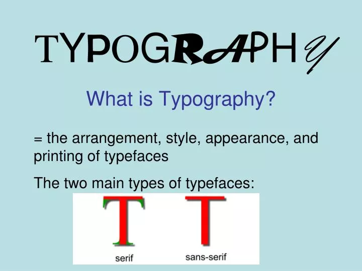
T Y P O G R A P H Y. = the arrangement, style, appearance, and printing of typefaces The two main types of typefaces:. What is Typography?. Font Searches: www.dafont.com , www.urbanfonts.com , http://www.fontspace.com. Fonts…they can covey messages and emotions too!.

E N D
TYPOGRAPHY = the arrangement, style, appearance, and printing of typefaces The two main types of typefaces: What is Typography?
Font Searches: www.dafont.com , www.urbanfonts.com, http://www.fontspace.com
Fonts…they can covey messages and emotions too! Which # font do you think best describes anger?Why?
Now look at artists who use TEXT as the subject for their artwork • http://www.bemboszoo.com/
Robert Indiana • Born as Robert Clark in Indiana, 1928. American artist, called Pop Artist, but he considers himself a “sign painter.” • Influenced by American roadside signs. • Went to several prestigious colleges and finally settled in New York. • Works with bold colors and graphic symbols. • Gives new meanings to basic words “Eat. Love. Die.” -makes us look at common things in a new perspective. • Collaborated with Andy Warhol
Robert Indiana Stamps – postcards - sculptures
Paul Smith, cerebral palsyhow do you think these images were made? • Link to Paul Smith amazing video
COLLAGE • An artistic composition created by gluing various materials/images together
How do you create an interesting composition? • What are some traffic signals artists use to direct the viewers eye down a path? • What if it is just black & white? • Where does your eye typically go first? Lightest area, biggest area, center
MOVEMENT = Placing objects in a composition to provide a visual path for the viewers eyes to travel across the surface • Tools to lead the eye: color, rhythm, line, sequence, contrast,
Type of Space: • Positive Space: Space taken up by objects that the artist wants the viewer to see. • Negative Space: Space that is around the objects or the leftover, empty space.
“Notan” is the term used by the Japanese to express “light-dark” as an element of design. In the west we use separate terms such as positive space and negative space, dividing the idea of light-dark into separate components. On paper it is easy to see that dark shapes cannot exist without a surrounding area of white. White shapes cannot exist without dark to define it. The two elements are really one. This is an eastern concept of yin-yang that each is what the other is not. NOTAN
Notice that positive space cannot be defined if it were not for negative space!
Where is the positive space? • Where is the negative space?
This student did a good job BALANCING the positive and negative space. At first glance it is hard to tell if it is white on black paper, or black on white paper.
CONTRAST: = a large difference between two things UNITY: = everything fits together as a whole; harmony
RHYTHM/REPETITION: = repetition of shapes, colors, lines, values = repeating an element over and over
VARIETY = differences in artwork; diversity You change the: -Font style -Size big/small -Thick / thin -direction / angle How do you create variety using text?
Your Job: • To use text in a way that it loses its identity as letters – and becomes a shape or space. • To learn to lead the viewer’s eye across an image by using the design principles.
Warm up activity: • Look through magazines to cut out letters and glue them down on your handout to illustrate the 5 ways to arrange a composition.
Design Requirements: • Choose 1 letter, 1 emotion, 1 font • Create a template for each size letter • Use at least 15 cut out letters in your final design • Create an interesting composition using repetition and positive/negative space. • Create a definite path for the eye to follow. • Craftsmanship: Neat and careful cutting/gluing.
Search websites for fonts: www.dafont.com www.urbanfonts.com www.fontspace.com www.font500.com www.fontpark.net