Download
1 / 20
210 likes | 408 Views
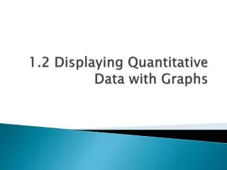
Chapter 4 Displaying & Summarizing Quantitative Data. Histograms. Similar to bar charts, but with quantitative data. No gaps between bars. Summarizes data visually using frequency count. Data: Amount spent by 50 customers at a grocery store.

E N D
Histograms Similar to bar charts, but with quantitative data. No gaps between bars. Summarizes data visually using frequency count.
Data: Amount spent by 50 customers at a grocery store 2.32 6.61 6.90 8.04 9.45 10.26 11.34 11.63 12.66 12.95 13.67 13.72 14.35 14.52 14.55 15.01 15.33 16.55 17.15 18.22 18.30 18.71 19.54 19.55 20.58 20.89 20.91 21.13 23.85 26.04 27.07 28.76 29.15 30.54 31.99 32.82 33.26 33.80 34.76 36.22 37.52 39.28 40.80 43.97 45.58 52.36 61.57 63.85 64.30 69.49 Source: http://lib.stat.cmu.edu/DASL/Datafiles/Shoppers.html
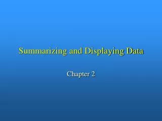
Histogram: Heights of Adolescents Source: http://wiki.stat.ucla.edu/socr/index.php/SOCR_Data_Dinov_020108_HeightsWeights
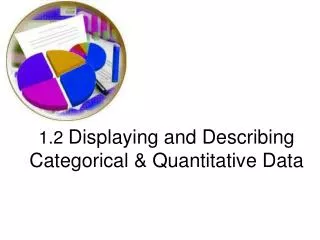
Histogram: Smiling Times of 8-week old baby Data Source: http://cnx.org/content/m16819/latest/
Stem-and-Leaf Display Quick way to summarize a small set of quantitative data. 99, 53, 93 , 82 , 85 , 64 , 75 , 62 , 74 , 81 , 73 , 70 , 81 , 73 , 94, 67 , 93 , 87 , 85 , 36 , 80 , 78
Shape of a Distribution • Unimodal • One peak value that occurs more frequently than the rest • Bimodal • Two peak values that occur more frequently than the rest • Multimodal • Three or more peak values • Uniform • Bars in histogram are all about the same height
Symmetry • Does the data look symmetric relative to the middle? • Does the distribution of the left half look like the right half? • Is the data skewed? • Are there tails on the data that stretch out away from the center? • Skewed to the Left: tail is on the left • Skewed to the Right: tail is on the right
Any unusual features (outliers)? Sometimes a small number of data values are significantly far away from the rest. Sometimes they can be a mistake in the data but can also be legitimate values that can be left out with a good explanation.
Center of the Distribution: Median Once we’ve described the basic shape, we want to be able to talk about the center. Use the horizontal axis to try to identify the center or median. Half the data above the median, half below
Spread of the Data • Range: max – min • Only takes into account the very extremes, doesn’t measure spread in between • Interquartile Range (IQR) • Quartiles divide data into quartiles (quarters) • Lower Quartile: separates bottom 25% from rest of data • Upper Quartile: separates top 25% from rest of data • IQR = upper quartile – lower quartile • Contains the middle half of the data
5 Number Summary Max Q3 (upper quartile) Median Q1 (lower quartile) Min
Find 5 Number Summary 99, 53, 93 , 82 , 85 , 64 , 75 , 62 , 74 , 81 , 73 , 70 , 81 , 73 , 94, 67 , 93 , 87 , 85 , 36 , 80 , 78
Summarizing Symmetric Distributions: The Mean When data is skewed or contains outliers, the median is a useful measure of the center. For symmetric data distributions, the mean is another useful calculation for the center. The mean is the arithmetic average Balancing point for the histogram
Mean vs. Median There is a rumor that dean of UNC announced that the average starting salary of graduates majoring in geography in 1984 was $300,000. That seems a bit high, any idea why? Well, it turns out that Michael Jordan was a geography major and got a $3,000,000 contract in the NBA. While the rest of the geography majors made $25,000 - $45,000, this outlier distorted the mean.
Spread: The Standard Deviation IQR measures spread, but only uses 2 data values. The standard deviation uses every data value. Only makes sense with symmetric data. Measures how far each data value is from the mean and averages them together.
Calculating Std. Dev. by hand Data: 10, 4, 2, 8, 6 mean = 6 Sum of squared deviations: 40 Divide by n-1: 10 Square root: ≈ 3.16 Standard Deviation = 3.16
Why do we want to use the Standard Deviation? Look at these 3 data sets: 0, 0, 0, 0, 0, 10, 10, 10, 10, 10 0, 1, 2, 3, 4, 5, 6, 7, 8, 9, 10 0, 0, 0, 5, 5, 5, 10, 10, 10 Find their mean, median, mode and spread. What do you see?
Looking at Histograms again For each of the data sets below, create a histogram and use that to decide which set of summary statistics to calculate and then calculate them using Minitab. Neck Sizes Student Email Gasoline Usage Source: Intro Stats, DeVeaux