Download
1 / 29
290 likes | 384 Views
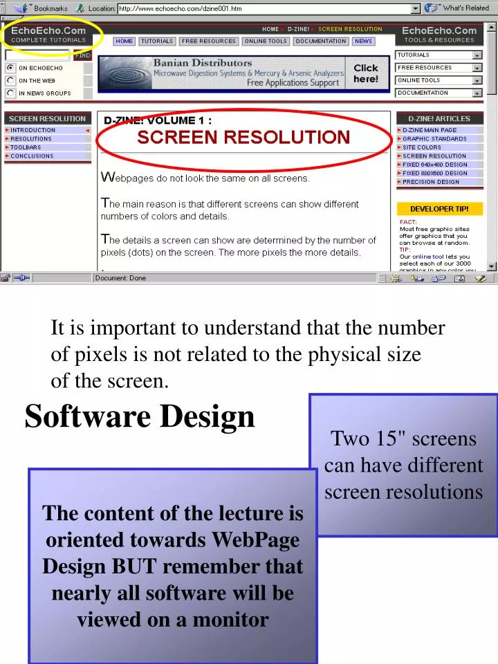
Software Design. It is important to understand that the number of pixels is not related to the physical size of the screen. Two 15" screens can have different screen resolutions.

E N D
Software Design It is important to understand that the number of pixels is not related to the physical size of the screen. Two 15" screens can have different screen resolutions The content of the lecture is oriented towards WebPage Design BUT remember that nearly all software will be viewed on a monitor
Banner advertisement Navigation menus Subsidiary menu Subsidiary menu Central, single column text Look at this example showing the same webpage viewed on the same monitor at two different screen resolutions:
Many have screen resolutions of 640x480 or 1024x768 pixels.Very few users have other screen resolutions screen resolution stats: If you compare the resolutions, it looks like this: Most screens have a resolution of 800x600 pixels
if we place the same red image on each screen it will look like this: the proportions are the same the height is 3/4 of the width no matter which resolution is used the example above shows how much content will fit on the screen, not how the screen actually looks screens set at high resolutions are not necessarily physically bigger than screens set at low resolutions screens set at high resolutions simply compress the content more than screens set at low resolutions
Another way to put it is an image viewed on a 30" monitor at a resolution of 1600x1200 pixel, looks exactly the same as an image seen on a 15" monitor set up to show 800x600 pixels However: the compression happens without loss of detail At high resolution a screen simply has more pixels on it If youlooked at the high resolution page through amagnifying glass you would see that even thoughthecontent is compressed, it still has all the detailsfromthe low resolution page
the EFFECT OF BROWSERS MSIE = Microsoft Internet Explorer • on a Windows 98 PC using MSIE 4.0 (version 4.72 to be precise): • if only the menu bar is activated the web page gets full window size less 80 pixels • on the contrary, if all toolbars are activated the page gets full window size less 186 pixels. Only menu bar activated (grey areas): the width is pretty much the same no matter how the browser is set up the height varies a great deal the actual height left for the webpage (the principal content) will vary, depending on which menus, buttons, etc. the user has activated
In either case, the number of pixels used by toolbars, etc. is 186 All toolbars and status bar activated (grey areas): the visual height of the web page is an elastic measurement on low resolution screens, the toolbars may use close to 40% of the entire screen on high resolution screens, they will use at most close to 20% of the screen
while the height also varies with the customization of the browser This means that the width of the screen only varies with the resolution Therefore it is hard to make a fixed design with respect to the visual height The result simply varies - not only from users with different screen resolutionsbutalso from users with the same resolutions but different browser setups.
It is strongly recommended that none of the navigation tools are designed to be outside the visual area of the opening screen even in the worst case (640x480 with all toolboxes activated) Ergo: the navigation structure of the page should be kept at the upper 300 pixels of the page actually the upper 294 pixels to be precise!
All toolbars and status bar activated: the navigation structure of the page should be kept within the upper 300 pixels of the page the number of pixels used by these toolbars, etc. is or the upper 294 pixels to be precise! 186 On a 640x480 screen with all toolboxes activated
All newspaper editors know the importance of what is kept abovethefold - it's what sells papers on a web page the above the fold area sells the rest of the page below, the above the fold area is shown using a lighter colour than the rest of the page When designing pages you should therefore keep this division of the page in mind The upper 300 pixels - and the rest ! The upper 300 pixels of a webpage is often referred to as beingabove the fold
Conclusions • Webpages are printed on "elastic paper” • Size of images and text varies depending on screen settings • Positioning of images and text varies depending on screen settings • Actual size of images and text depends on both screen settings & physical monitor size • The same webpage looks different depending on the users’ monitor size and screen resolution • Only the visual height varies with customization of browsers • The visual width is less elastic than the visual height But this is not the end!
When starting to build a new web site it is very tempting to add content to several pages right away But many different aspects will influence the final look it is almost impossible to take them into consideration once the pages are done in rough Most important CONCLUSION find the right layout before you start adding content to your pages the best way is to design an empty template page Add all the tables and graphics Write dummy texts etc, and stick to the dummies until the layout is perfect
here we have been considering screen resolution and browser set ups as well as the dimensions of the common VDU other physical constraints maybe important in determining some design issues
In Donald Norman’s chapter “Design as Practiced” in Winograd’s book “Bringing Design to Software” the Apple Switch problem is examined and reviewed Whilst examining this problem other considerations might be taken into account - the concept of a universal solution to a problem - is this really what we want?
THE APPLE MACINTOSH • differences to the PC: • usually a single box construction (no separate monitor) • early use of icon-driven applications software • software driven 3.5” disk ejection An example of software/hardware confusion - it may be a software triggered disk eject but there are specialised circuits to the disk slot which implement shutdown and ejection
THE APPLE MACINTOSH The problem: all machines usually have an on/off button nowadays, that on/off button is often a soft power down button But then again, sometimes it is a HARD shutdown button
THE APPLE MACINTOSH 3.5” floppy disk slot the Macintosh 610: | But then again, sometimes it is a HARD shutdown button
THE APPLE MACINTOSH the Macintosh 610: What was required: “a simple and effective way for people to turn on their machine and to shut down or close safely all files, applications, queues and caches, and to turn off all power except for that required to monitor essential machine states”
THE APPLE MACINTOSH the Macintosh 610: Exceptional circumstances? How to force a shutdown? If there is NO shutdown button at all?
| Real power switch on the rear of the box THE APPLE MACINTOSH the SOLUTION: ON/OFF button on the keyboard
Design as Practiced Donald Norman’s conclusion: “When you are asked to solve a problem, look beyond it. Ask why that particular problem arose in the first place. Search beyond the technical: the business model, the organisational structure and the culture. The path to a solution seldom lies in the question as posed: that appears only when we are able to pose the right question.” the meaningless button
Top Ten Mistakes in Web Design: May 1996 1. Using Frames 2. Gratuitous Use of Bleeding-Edge Technology 3. Scrolling Text, Marquees, and Constantly Running Animations 4. Complex URLs 5. Orphan Pages 6. Long Scrolling Pages 7. Lack of Navigation Support 8. Non-Standard Link Colours 9. Outdated Information 10. Overly Long Download Times From Jakob Nielsen’s Alertbox: www.useit.com
Top Ten Mistakes in Web Design: May 1996 • frames break the unified model of the Web • the user's screen view of information is now determined by a sequence of navigation rather than a single action • bookmarks may not get the same view back when followed at a later date • URLs stop working in that address information at the top of the browser no longer constitutes a complete specification of the information shown in the window 1. Using Frames Many browsers cannot print framed pages appropriately There may be trouble searching: search engines may not know what composites of frames to include as navigation units in their index
Top Ten Mistakes in Web Design: May 1996 trying to attract users to your site by using the latest web technology will attract a few nerds, but mainstream users care more about useful content and good customer service 2. Gratuitous Use of Bleeding-Edge Technology 3. Scrolling Text, Marquees, and Constantly Running Animations Moving images have an overpowering effect on the human peripheral vision - don’t try to emulate Trafalgar Square and constantly attack the human senses: give your user some peace and quiet to actually read the text!
Top Ten Mistakes in Web Design: May 1996 machine addresses, like URLs, shouldn’t be exposed, but they are. Some users decode URLs to infer the structure of web sites, probably because of a lack of support for navigation. 4. Complex URLs So, use human-readable directory and file names that reflect the nature of the information space, minimize the risk of typos by using short names with all lower-case characters and no special characters, such as ~ all pages need clear indications of what web site they belong to - they might be accessed without coming through the home page. Similarly, every page should have a link up to the home page and the structure of your information space. 5. Orphan Pages
Top Ten Mistakes in Web Design: May 1996 At this time, only about 10% of users scrolled beyond the information that was visible on screen when a page came up, but with the advent of the roller on the mouse this has increased. However, it is wise to put all critical content and navigation options on the top part of the page. 6. Long Scrolling Pages 7. Lack of Navigation Support Don't assume that users know as much about your site as you do - they need support in the form of a strong sense of structure and place, maybe a site map. Always let users know where they are, where they can go, and, perhaps, provide a search feature
Top Ten Mistakes in Web Design: May 1996 8. Non-Standard Link Colours unseen links are blue; previously seen are purple or red - consistency is the key most people would rather spend time creating new content than on maintenance, but maintenance can be a valuable way of enhancing website content 9. Outdated Information 10. Overly Long Download Times 10 secs is usually seen as the maximum response time before users lose interest. On the web, users have been trained to endure so it may be acceptable to increase this limit to 15 secs for a few pages.
Top Ten Mistakes in Web Design: May 1999 “The "top ten" design mistakes I identified in 1996 are still bad for Web useability and are still found on many websites. So in that sense, not much has changed over the last three years.” 1. Breaking or Slowing Down the Back Button 2. Opening New Browser Windows but “an entirely new class of mistakes” has arisen: 3. Non-Standard Use of GUI Widgets 4. Lack of Biographies 5. Lack of Archives 6. Moving Pages to New URLs 7. Headlines That Make No Sense Out of Context 8. Jumping at the Latest Internet Buzzword 9. Slow Server Response Times 10. Anything That Looks Like Advertising